Designs/Activity Management
< Designs
Jump to navigation
Jump to search
| This page has been migrated to the Sugar Labs wiki. This is an archive (and likely, out-of-date) copy of material found at http://wiki.sugarlabs.org/go/Design_Team/Designs/Activity_Management . Please edit and comment on it there. If you disagree with its migration, please explain why on its talk page. |
Current Design
01
back | next
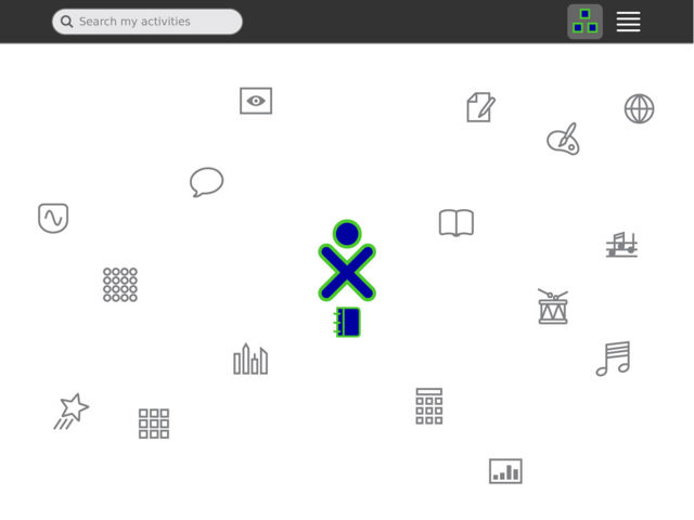
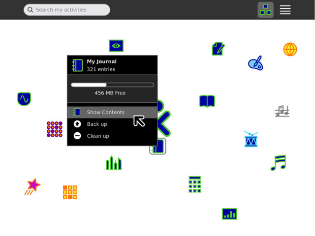
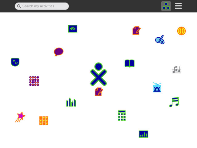
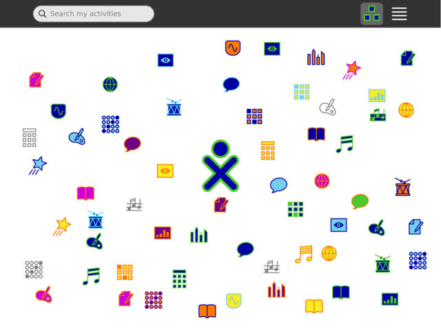
The Home screen is a place from which to launch new or recently used activities. The child's favorite activities may be arranged around their XO, while their current activity is shown directly beneath it, consistent with the other zoom levels. Scaling of the icons as the view fills up will allow hundreds of activities to be shown.
02
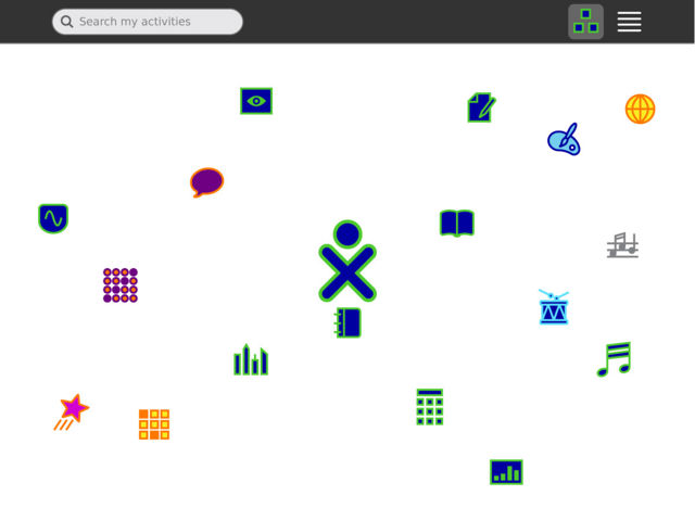
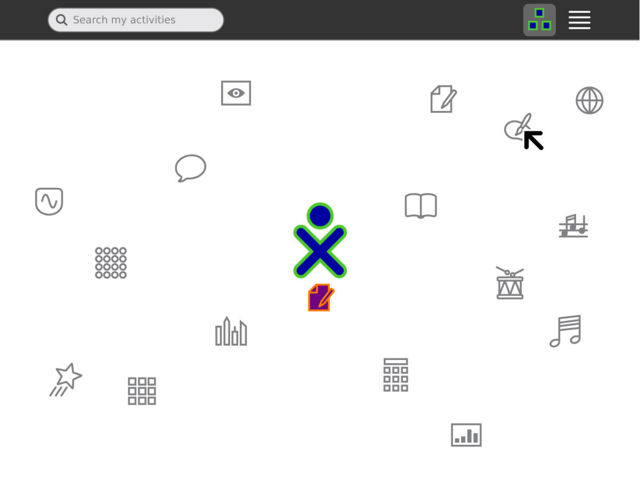
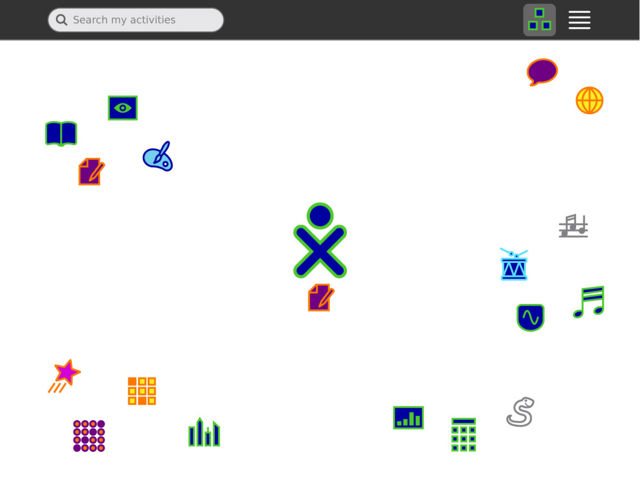
While activities appear in their raw, uninstantiated (gray outline) state at first, they take on the colors of the most recent instance once started. This provides a way for children to dive directly into projects they've been working on recently from Home, and helps prevent them from creating lots of new instances by accident. This also lends a touch of personalization to the view, allowing the colors to allude to their collaborative experiences.
03
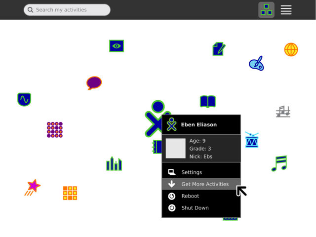
The XO is the heart of the interface. An addition to the XO menu provides a quick and easy link directly to a library containing additional activities. The activities available depend on the child's level of connectivity: local, to a school server, or to the internet. A single click will download a new activity and place it within Home, where it will appear in its uninstantiated state for easy identification.
04
05
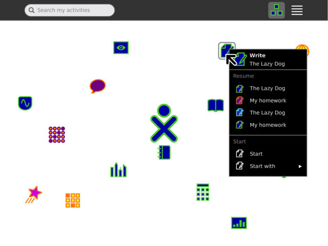
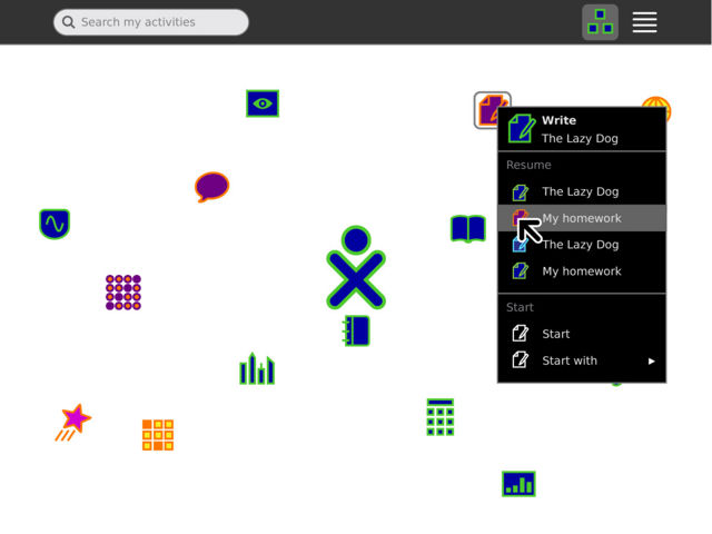
A child may launch an activity simply by clicking its icon. The palette for an activity offers a list of recent instances of the activity, as well as the option to start a new instance from scratch. It also offers the option to start the new instance privately, with a friend, or publicly (and later with a specific group).
06
07
08

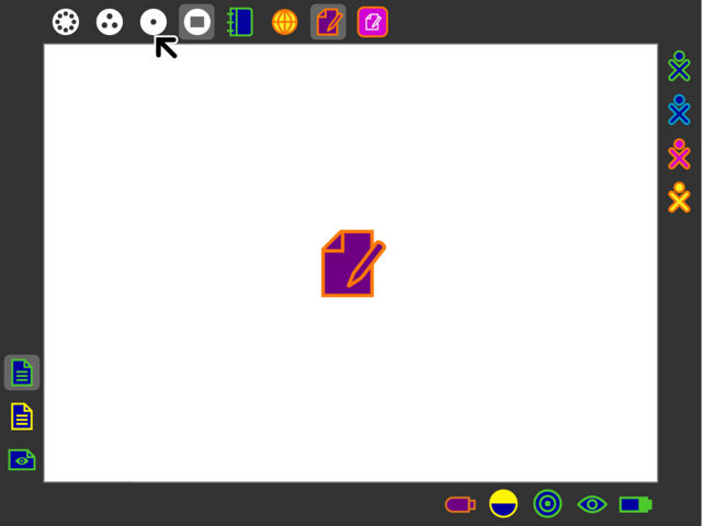
The launching of an activity automatically transitions to the activity zoom level, where a large, pulsing representation of the activity appears. This provides immediate and obvious feedback to the children, to let them know both that the action they took had an effect, and that they should wait for the launch to complete. This provides a friendly and entertaining method of feedback, while simultaneously discouraging children from launching many activities at the same time.
09
10
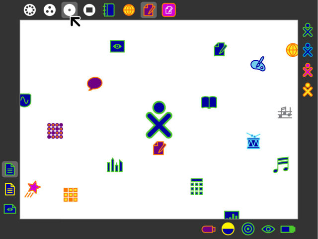
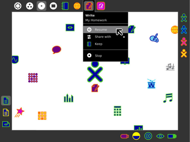
The child's running activities appear at the top edge of the Frame, adjacent to the zoom levels. Their position in the Frame makes them easy to access from anywhere, which also makes switching activities more natural. Additionally, the child may interact on them directly: for instance, they might drag a friend from the Neighborhood onto an activity icon to invite them.
11
12
13
14
Finally, the list view of Home reveals an ordered list of all activities installed on the laptop. It offers automatic grouping when more than one version of an activity is present, as well as additional information that may be relevant to show for lesser used activities. It also provides a quick way to star and un-star activities, to change the set of activities which appear in the free layout view.
15
back | next
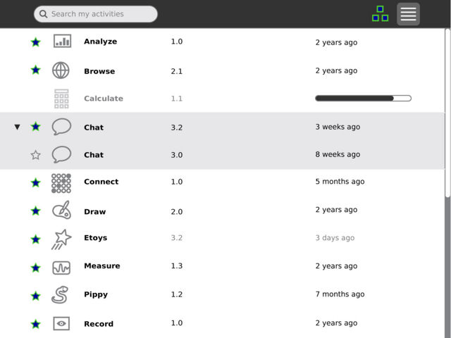
The list view of Home provides a filterable list of all activities installed on the machine. Those which the child stars within list view appear as favorites in the ring. Activities will be starred by default when downloaded to make them immediately available from the ring, but may later be removed as the child sees fit.
Previous Designs
