8.2 GUI and usability improvements
Contents
GUI and usability improvements
A number of aspects of the Sugar UI have been revamped to improve the user experience.
Home view
There are now three distinct view options:
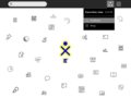
Home Freeform view
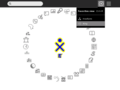
Home Ring view
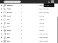
Home List view


- Freeform
This view shows only favorite activities. The activity icons can be positioned by dragging them around the screen.
- Ring
This view shows only favorite activities. The activities are kept neatly ordered within a ring surrounding the XO.
- List
This view shows every activity currently installed on the laptop, as well as other info about them such as their installation date and version number. The search field allows children to easily locate an activity in the list. Favorite activities can be specified here by starring them.
- Launching activities
The Home view serves as a space for launching new activities. The Frame now contains the running activities which used to appear in Home. Clicking on an activity icon will launch it with a pulsing icon shown in the center until the activity starts. This feedback shows that the activity is starting and discourages users from launching many activities at once.
- Removing activities

By hovering over the activity icon it's possible to take other actions as well. For instance, one may easily add or remove it as a favorite activity, or remove the activity completely, uninstalling it permanently. To prevent accidental deletion, a confirmation step is required when deleting activities.
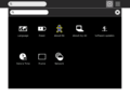
Frame
In the new Frame, the edges represent: places, people, devices, and objects. The Frame is accessed by putting the cursor in the corner or on the edge of the screen (see Frame control panel for setting these options) or by pressing the Frame key in the upper right of the keyboard. If the Frame is started by key stroke it must be removed by keystroke.

- 1. Places
The top edge shows the "places" within the UI. The zoom level buttons appear here. The list of currently running activities also appear on the top edge of the frame; the active activity is highlighted. The Journal is always present here as a running activity.
- 2. People
The right edge serves as an "active buddy list." Other XOs with whom the XO is collaborating appear on the right edge of the Frame.
- 3. Devices
System status is in the bottom edge of the Frame. The battery level, network status (including the new mesh device, which allows one to switch channels), and speaker all appear here.
- 4. Objects
The left edge of the Frame serves as a multi-item clipboard. The currently selected item will be pasted when the paste button (or shortcut) is invoked.
Journal
The 8.2 release includes an updated Journal The look is cleaner and some additional features have been added to make object management easier.
- List view
The list view still contains a list of all of the objects created on the laptop, ordered by date. Resuming an activity is as simple as clicking on the activity icon itself. There are a few enhancements to the Journal list as well:
- In-line renaming
It's now possible to rename entries directly within the list view, by clicking on the title text. A text field will appear to receive changes, which can be confirmed or canceled with enter and esc, respectively.
- Object palettes
The objects represented within the entries (specifically, activity and people icons) now have palettes attached to them. By hovering over their icons, it's possible to find out more information about them, such as the name of the person, and take actions on them, such as copying or deleting an entry. These changes make it possible to do more from the list, without having to constantly enter the detail view.
- Better feedback
The Journal now provides better feedback in edge cases, for instance when there are no search results returned for a query, to prevent confusion.
- Details view
By clicking on the details button (the little arrow) at the right of an entry, a child can view the details page for the entry. This includes a preview, editable description and tags, and other info about the entry. The toolbar at the top of the screen provides useful actions for launching, copying, or deleting the entry.
Graphical sugar control panel
Accessible from the pop-up menu of the XO icon in the home view, the control panel currently provides a graphical interface for setting language, power, UI, date and other options. More detailed instructions can be found here.
Sugar Control Panel
Graphical interface for setting many XO preferences.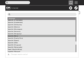
Language
Allows selection of the default language.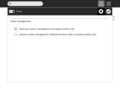
Power
Enables power saving modes. See Improved Power Management section below for more details.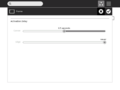
Frame
Sets the time it takes the Frame to appear when the cursor is on the corner or on the edge (side) of the screen.
About my XO
Shows the build number, firmware version and serial number.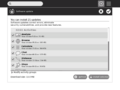
Software Updates
Checks for latest version of activities and optionally upgrades them
Date & Time
Allows setting of the Timezone. Note: this function no longer needs Super User access.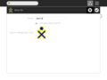
About Me
Sets the name and color of your XO icon. These values are seen by other XOs when using collaboration.
Network
Allows turning off the wireless radio and identifies a school server for collaboration


