User:Wade/Ideas/Activity Management: Difference between revisions
m (→Design) |
m (→Design) |
||
| Line 40: | Line 40: | ||
* This design makes obvious ''"where's my stuff"'', as everything the user has created is visible from the start. |
* This design makes obvious ''"where's my stuff"'', as everything the user has created is visible from the start. |
||
* This design makes it more clear ''who's XO this is''. Rather than remembering the user's colors and seeing the standard list of installed activities, you will see your projects and tags. |
* This design makes it more clear ''who's XO this is''. Rather than remembering the user's colors and seeing the standard list of installed activities, you will see your projects and tags. |
||
== Annotated Concept Sketches == |
|||
==== Initial view at first boot ==== |
==== Initial view at first boot ==== |
||
Revision as of 21:29, 12 June 2008
Problems addressed
Over-tasked activity icon
The current activity management design double-tasks the activity icons in the home page with:
- Creation of blank activities.
- Resuming old activity instances.
This unfortunately fails to enforce the notion of an activity being separate from an activity instance, and will confuse users in the long run.
It also becomes cumbersome as soon as the user needs two instances of an activity. They will be forced to use a lengthy context menu, or to graduate to using the Journal regularly to start each activity instance, leaving the home screen basically useless.
In other words, I don't think the existing Activity Management design scales well past a single instance of each activity.
Lack of organizational tools
The current design basically requires users to drag around activity icons to organize them. Anyone who has used a modern desktop operating system will know that this is cumbersome to use, and in the hands of children will lead to extremely confusing home screen arrangements.
This dovetails with the previous problem, since documents cannot be placed on the home screen. If a user wanted to arrange their Write and Calculate together because they were doing math homework, and then later wants to do science homework, they must move the Write activity over next to the Measure activity to maintain any useful grouping.
It becomes clear that the dragged icon system is simply a means to save make room for more activities, and offers no organizational benefits whatsoever.
Design
Please forgive this early draft as it was sketched, photographed, wikified and described in one hour following Eben's post regarding the draggable desktop icons. This comment will be removed once the design is cleaned up a bit.
This design removes the permanent activity icons from the home screen, and replaces them with a tag-centric view of previously created activity instances.
In a sense, it is turning the home screen into a spacial view of the Journal, plus a mechanism for creating blank activities.
It introduces a transient, grayscale activity ring which appears when the XO icon is clicked. Visually, this looks like creating new activity instances "out of the XO".
It also introduces a tag-centric layout, where user-created tags orbit the XO, and activity instances orbit the tags.
Rationale
- Keeping with the constructionist nature of the machine, the user interface should be centered around what the user has created.
- I believe the most common initial step when booting the XO will be to resume existing work.
- This design makes obvious "where's my stuff", as everything the user has created is visible from the start.
- This design makes it more clear who's XO this is. Rather than remembering the user's colors and seeing the standard list of installed activities, you will see your projects and tags.
Annotated Concept Sketches
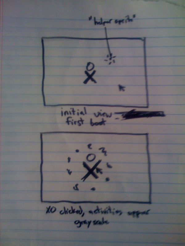
Initial view at first boot
Initial view at first boot.
Animated helper sprite is shown because the journal is empty. It animates and shows the user to click on the XO (this will be the subject of a future design page).
New activity ring
User clicks on the XO, and the activity ring appears with the activity icons in grayscale. This appearing ring of grayscale icons is the standard metaphor for creating a blank activity.
- Hovering over activity icons show them in the user's color.
- Clicking anywhere else dismisses the activity ring.
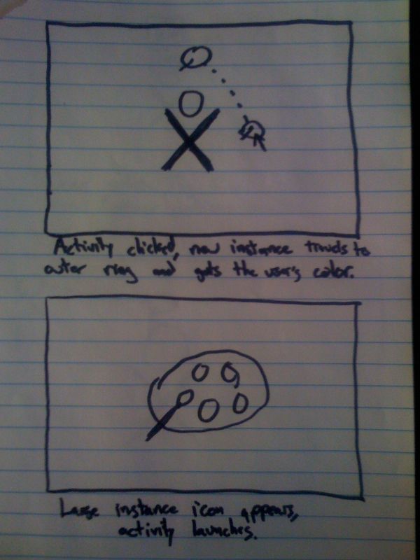
Activity created
User clicks on an icon, the colored icon travels to the outer ring, and the activities ring disappears.
Activity launching
After a brief delay, the icon zooms up to fill the screen and pulses while the activity launches.
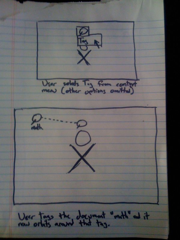
Tag assignment
User uses the context menu to assign a tag to the activity (the rest of the context menu is omitted).
Tag based layout
With the tag assigned, the tag's visual representation (text in this case) appears in an outer ring, and the activity icon travels to orbit around the tag.
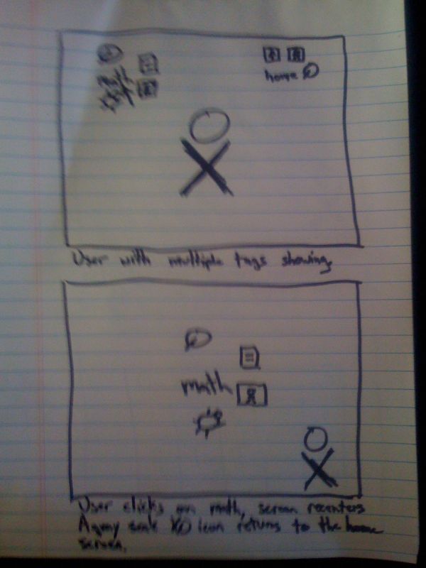
Multiple tags
An example of the home screen with a number of tags created.
Tag focus
The user clicks on the Math tag, and it travels to the center of the screen while the other tags disappear.
The XO icon travels to the corner of the screen and becomes grayscale, this can be used to return to the home screen.
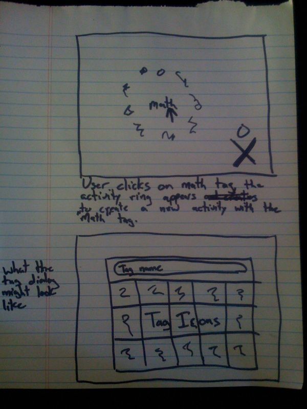
New Tagged activity
The user clicks the Math tag, and the grayscale activities ring appears. If they click an activity icon, the blank activity will be created with the Math tag already assigned.
Tag creation dialog
The tag creation dialog allows creating tags with text names and/or pre-made icons.
Images can be pasted from the clipboard into the boxes to create new tag icon possibilities.
