User:Dogi/ProjectDB/admin: Difference between revisions
Jump to navigation
Jump to search
No edit summary |
No edit summary |
||
| (3 intermediate revisions by the same user not shown) | |||
| Line 16: | Line 16: | ||
and for shipped projects: |
and for shipped projects: |
||
[[Image:Cafeold11.png|center]] |
[[Image:Cafeold11.png|center]] |
||
this is the laptop (XO) location view: |
|||
[[Image:Cafeold12.png|center]] |
[[Image:Cafeold12.png|center]] |
||
admins can edit projects: |
|||
[[Image:Cafeold13.png|center]] |
|||
[[Image:Cafeold14.png|center]] |
|||
[[Image:Cafeold15.png|center]] |
[[Image:Cafeold15.png|center]] |
||
this is an overview for the projects: |
|||
[[Image:Cafeold16.png|center]] |
[[Image:Cafeold16.png|center]] |
||
Latest revision as of 20:40, 17 October 2008
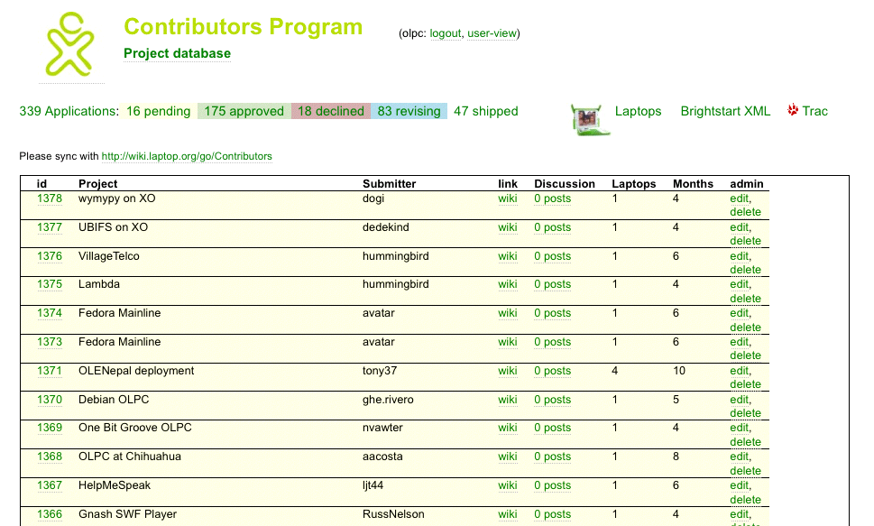
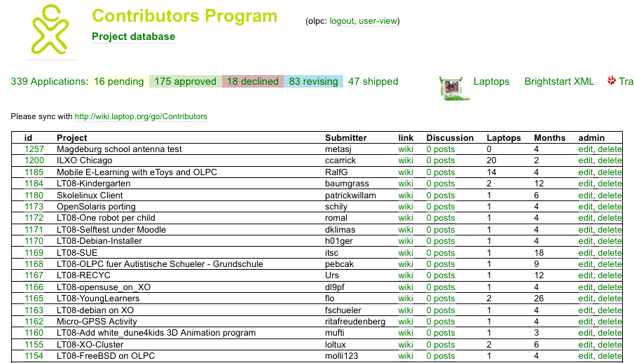
This is the first page for an admin:
this (all projects view) and the pending projects view in the beginning look the same ...
- too long to scroll
- but nice: color for having a difference
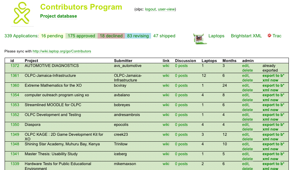
same is for approved projects:
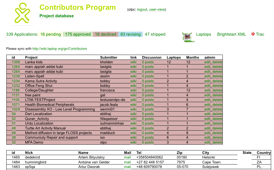
the view for declind projects:
comments:
- too much information on one page ...
- a little confusing
- and not perfectly structured for our intern processes
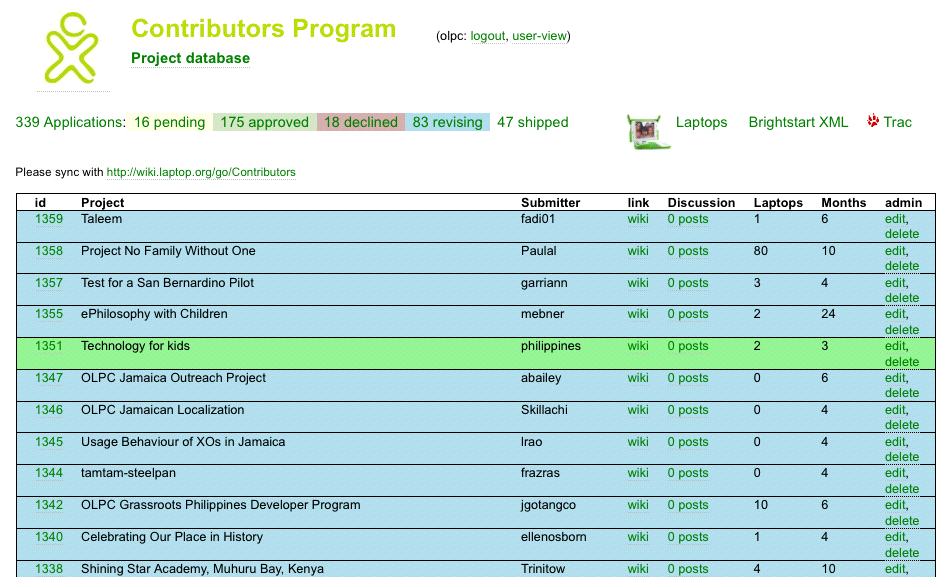
the view for revisiting projects:
and for shipped projects:
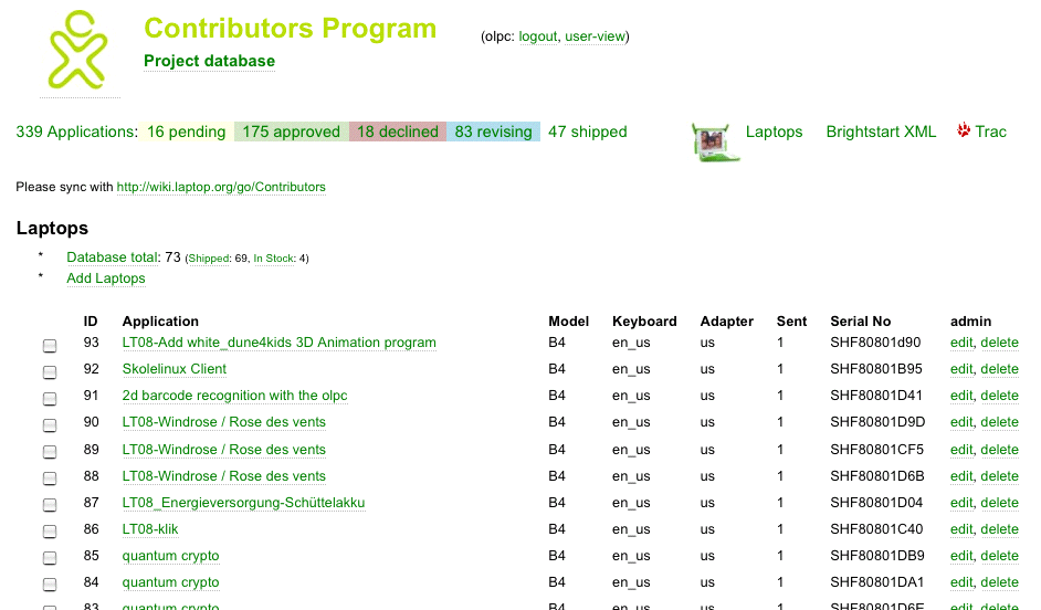
this is the laptop (XO) location view:
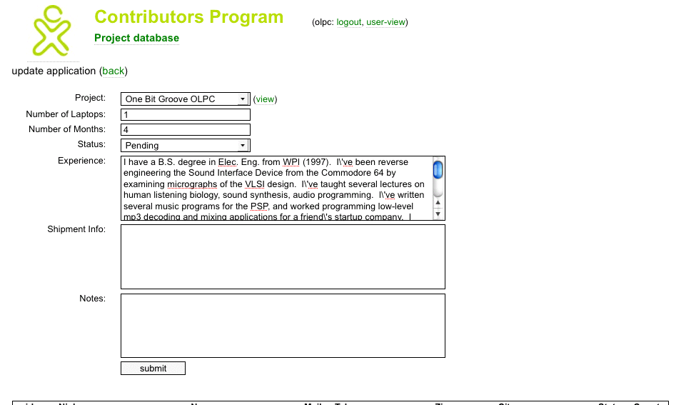
admins can edit projects:
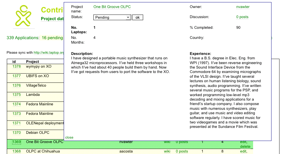
this is an overview for the projects:
