User:Ndoiron/SocialCalc/Mongolian: Difference between revisions
No edit summary |
No edit summary |
||
| Line 4: | Line 4: | ||
==For all Charts== |
==For all Charts== |
||
* 1) Select |
* 1) Select Мөр, Багана of numbers |
||
* 2) Click |
* 2) Click '''Граф''' |
||
* 3) Select |
* 3) Select Graph Type (Ямар Граф?) |
||
* 4) Click |
* 4) Click '''OK''' |
||
==Багана / Мөр Граф== |
|||
Continue reading for examples of each chart type. |
|||
==Bar Charts== |
|||
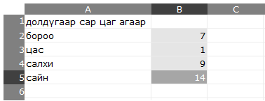
You can use a bar chart to compare different values to each other. |
You can use a bar chart to compare different values to each other. |
||
| Line 21: | Line 19: | ||
[[Image:Barchart1M.png]] |
[[Image:Barchart1M.png]] |
||
Click the '''Graph''' tab, select the ''' |
Click the '''Graph''' tab, select the '''Багана Граф''' type, then click OK. |
||
'''Click Graph or OK again to change the colors in the chart''' |
'''Click Graph or OK again to change the colors in the chart''' |
||
| Line 27: | Line 25: | ||
[[Image:Barchart2M.png]] |
[[Image:Barchart2M.png]] |
||
Also try |
Also try '''Мөр Граф''' - which works the same way but has bars in a different direction: |
||
== |
==Тойрог== |
||
You can use a pie chart to compare fractions making up the whole. |
You can use a pie chart (Тойрог) to compare fractions making up the whole. |
||
For example, you can make a pie chart that shows how people divided for a vote on their favorite class. |
For example, you can make a pie chart that shows how people divided for a vote on their favorite class. |
||
* 1) Make a list of |
* 1) Make a list of subjects |
||
* 2) To the right, put a count of how many people voted for that |
* 2) To the right, put a count of how many people voted for that subject |
||
* 3) Click and drag to highlight the list of numbers |
* 3) Click and drag to highlight the list of numbers |
||
[[Image:Piechart1M.png]] |
[[Image:Piechart1M.png]] |
||
Click the ''' |
Click the '''Граф''' tab, select '''Тойрог''' type, and click OK. |
||
'''Click |
'''Click Граф or OK to change colors.''' |
||
[[Image:Piechart2M.png]] |
[[Image:Piechart2M.png]] |
||
== |
==Шугам== |
||
You can use a line chart to see a value change over time, compare multiple values over time, or show the relationship between any two variables. |
You can use a line chart (Шугам) to see a value change over time, compare multiple values over time, or show the relationship between any two variables. |
||
For example, you can make a line chart showing how temperature of water |
For example, you can make a line chart showing how temperature of water as it is heated. |
||
* 1) Make a list of times (they do not need to be equally spaced) |
* 1) Make a list of times (they do not need to be equally spaced) |
||
* 2) To the right, make a list of temperatures |
* 2) To the right, make a list of temperatures |
||
| Line 55: | Line 53: | ||
[[Image:Linechart1M.png]] |
[[Image:Linechart1M.png]] |
||
Click the ''' |
Click the '''Граф''' tab, select '''Шугам''', and click '''OK'''. |
||
[[Image:Linechart2M.png]] |
[[Image:Linechart2M.png]] |
||
| Line 65: | Line 63: | ||
You can also make a line chart with more than one line (more than one data set). Click on the '''Edit''' tab and add a second list of numbers below the first list. |
You can also make a line chart with more than one line (more than one data set). Click on the '''Edit''' tab and add a second list of numbers below the first list. |
||
This example shows the temperature |
This example shows the temperature when you heat milk and water. |
||
[[Image:Linechart3M.png]] |
[[Image:Linechart3M.png]] |
||
Select the entire column of numbers, press |
Select the entire column of numbers, press '''Граф''', and click '''OK'''. |
||
[[Image:Linechart4.png]] |
[[Image:Linechart4.png]] |
||
Revision as of 05:56, 2 April 2010
Charting additions to the SocialCalc Activity.
Test the code with a Firefox browser here
For all Charts
- 1) Select Мөр, Багана of numbers
- 2) Click Граф
- 3) Select Graph Type (Ямар Граф?)
- 4) Click OK
Багана / Мөр Граф
You can use a bar chart to compare different values to each other.
For example, you can make a bar chart that compares the lifespan of different animals.
- 1) Make a list of animals
- 2) To the right, make a list of animals' lifespans
- 3) Click and drag to highlight the list of numbers
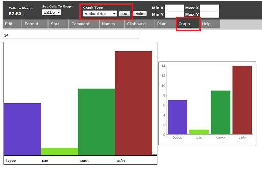
Click the Graph tab, select the Багана Граф type, then click OK.
Click Graph or OK again to change the colors in the chart
Also try Мөр Граф - which works the same way but has bars in a different direction:
Тойрог
You can use a pie chart (Тойрог) to compare fractions making up the whole.
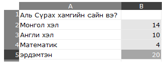
For example, you can make a pie chart that shows how people divided for a vote on their favorite class.
- 1) Make a list of subjects
- 2) To the right, put a count of how many people voted for that subject
- 3) Click and drag to highlight the list of numbers
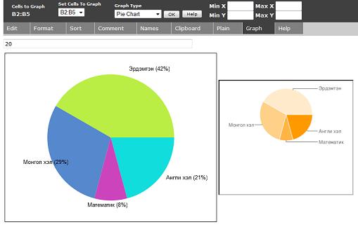
Click the Граф tab, select Тойрог type, and click OK.
Click Граф or OK to change colors.
Шугам
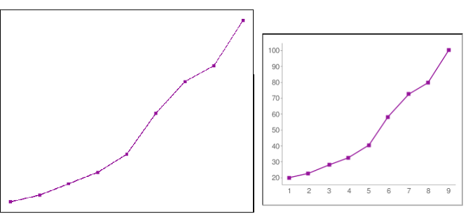
You can use a line chart (Шугам) to see a value change over time, compare multiple values over time, or show the relationship between any two variables.
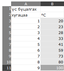
For example, you can make a line chart showing how temperature of water as it is heated.
- 1) Make a list of times (they do not need to be equally spaced)
- 2) To the right, make a list of temperatures
- 3) Click and drag to highlight the list of numbers in the right column
Click the Граф tab, select Шугам, and click OK.
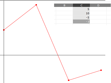
Without a list of x-values in the left column, the points will be placed at [0,1,2,3...)
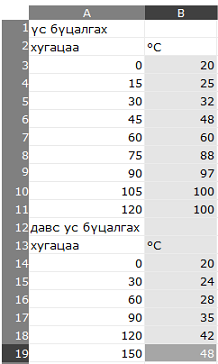
You can also make a line chart with more than one line (more than one data set). Click on the Edit tab and add a second list of numbers below the first list.
This example shows the temperature when you heat milk and water.
Select the entire column of numbers, press Граф, and click OK.
SocialCalc draws a second line when the next X value is less than the current one. If you were graphing a line from (1,0) to (2,0) and a line from (3,1) to (4,1) you would need to list the rightmost line - (3,1) to (4,1) - first.
Graph Window
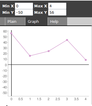
The line chart will set the window to fit your data. You can set the window yourself (X Min, X Max, Y Min, Y Max) in the textboxes above the chart. For example, you can set Y Min to zero so that the X-axis is visible in your chart.
Clicking OK resets the window, and clicking Graph will change line colors without changing the window.
