User:Godiard/Record/NewToolbar: Difference between revisions
Jump to navigation
Jump to search
| (One intermediate revision by one other user not shown) | |||
| Line 1: | Line 1: | ||
= Ideas to discuss the UI for Record = |
= Ideas to discuss the UI for Record = |
||
With Simon, we defined the following ideas: |
|||
* Suggestions for improvements from Tom: http://www.flatlandfarm.de/blog/?p=283 |
|||
* Possible UI for changing the modes (photo, audio, video) http://wiki.sugarlabs.org/go/User:Garycmartin#Memorize_Toolbar_Mockups |
|||
* we add an edit button to the toolbar including a copy button |
|||
* we add a view button (fullscreen, show/hide mediabox) |
|||
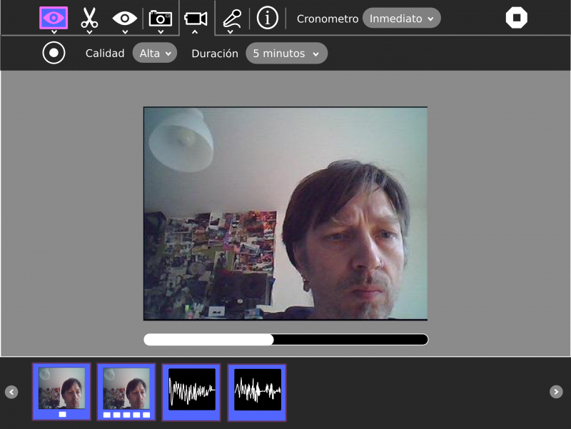
* then we add a button for each mode (photo, audio, video), every mode button has a toolbar with the properties like (duration, quality) and a button to start the recording (use the the circle to match the physical button) |
|||
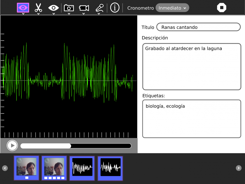
* we add a 'take note'/'playback' mode: plays back the media and gives an option to take notes (title, description, tags) |
|||
* we only show the mediabox when we have an item (we call mediabox to the box in the bottom of the screen) |
|||
* the mediabox must have a similar behavior to the bookmarks box in Browse for consistency. |
|||
* we will show all the medias in one box |
|||
* (sharing: sync the mediabox) |
|||
* if you select an item in the mediabox we switch to the 'take note'/'playback' mode |
|||
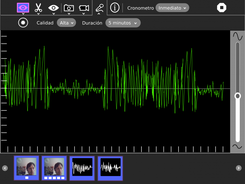
* the 'record audio' will show a preview similar to the measure one |
|||
* the recording level will be adjustable in the activity |
|||
More info here http://lists.sugarlabs.org/archive/sugar-devel/2011-March/030482.html |
|||
== Design team recommendations == |
|||
* place the chronometer combo in the secondary toolbars, as opposed to the main toolbar |
|||
* write each object to Journal upon its creation rather than trying to write all of them at once on an Activity switch or Stop (which can feel like a crash/hang if you have recorded more than a few new objects) |
|||
* remove the (i) info icon from the toolbar and instead badge each media thumbnail on the bottom right corner with an info widget (icon still to be decided) |
|||
* use the Journal detail view API explicitly for editing individual object metadata information, rather than the custom info/take notes side bar, see Browse and its download complete alert for example code. We standardise on an edit details UI for all Activities that want to edit their metadata at any time, an existing proposal already being worked on [1]. |
|||
* camera icon should be the one as seen in sugar-artwork for camera-external, need a similar styled icon for video (Walter has also recently started using camera-external in Turtle Art/Blocks) |
|||
* I suggested the sugar-artwork microphone icon (lips) would be good for the audio recording icon (I believe it was originally designed for use as the device icon for a proposed microphone input gain control palette). We didn't formally +1 in the meeting, but worth considering if you don't find it controversial |
|||
There is still some concern over the user interaction for a primary tool, with sub-toolbar, triggering a full screen canvas change (e.g. as mocked up in your Record camera vs video vs audio, and my Memorize play vs create UI modes), as it might be confusing to get back out of a mode (especially when triggered unexpectedly by hover delay). I'll make a test activity with this interaction for next Sunday's design meeting and see how it feels. |
|||
Regards, |
|||
--Gary |
|||
[1] Option 1. from Christian's 'detail view anywhere' mockups http://wiki.sugarlabs.org/go/File:Detailview_20110313.pdf |
|||
== Main Toolbar == |
|||
[[File:Record-1.png|800px]] |
[[File:Record-1.png|800px]] |
||
== Edit Toolbar == |
|||
* Add consistency and is easier found the copy button. |
|||
[[File:Record-edit.png|800px]] |
[[File:Record-edit.png|800px]] |
||
== View Toolbar == |
|||
* We can show/hide the mediabox or show the media in the full screen. |
|||
[[File:Record-view.png|800px]] |
[[File:Record-view.png|800px]] |
||
== Toolbars for photo, video and audio modes == |
|||
* May be we must move the chronometer combo to the secondary toolbar. |
|||
* All the media, photo, video, audio is in the same mediabox, to emphasize the idea of project. |
|||
[[File:Record-photo.png|800px]] |
[[File:Record-photo.png|800px]] |
||
| Line 13: | Line 61: | ||
[[File:Record-sound.png|800px]] |
[[File:Record-sound.png|800px]] |
||
== Info / Playback / Take notes toolbar == |
|||
* We need a better icon. |
|||
* Can we save to the Journal every metadata change (on exit of inputs) or we must add a button to accept the changes? |
|||
[[File:Record-info.png|800px]] |
[[File:Record-info.png|800px]] |
||
Latest revision as of 18:55, 14 April 2011
Ideas to discuss the UI for Record
With Simon, we defined the following ideas:
- Suggestions for improvements from Tom: http://www.flatlandfarm.de/blog/?p=283
- Possible UI for changing the modes (photo, audio, video) http://wiki.sugarlabs.org/go/User:Garycmartin#Memorize_Toolbar_Mockups
- we add an edit button to the toolbar including a copy button
- we add a view button (fullscreen, show/hide mediabox)
- then we add a button for each mode (photo, audio, video), every mode button has a toolbar with the properties like (duration, quality) and a button to start the recording (use the the circle to match the physical button)
- we add a 'take note'/'playback' mode: plays back the media and gives an option to take notes (title, description, tags)
- we only show the mediabox when we have an item (we call mediabox to the box in the bottom of the screen)
- the mediabox must have a similar behavior to the bookmarks box in Browse for consistency.
- we will show all the medias in one box
- (sharing: sync the mediabox)
- if you select an item in the mediabox we switch to the 'take note'/'playback' mode
- the 'record audio' will show a preview similar to the measure one
- the recording level will be adjustable in the activity
More info here http://lists.sugarlabs.org/archive/sugar-devel/2011-March/030482.html
Design team recommendations
- place the chronometer combo in the secondary toolbars, as opposed to the main toolbar
- write each object to Journal upon its creation rather than trying to write all of them at once on an Activity switch or Stop (which can feel like a crash/hang if you have recorded more than a few new objects)
- remove the (i) info icon from the toolbar and instead badge each media thumbnail on the bottom right corner with an info widget (icon still to be decided)
- use the Journal detail view API explicitly for editing individual object metadata information, rather than the custom info/take notes side bar, see Browse and its download complete alert for example code. We standardise on an edit details UI for all Activities that want to edit their metadata at any time, an existing proposal already being worked on [1].
- camera icon should be the one as seen in sugar-artwork for camera-external, need a similar styled icon for video (Walter has also recently started using camera-external in Turtle Art/Blocks)
- I suggested the sugar-artwork microphone icon (lips) would be good for the audio recording icon (I believe it was originally designed for use as the device icon for a proposed microphone input gain control palette). We didn't formally +1 in the meeting, but worth considering if you don't find it controversial
There is still some concern over the user interaction for a primary tool, with sub-toolbar, triggering a full screen canvas change (e.g. as mocked up in your Record camera vs video vs audio, and my Memorize play vs create UI modes), as it might be confusing to get back out of a mode (especially when triggered unexpectedly by hover delay). I'll make a test activity with this interaction for next Sunday's design meeting and see how it feels.
Regards, --Gary
[1] Option 1. from Christian's 'detail view anywhere' mockups http://wiki.sugarlabs.org/go/File:Detailview_20110313.pdf
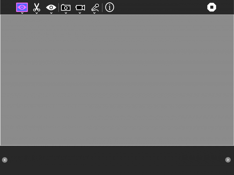
Main Toolbar
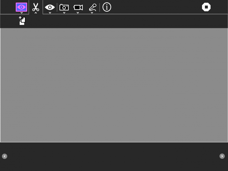
Edit Toolbar
- Add consistency and is easier found the copy button.
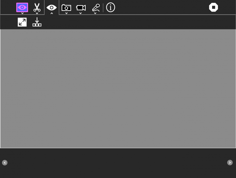
View Toolbar
- We can show/hide the mediabox or show the media in the full screen.
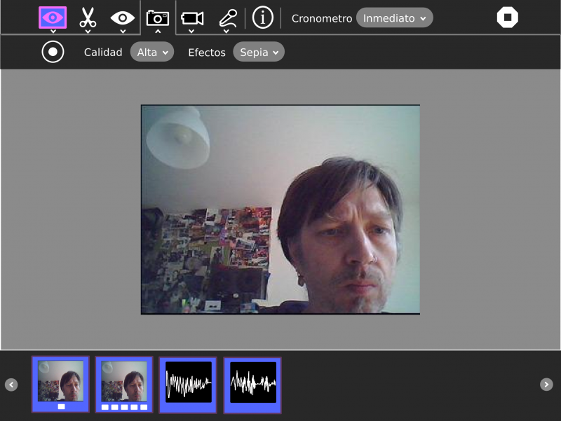
Toolbars for photo, video and audio modes
- May be we must move the chronometer combo to the secondary toolbar.
- All the media, photo, video, audio is in the same mediabox, to emphasize the idea of project.
Info / Playback / Take notes toolbar
- We need a better icon.
- Can we save to the Journal every metadata change (on exit of inputs) or we must add a button to accept the changes?
