Sugar design review 3: Difference between revisions
Jump to navigation
Jump to search
No edit summary |
(Reverted link SPAM by 213.177.125.166.) |
||
| (79 intermediate revisions by 14 users not shown) | |||
| Line 1: | Line 1: | ||
== Overview == |
|||
Design review meeting (Diana, Bryan, Dan, Marco) - Week 26 - 30 Jun |
|||
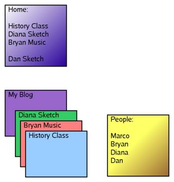
The basic components of the framework are activities, the Home Page, and the People Page. The latter two components are slide-in window activated by special keys. |
|||
== Issues to discuss == |
|||
[[Image:Sugar-graph.jpg|350px|thumb|none|The Sugar UI framework]] |
|||
- Keyboard. The design will be finalized 6 July. I think we should put some good thinking into it and coming with a proposal. It's important to have something that feets our needs (special keys etc) |
|||
== Activities == |
|||
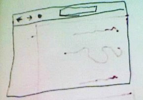
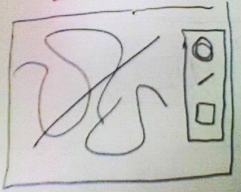
* Each activity will be a fullscreen window. This is important, given the limited size of the display. |
|||
* Each activity will have a close button in the top-right corner; transparent so as to not cover the eventual content. |
|||
* The framework will not provide docks, such as a default toolbar bar or a menubar. Activities author will decide to use toolbox, toolbars, or whatever is more appropriate; we will probably provide some guidelines. |
|||
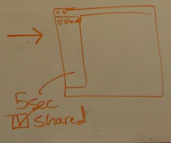
* Activities are shared by default: when opening a new activity the buddies window (with the chat collapsed) will be shown for a few seconds, and a "shared" checkbox (or something similar) will allow the user to keep this activity private. |
|||
* When activating an activity, the buddies window (with the chat collapsed) is displayed for a few seconds, to show which other kids are around and to give user a clue that other people can actully be present on the page. |
|||
{| |
|||
|[[image:activities1.jpg|350px|thumb|none|Web-browser activity]] |
|||
|[[image:activities2.jpg|350px|thumb|none|Sketch activity]] |
|||
|} |
|||
[[image:activities3.jpg|350px|thumb|none|Presence window popping up for a few seconds]] |
|||
== Home Page == |
|||
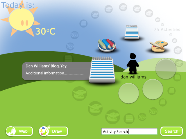
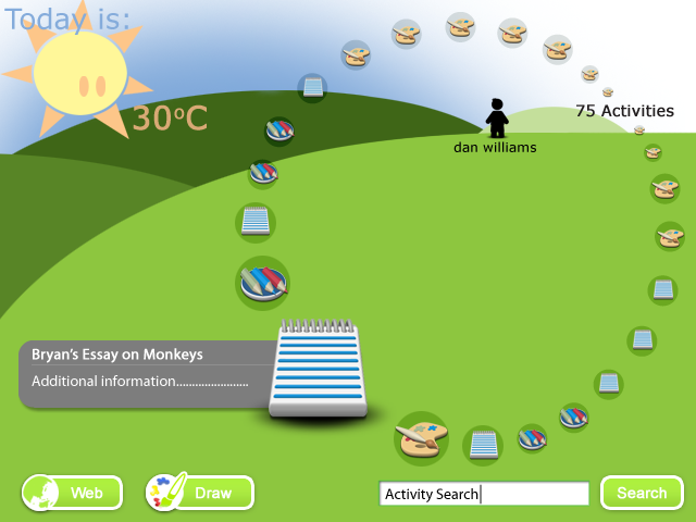
* The Home Page is a visual representation of the <b>active</b> activities, either currently followed by the user or just shared on the network around him. |
|||
* It will be the start page. It's a good start point because, from the active activity, kids will get an idea of what they can do with the laptop and see that there are other buddies around them. |
|||
* It will also be the page kids open when they want to do something different or just get back to an activity they were previously working on. |
|||
* It will allow to start new activities. Probably just a new button bringing up a list of possible activities (Web, Sketch, Music composition, for example) |
|||
* It will be feature an incremental search entry. |
|||
* It will be activated by an home button. In the first revision of the hardare it will be possible to navigate it using arrow keys. For this to be convenient the home and the arrows button should both be located near the keyboard and the mouse pad. |
|||
* With the next hardware revision we hope to be able to use thumbwheel for navigation. |
|||
* It will slide in also when hitting one of the screen edges with the cursor (probably). |
|||
* Activities will have to be ordered/filtered so that those that the user has currently open, the most active and the most relevant will have higher priority. |
|||
* There will be two states. One will show the activities the kid is currently participating in, the other will show all the activities shared on the network. The transition between the two states and icons motion will be animated. |
|||
[[image:Sugar_home_state_1.png]] |
|||
[[image:Sugar_home_state_2.png]] |
|||
:These mockups have a [http://en.wikipedia.org/wiki/Microsoft_Bob Microsoft Bob]-like idea of what the user wants. Would you use this interface yourself? Try it for a few days. [[User:68.163.239.61|68.163.239.61]] 10:46, 25 July 2006 (EDT) |
|||
== The People (Buddies) Page == |
|||
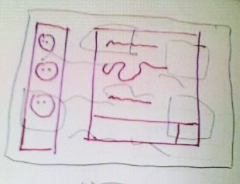
* The presence window and the chat window from [[Sugar review 2]] will be merged in a single slide-in window. |
|||
* There will probably be a way to collapse/uncollapse chat. |
|||
* It will be activated by a "People" button (one of the function keys at the top of the keyboard). |
|||
* It will slide in also when hitting one of the screen edges with the cursor. |
|||
[[Image:people_window.jpg|350px|thumb|none|The People Page]] |
|||
== My Blog == |
|||
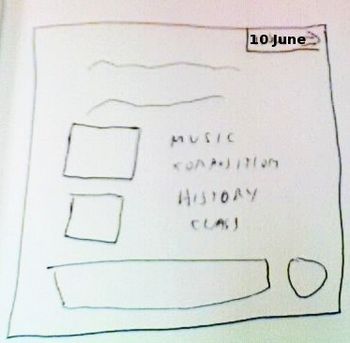
* A special activity always accessible from the Home Page |
|||
* Organized and navigable by date |
|||
* It will keep track of the activities the kid participated in or created during the day. It give us a way to get back to them even when they are not active anymore. |
|||
* Part of it (the explicitly posted diary entries most likely) will be visible to the other kids, for example by double clicking on someone in the buddies window. |
|||
* Other kids blogs will not appear in the Home Page, in order to not clutter it. |
|||
* It will allow the kids to post diary entries. |
|||
[[Image:myblog.jpg|350px|thumb|none|My Blog]] |
|||
== Notes == |
|||
* I think it would be nice to have a set of activity shared, similarly to how I have buddies in the presence window with the bots hack. We need to see this work out of the box. ― marco |
|||
* We had a discussion about invites and about the necessity of some kind of notification while working on the fullscreen activities (for invites but also in general). Not yet very well defined, so I'd rather push to the next iteration. ― marco |
|||
[[Category:Sugar]] |
|||
Latest revision as of 15:14, 2 March 2007
Overview
The basic components of the framework are activities, the Home Page, and the People Page. The latter two components are slide-in window activated by special keys.
Activities
- Each activity will be a fullscreen window. This is important, given the limited size of the display.
- Each activity will have a close button in the top-right corner; transparent so as to not cover the eventual content.
- The framework will not provide docks, such as a default toolbar bar or a menubar. Activities author will decide to use toolbox, toolbars, or whatever is more appropriate; we will probably provide some guidelines.
- Activities are shared by default: when opening a new activity the buddies window (with the chat collapsed) will be shown for a few seconds, and a "shared" checkbox (or something similar) will allow the user to keep this activity private.
- When activating an activity, the buddies window (with the chat collapsed) is displayed for a few seconds, to show which other kids are around and to give user a clue that other people can actully be present on the page.
Home Page
- The Home Page is a visual representation of the active activities, either currently followed by the user or just shared on the network around him.
- It will be the start page. It's a good start point because, from the active activity, kids will get an idea of what they can do with the laptop and see that there are other buddies around them.
- It will also be the page kids open when they want to do something different or just get back to an activity they were previously working on.
- It will allow to start new activities. Probably just a new button bringing up a list of possible activities (Web, Sketch, Music composition, for example)
- It will be feature an incremental search entry.
- It will be activated by an home button. In the first revision of the hardare it will be possible to navigate it using arrow keys. For this to be convenient the home and the arrows button should both be located near the keyboard and the mouse pad.
- With the next hardware revision we hope to be able to use thumbwheel for navigation.
- It will slide in also when hitting one of the screen edges with the cursor (probably).
- Activities will have to be ordered/filtered so that those that the user has currently open, the most active and the most relevant will have higher priority.
- There will be two states. One will show the activities the kid is currently participating in, the other will show all the activities shared on the network. The transition between the two states and icons motion will be animated.
- These mockups have a Microsoft Bob-like idea of what the user wants. Would you use this interface yourself? Try it for a few days. 68.163.239.61 10:46, 25 July 2006 (EDT)
The People (Buddies) Page
- The presence window and the chat window from Sugar review 2 will be merged in a single slide-in window.
- There will probably be a way to collapse/uncollapse chat.
- It will be activated by a "People" button (one of the function keys at the top of the keyboard).
- It will slide in also when hitting one of the screen edges with the cursor.
My Blog
- A special activity always accessible from the Home Page
- Organized and navigable by date
- It will keep track of the activities the kid participated in or created during the day. It give us a way to get back to them even when they are not active anymore.
- Part of it (the explicitly posted diary entries most likely) will be visible to the other kids, for example by double clicking on someone in the buddies window.
- Other kids blogs will not appear in the Home Page, in order to not clutter it.
- It will allow the kids to post diary entries.
Notes
- I think it would be nice to have a set of activity shared, similarly to how I have buddies in the presence window with the bots hack. We need to see this work out of the box. ― marco
- We had a discussion about invites and about the necessity of some kind of notification while working on the fullscreen activities (for invites but also in general). Not yet very well defined, so I'd rather push to the next iteration. ― marco
