User:Delucks: Difference between revisions
(→OLPC) |
|||
| (24 intermediate revisions by 3 users not shown) | |||
| Line 1: | Line 1: | ||
== My name is Meredith Lucks. And I made the image below. == |
== My name is Meredith Lucks. And I made the image below. == |
||
| ⚫ | |||
== Experience == |
== Experience == |
||
| Line 7: | Line 7: | ||
== OLPC == |
== OLPC == |
||
I am interested in this project, as it is flooded with possibilities in the realm of Design, as well as connecting me with other types of work. |
I am interested in this project, as it is flooded with possibilities in the realm of Design, as well as connecting me with other types of work. |
||
I am also excited to attack any game designs that need help or a design in general. I will be consistently posting new work, and adding ideas. More sooner than later.. |
I am also excited to attack any game designs that need help or a design in general. I will be consistently posting new work, and adding ideas. More sooner than later.. |
||
''' The image below is an icon I have created and can also be seen at: [http://www.ayeayedontknow.com] and http://www.dethship.com If you like any of the ideas +displayed+ through icons that you may see, talk at me on my Talk Page, or |
''' The image below is an icon I have created and can also be seen at: [http://www.ayeayedontknow.com] and http://www.dethship.com If you like any of the ideas +displayed+ through icons that you may see, talk at me on my Talk Page, or via the [[Artist Roll Call]] Page.''' |
||
| ⚫ | |||
'''Please! contact me if you want to use an image.''' |
'''''Please! contact me if you want to use an image.''''' |
||
==A Theoretical Approach to the Application of the Review Squad Icon== |
|||
Below, this is an example screen shot, or a supposed application screen shot, where the Review Squad Icon could be just half of what it originally was. So, the U.I. are identified by the "half-masks" on either side of the screen. I have correlated the colors, using those of Sugar's U.I.'s. So, whoever is on the Review Squad of course has one of these color-coded U.I.'s shown below, and whenever a "decision" or, say, a "meeting" would take place, the Users would attach themselves to the "Meet up Point"-which is obviously marked by the "x" (whereas previously the "x" was apart of the body of the Owl U.I.), essentially when "meeting up" at this "x" they create the User Interface shown a few times above and below..just something interesting, maybe this can be implemented somewhere.. |
|||
[[image: concepts.png]] |
|||
==Using Eduardo's Icon for the Above== |
|||
Utilizing [[User:HoboPrimate|Eduardo's]] "Stamping Icon" for the above proposed U.I..... |
|||
The "stamping" idea is great and translates-obviously, so the U.I. example on my page would have the Review Squad represented by a "half-mask" (instead of the whole one, like the initial one I made-which will be basically the icon in the end, just tweaked) that has the ability to have a "Meeting/Discourse of Importance" with another Reviewer. So, obviously, some one would have to implement this in a sort of program or that kind of atmosphere. |
|||
But it would be Really awesome if, say, the [[http://wiki.laptop.org/go/Image:Review-squad-1.svg#file|Stamp]] was their stamp of approval, or that they had even had a "meeting" on a subject, kind of like a flag, automatically really really delineating them from the rest of the Users. (This of course introduces competition, which, in Learning/Education, is going to be inherent, but also needs to be a bit encouraged-raising the bar). |
|||
== Review Squad Icon == |
|||
[[image: rs_nofeet.png]] |
|||
This is a rough cut of an icon I am working on for The Review Squad, the idea is it is essentially the head of the "X" sitting on top of the "X" (in one case, so it kind of represents feet) I think the head looks kind of like an owl(of course representing "wise" knowledge), but has room for imagination by the User..oh and these are obviously rough around the edges.. |
|||
[[image: rswith_feet.png]] |
|||
: Oh man, those are adorable! I love the owl idea. A few notes... |
|||
:* We want the icon to be simple to draw, so that even a 5-year-old could sketch it out recognizably with a stick in the dust if she wanted to (think of how simple it is to draw the XO logo) - I think the current drawing is pretty close to that, but something to keep in mind. |
|||
:* Can the eyes be made a little friendlier/cartoony? (not sure if this means the entire thing would have to look more cartoony as well) The owl looks like it's trying to hypnotize someone. :-) |
|||
:* Try a few variants on the "ears" - big, small, pointing out, pointing in, fat, wide, round... |
|||
:* Going off the 'owl' metaphor... I wonder if it would actually look good with a beak. It also reminds me of some of the African tribal masks I saw at a museum in Chicago once. |
|||
:* More contrast between the colors - this icon should also look good in grayscale, and b&w, given that it will probably be printed on shirts etc. and shown on the b&w display mode of the laptop rather frequently. If we can aim for 2 or 3 colors (including black for outlines) that would be ideal. Another thought is that kids could personalize the colors of their "owl" just as they can personalize the colors on their "XO" logo on the laptop (fewer colors would help with this as well). |
|||
:* I like the version with the feet - they're somewhat complex polygons, though. Can they be simplified? |
|||
In short, I think these are great and definitely moving in the right direction. Thanks for taking this on! [[User:Mchua|Mchua]] 03:20, 25 July 2007 (EDT) |
|||
== Samples (updated like daily!) == |
== Samples (updated like daily!) == |
||
'''New Music! Iconic Images'''This one is more towards the icon-side obviously, it needs to be simplified for use with any programs, but I envisioned it for a database of sounds, specifically animal sounds. There is obviously a direct correlation from the Lion as the representative of the Animal Kingdom, and I feel that this would spark curiosity with the User, as well as spark a certain level of creativity through the abstract qualities the image exudes. |
|||
| ⚫ | |||
---- |
|||
This is related to the database idea, where this represent percussion |
|||
china |
|||
[[Image:cymbal_database.png]] | [[Image:button_three.png]] |
|||
NEWS |
|||
---- |
|||
| ⚫ | |||
[[Image:peggy_iconee.png]] |
|||
'''Below is just a sketch, I will most likely implement the head for an icon.''' |
'''Below is just a sketch, I will most likely implement the head for an icon.''' |
||
Latest revision as of 11:39, 4 September 2007
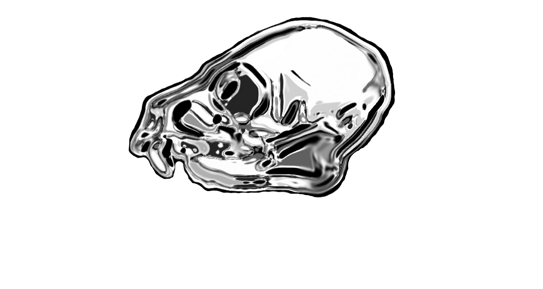
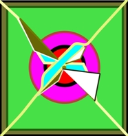
My name is Meredith Lucks. And I made the image below.
Experience
I recently graduated from the Savannah College of Art and Design and the Streets as we know them....anywho, I am profficient in CS2 design package-includes programs like Photoshop and Illustrator and recently have been turned on to using Inkscape. I don't use Dreamweaver. I use video and sound editing software as well. And I am very profficient in Final Cut (HD) as well as Pro Tools and other programs like these.
OLPC
I am interested in this project, as it is flooded with possibilities in the realm of Design, as well as connecting me with other types of work. I am also excited to attack any game designs that need help or a design in general. I will be consistently posting new work, and adding ideas. More sooner than later.. The image below is an icon I have created and can also be seen at: [1] and http://www.dethship.com If you like any of the ideas +displayed+ through icons that you may see, talk at me on my Talk Page, or via the Artist Roll Call Page.
Please! contact me if you want to use an image.
A Theoretical Approach to the Application of the Review Squad Icon
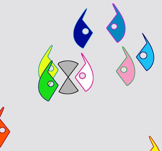
Below, this is an example screen shot, or a supposed application screen shot, where the Review Squad Icon could be just half of what it originally was. So, the U.I. are identified by the "half-masks" on either side of the screen. I have correlated the colors, using those of Sugar's U.I.'s. So, whoever is on the Review Squad of course has one of these color-coded U.I.'s shown below, and whenever a "decision" or, say, a "meeting" would take place, the Users would attach themselves to the "Meet up Point"-which is obviously marked by the "x" (whereas previously the "x" was apart of the body of the Owl U.I.), essentially when "meeting up" at this "x" they create the User Interface shown a few times above and below..just something interesting, maybe this can be implemented somewhere..
Using Eduardo's Icon for the Above
Utilizing Eduardo's "Stamping Icon" for the above proposed U.I..... The "stamping" idea is great and translates-obviously, so the U.I. example on my page would have the Review Squad represented by a "half-mask" (instead of the whole one, like the initial one I made-which will be basically the icon in the end, just tweaked) that has the ability to have a "Meeting/Discourse of Importance" with another Reviewer. So, obviously, some one would have to implement this in a sort of program or that kind of atmosphere.
But it would be Really awesome if, say, the [[2]] was their stamp of approval, or that they had even had a "meeting" on a subject, kind of like a flag, automatically really really delineating them from the rest of the Users. (This of course introduces competition, which, in Learning/Education, is going to be inherent, but also needs to be a bit encouraged-raising the bar).
Review Squad Icon
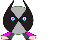
This is a rough cut of an icon I am working on for The Review Squad, the idea is it is essentially the head of the "X" sitting on top of the "X" (in one case, so it kind of represents feet) I think the head looks kind of like an owl(of course representing "wise" knowledge), but has room for imagination by the User..oh and these are obviously rough around the edges..
- Oh man, those are adorable! I love the owl idea. A few notes...
- We want the icon to be simple to draw, so that even a 5-year-old could sketch it out recognizably with a stick in the dust if she wanted to (think of how simple it is to draw the XO logo) - I think the current drawing is pretty close to that, but something to keep in mind.
- Can the eyes be made a little friendlier/cartoony? (not sure if this means the entire thing would have to look more cartoony as well) The owl looks like it's trying to hypnotize someone. :-)
- Try a few variants on the "ears" - big, small, pointing out, pointing in, fat, wide, round...
- Going off the 'owl' metaphor... I wonder if it would actually look good with a beak. It also reminds me of some of the African tribal masks I saw at a museum in Chicago once.
- More contrast between the colors - this icon should also look good in grayscale, and b&w, given that it will probably be printed on shirts etc. and shown on the b&w display mode of the laptop rather frequently. If we can aim for 2 or 3 colors (including black for outlines) that would be ideal. Another thought is that kids could personalize the colors of their "owl" just as they can personalize the colors on their "XO" logo on the laptop (fewer colors would help with this as well).
- I like the version with the feet - they're somewhat complex polygons, though. Can they be simplified?
In short, I think these are great and definitely moving in the right direction. Thanks for taking this on! Mchua 03:20, 25 July 2007 (EDT)
Samples (updated like daily!)
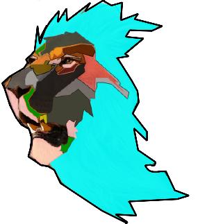
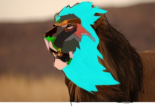
New Music! Iconic ImagesThis one is more towards the icon-side obviously, it needs to be simplified for use with any programs, but I envisioned it for a database of sounds, specifically animal sounds. There is obviously a direct correlation from the Lion as the representative of the Animal Kingdom, and I feel that this would spark curiosity with the User, as well as spark a certain level of creativity through the abstract qualities the image exudes.
This is related to the database idea, where this represent percussion
china
Below is just a sketch, I will most likely implement the head for an icon.
