Display: Difference between revisions
(→Other notes: +'1 cd; ~1 lm'. Corrected nomenclature: cd/m^2 is luminance, not luminous intensity - source article has it wrong.) |
No edit summary |
||
| Line 64: | Line 64: | ||
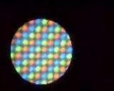
[[Image:Microscope capture 01.png|thumb|right|Upside-down XO screen, taken with the [[microscope]].]] |
[[Image:Microscope capture 01.png|thumb|right|Upside-down XO screen, taken with the [[microscope]].]] |
||
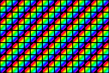
[[Image:Microscope capture 02.png|thumb|right|IBM ThinkPad screen, for comparison.]] |
[[Image:Microscope capture 02.png|thumb|right|IBM ThinkPad screen, for comparison.]] |
||
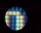
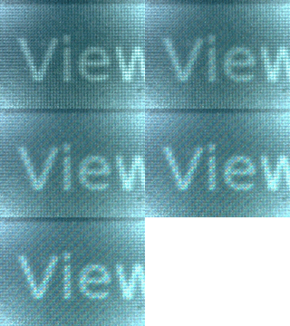
[[Image:Olpcdisplayanim 160.gif|thumb|right|XO screen with different backlight levels]] |
|||
The screen is composed of several layers. Starting at the back, there is a white LED backlight, a 1200x900 grid of color filters, a semi-reflective layer, and a 1200x900 LCD. |
The screen is composed of several layers. Starting at the back, there is a white LED backlight, a 1200x900 grid of color filters, a semi-reflective layer, and a 1200x900 LCD. |
||
Revision as of 18:52, 17 October 2007
The display is one of the innovative features of the XO. It can be used in darkness, and in direct sunlight. Because learning takes place in both.
Designing for the display
Summary
The display is...
1200x900, 200 dpi. 6x4 in (152.4x101.6 mm). 6 bit deep (262k colors).
Use normal font point sizes.
UI elements designed for 100 dpi should be enlarged by about 1/3, or they will look smaller.
Under different lighting conditions, the display may appear to be color, pale color, or monochrome. So check the appearance of your UI in monochrome. Use high-contrast UI elements. Pick colors with different luminances.
Ignore talk of "mono and color modes", and of screen resolutions other than 1200x900. We named things poorly, and immense confusion has resulted.
Elaboration
Use normal font point sizes. That's points, not pixels, of course. The fonts will appear larger than normal (because the child is closer than usual). But compared with adults, children use larger fonts. So a 12 pt font looking 14 pt is fine.
Ignore talk of "mono and color modes", and of screen resolutions other than 1200x900. We named things poorly, and immense confusion has resulted. We called two very different things mono/color. Which combined with the unusual screen hardware, has generated immense confusion,and consequent misinformation. The hardware section below discusses it, but most activities just don't care.
UI design and physical geometry
Think about how large your UI elements will actually be in physical geometry, and design accordingly. Normal viewing distance might be 40-50 cm. Compared to 40 to 60 or 70 cm for adults. Pixel size is 0.127 mm, or about 1 arc minute. Elements designed for 100 dpi should be enlarged 20-50%, or they will look smaller. 1/3 is a nice number. The web browser scales web pages by ~40%. (what is the precise browser number?)
You only really need to worry about the color artifacts if you're trying to draw elements smaller than 3 pixels wide or tall. But that's probably a bad idea anyway, since that's going to be tiny (0.01 in, 0.24 mm).
Use
- You can always at least see grayscale, even in direct sunlight.
- You get color from the backlight. Though as sunlight gets brighter, the colors wash out and it again looks like grayscale.
- The backlight uses power. So you can turn it down, and off, to make the battery last longer.
- Turning off the backlight also tells the screen to not worry about color, so it can give you a slightly higher resolution. Which can make hours of reading more comfortable.
Understanding the hardware
The display has two main parts, the screen, and the DCON screen driver chip.
Screen
The screen is unusual. It can be used in darkness, and in direct sunlight. There are several ways to describe it.
Our screen, described as two screens sharing an LCD
One way to think of the screen is as the combination of two separate screens, which share only an LCD glass. One screen is a normal backlit screen. The other is a normal reflective screen.
The LCD is a 1200x900 grid of square, 0.127 mm (200 dpi) pixels which each have 64 levels of gray (6 bits). As usual, when a pixel is off, it's transparent. And when it is fully on, it is opaque.
The backlit "screen", has a backlight, which shines through a color filter, on to the 1200x900 grid. The filter gives each pixel just one color, red, green, or blue. The pixels are thus behaving like the "sub-pixels" of a normal backlit display.
The reflective "screen" has a reflector behind the LCD grid. So room light comes in (through the LCD), bounces off the reflector, and goes back out, through the LCD. So there are 1200x900 pixels, which depend on ambient outside light to be seen.
The light the user sees comes from both of these. Some from the reflective "screen", and some from the backlit one. How much comes from each depends on how high the backlight is turned on, and how bright the room/outdoors is.
In a completely dark room, you see only the backlit "screen". In direct sunlight, you only see the reflective one. In between, you see both.
If one "screen" is 1200x900, and the other is like 693x520, what's the resolution of the combined screen? In sunlight, or in a normal room with the backlight turned off, it's 1200x900. It a completely dark closet, perception tests put it at something like 800x600. Under normal conditions, with the backlight on, perception tests put it at something like XGA (which is 1024x768). Why use perception tests? Because the whole emphasis of the unusual screen design is to mesh well with how human perception works. So to get a useful measurement, you need to include an eyeball.
Our screen, described by its parts

The screen is composed of several layers. Starting at the back, there is a white LED backlight, a 1200x900 grid of color filters, a semi-reflective layer, and a 1200x900 LCD.
The brightness of the backlight can be adjusted. It has (how many?) settings, including off. (include an image of the backlight control)
The semi-reflective layer both reflects room light, and lets the backlight's light out. How much you see of each, depends on the relative strength of the two light sources.
- In direct sun, you see only reflected light. The backlight setting doesn't matter.
- In a completely dark room, there is no reflected light. So you only see the backlight, and if you turn it off, you see nothing.
- In between, you see some mix. You see more backlight if you turn down the room lighting, or you raise the backlight setting. You see less backlight when the room gets brighter, or you lower the backlight setting.
All color is created by the backlight and filters.
There are 1200x900 pixels. Each one has a single colored filter behind it. So each pixel is capable of either R, G, or B. Only one. It relies on its neighbors to provide the others. So each pixel has:
- a fixed hue (R, G, or B),
- a luminance which can be set (6 bit)
- and a chrominance which depends on the relative strength of the room light and backlight.
This Munsell page has a nice diagram.
Consider a single one of those 1200x900 pixels. A red one. If its value is 0, black, then lighting doesn't matter. If its value is 255 (or whatever, fully transparent), then in bright sunlight you see only white, and in a dark room you see fully saturated red. If its value is in between, in bright sunlight you see a gray, and in a dark room you see a grayed (ie desaturated) red.
The theory
The display employs something the video encoding experts have done for some time: the human visual system sees higher resolution in luminance (B&W) than chrominance (color): for example MPEG luminance resolution is 4X the chrominance resolution. A key thing to understand is that the ambient light level of the room changes the resolution of the display. The pixel has a reflective part that is B&W, and a transmissive part that is one color: red or green or blue. It should be that a red and a green and blue pixel combine to make a single full-color pixel. Thus the resolution should be 1200/sqrt(3) x 900/sqrt(3) or 693x520. But, when the room is totally dark, the resolution given via standard methods of determining display resolution is approximately 800x600 or about 133 dpi. These measurements were done in a number of ways, and are being written up for publication (some were straight fresnel patterns, other perceptual image detail tests). In a dark room the effect is akin to sub-pixel rendering - we see an improvement in resolution of ~33% via sub-pixel rendering.
With room lights on, an additional effect comes into play: the display has luminance (B&W) information at 200dpi in it's reflective mode, with the room lights on the display also reflects 200dpi in black and white. This increases the effective resolution to about XGA or 1024x768 when using test patterns to ascertain the display resolution. Finally, the laptop can be brought outside into bright sunlight and the screen is still viewable - now the color is barely visible (if the backlight is left on), but on the screen the 1200x900 200dpi resolution is seen crisply and clearly.
Other notes
So a resolution rule of thumb is: 1200x900 gray (sunlit, or room with backlight off), ~1024x768 color (room with backlight on); ~800x600 closet (total darkness). But note, even in total darkness, you have better than 100 dpi. So when writing an activity, you basically don't care.
There are some signs of "1200x900 (mono), 693x520 (color)" is becoming an "official story". Perhaps because 693x520 appears simpler and more objective. Even if it's not very useful.
The top left corner pixel is red. So the first row is RGBRG... and the second row is GBRGB... and the 3rd BRGBR... .
A magazine [1] tested a B2 (B1?), and reports a luminance of 64 cd/m^2 ("about half that of a normal notebook panel"), and contrast of 82:1. 64 cd/m^2 would be a luminous intensity of 1 cd (candela). And something vaguely like 1 lm. I don't know how reliable the numbers are, nor how similar B4/XO-1 is. And the intensity likely varies as the LCD backlight ages.
The frame buffer is always 1200x900, 200 dpi. Always. What that 200dpi looks like varies a great deal depending on lighting. Lit externally, you see the grayscale pixels on a 1/200 inch grid. Lit internally (by the backlight), the display gains color. Depending on the ratio of external to internal lighting, the pixels vary from pure gray (black-to-white), to tinted, to pure color (black-to-... red, green or blue, depending on the pixel).
DCON screen driver chip
The DCON has three possible color modes:
- DCON monochrome
- DCON color swizzled not antialised
- DCON color swizzled antialised.
(Actually there are more, like video pass-thru, but we'll skip those).
When the user turns the backlight off, the DCON is placed in "DCON monochrome" mode. Otherwise it's "DCON color swizzled antialised".
Using sugar, or olpc-hardware-manager, to set /sys/devices/platform/dcon/output to 0 (color), gives "DCON color swizzled antialised". Setting it to 1 (mono), gives you DCON monochrome mode. You cannot currently get "DCON color swizzled not antialised".
While you cannot currently get "DCON color swizzled not antialised" ([2] is not yet correct), because the OS level knob was not implemented [3], avoiding antialiasing apparently turns out to save power, and so seems likely to become available in future.
For each pixel, the DCON always gets 19 bits input (6-7-6), and sets the 6 bit pixel transparency.
In DCON monochrome mode, the pixel's 6 bits come from a normal luminance calculation. y = 0.3*r + 0.6*g + 0.1*b.
Swizzling just means you pay attention to only one of the r,g,b channels. The color of the filter which the pixel is in front of. And ignore the other two.
In antialiasing, in addition to considering one's own channel value, you also consider the values of that channel on adjacent pixels.
Other notes
Describe /source. Read uses it to say "ok, no more changes anticipated for a while - start saving power". Whether it will still be accessible once security comes in is unclear.
Tools
color selection
Luv and Lab color pickers and palettes may be helpful for choosing colors. The xo can be colorful. You just have one extra consideration, luminance, to manage. Munsell would work too, but I don't know of a usable one.
- A Munsell-based palette. Munsell it unfortunately perceptually smushed.
The following code can be useful to separate gray-level and color decisions.
import colorsys
def gray_rgb(gray,r,g,b):
    "Given an rgb and a gray level, return a similar rgb with gray-like intensity".
    h,l,s = colorsys.rgb_to_hls(r,g,b)
    return colorsys.hls_to_rgb(h,gray,s)
There is another implementation[4]. It it returns the wrong thing for a different set of inputs, but is not noticeably better. And it's much more complex.
screen simulation
- GTK for OLPC includes a pointer to a patch for Xephyr, an X server emulator. It tries to fake DCON and screen, but the algorithm isn't right, and you can't change lighting.
- display simulator takes a screen snapshot, and tries to fake what it would look like on the xo screen under various lighting. But the algorithm isn't yet right.
life-size laptop pictures
Todo
other things which should be mentioned:
- Talk about power saving, including turning down refresh rate, and dynamically turning off sections of the screen.
- Give more detail about the DCON modes, and how to use them. See [5] and [6].
- ... what else?
See also
- Hardware specification#Display
- DCON and its File:DCON Specification, V0.8.odt
- Dealing with Dual-Mode Display
- Munsell
- http://lists.laptop.org/pipermail/devel/2007-January/003817.html
- #1017 has some discussion of the color pipeline
- http://croquetweak.blogspot.com/2007/03/interactive-olpc-xo-display-simulation.html
- Talk:Hardware_specification#Display_characterization_.28as_we_outsiders_understand_it.29 Warning - parts of this are misleading/mistaken.
- http://dev.laptop.org/git.do?p=olpc-2.6;a=history;f=drivers/video/olpc_dcon.h
- Getting started programming#Mode-switching_code_for_the_screen
- A video with closeups of an XO and ThinkPad screen, made using an XO microscope.


