Sugar design review 2: Difference between revisions
(→People) |
mNo edit summary |
||
| (2 intermediate revisions by the same user not shown) | |||
| Line 11: | Line 11: | ||
* Bryan Clark |
* Bryan Clark |
||
* Marco Pesenti Gritti |
* Marco Pesenti Gritti |
||
6151859500303316285174 |
|||
= Results = |
= Results = |
||
| Line 115: | Line 114: | ||
[[Category:Messaging ideas]] |
[[Category:Messaging ideas]] |
||
[[Category:Sugar]] |
|||
Latest revision as of 14:45, 29 June 2006
Goals
- Experiment with ideas about social presence
- Experiment with ideas about how to chat and share information
- Start figuring out our visual design and strategy
People
- Dan Williams
- Diana Fong
- Bryan Clark
- Marco Pesenti Gritti
Results
- Please know that clicking on a picture shows a larger display of it.
Social presence
Sharing, chatting, play, etc. require finding other people to interact with. Sugar tries to do this through shared "spaces", of which there are two kinds: quick chats, and shared documents.
Quick Chats
You don't always want to have to create a shared document or some other context just to have a really quick chat with your friend Meike. So Sugar supports "quick chats" that aren't tied to any particular context. They don't stick around after you close them, and they probably won't be logged in any way. There should (eventually) be a way to create some sort of context around them after-the-fact, but we'll punt that for now.
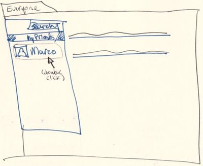
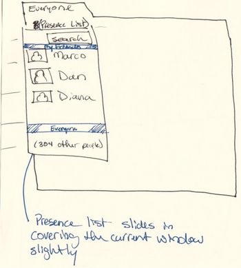
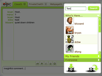
You can create a quick chat by double clicking on a buddy from the presence pane.
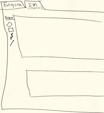
A new tab will open where you can text chat with your buddy and/or send sketches you have drawn.
The buttons at the bottom of the presence window allows to invite more friends into the chat.
Shared documents can be web pages, drawing canvases, wiki pages. These are the starting point, and you can form topical chats around these shared documents as well. Imagine a "History Class" wiki page containing assignments, useful links, teacher's notes, etc. This class wiki page, like any shared document, can have a chat associated with it.
You find shared documents through a few means:
- A well-known location or name. Ideally not an actual URI, but an easily remembered named resource.
- Someone shares the location with you through chat
- The teacher writes the location on the classroom board or other writable surface
- Through the Everyone page's shared document list (see below)
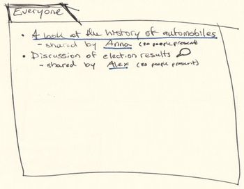
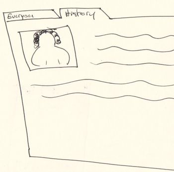
The Everyone page is like a homepage. For the moment, it contains a list of all the documents/links/whatever that others have shared with everyone. For example, if the teacher wishes the class to go to the "History Class" wiki page, he/she shares the History Class page with everyone. Students then go to the Everyone page, and click the link that the teacher shared.
(We realize this doesn't scale that well, but we're starting with here anyway.)
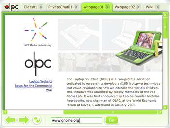
From the Everyone page, you click on a shared document, which opens that document in a new tab.
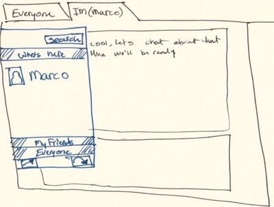
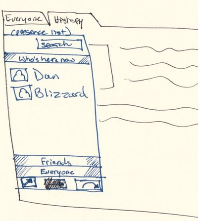
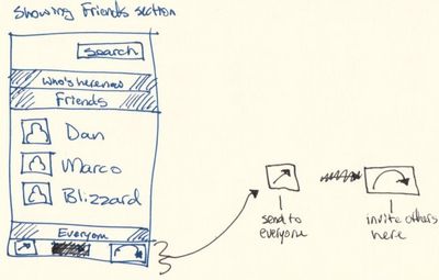
The presence pane is available from each shared document too, and allows you to invite more people to see the document (via the "Friends" and "Everyone" parts). From here it's also possible to make a chat window slide in and talk with people that are currently viewing this document ("Who's Here Now").
New components
Presence pane
The presence pane is now a slide-in window globally available. Its content is contextual to the currently activated tab.
It features:
- A list of people participating in the active activity (i.e., a web page, chat room, shared document, etc...)
- A list of your friends. We didn't discuss how to build this list in detail. It could be automatic (serendipity/who you talk to most), manual (you add and remove buddies from the list) or a mix of both (for example serendipity but still allow to add and remove).
- A searchable list of all available buddies.
- A button to invite other buddies on the activity (how is the invitation displayed?)
- A "Send to everyone" button (need to figure out what Bryan had in mind exactly here... Share? Send invitations to everyone?)
Everyone page
- Allow to search the shared documents and the web to replace the google search activity (?)
- Deskbar[1] (a Gnome panel accessory) could be used to replace the google search area. It lets you launch applications[2], search your computer, and search files all from one auto-completing text box[3]. Non-tech folks love it, as you can get to everything from one spot. Deskbar is in Python and gtk+ (etc). Flash movie of Deskbar[4] (old version). The interface works well with a large number of items.
- Show a list of the shared documents and allow to open them, perhaps with a folder-like ability to sort by name/date/type/size.
Chat window
Just like the old chat window but globally available (sliding in) and contextual to the activity.
Visual design
- Diana is working on mockups of the Sugar visual appeareance (yay!).
- We are going to need to evaluate this and see how much of it is doable within our current platform.
- The implementation is probably going to be a mix of custom (cairo drawn) and traditional widgets.
