User:Ndoiron/SocialCalc: Difference between revisions
| (9 intermediate revisions by the same user not shown) | |||
| Line 1: | Line 1: | ||
Charting additions to the [[SocialCalc]] Activity. |
Charting additions to the [[SocialCalc]] Activity. |
||
Test the code with a Firefox browser [http://andrew.cmu.edu/user/ndoiron/socialCalc/ |
Test the code with a Firefox browser [http://andrew.cmu.edu/user/ndoiron/socialCalc/index.html here] |
||
==For all Charts== |
|||
Pie and line charts are produced with the same steps as bar charts in the current version. |
|||
* 1) Select a row or column of numbers |
|||
* 2) Click the '''Graph''' tab |
|||
* 3) Select a graph type |
|||
* 4) Click the '''OK''' button |
|||
Continue reading for examples of each chart type. |
|||
This page serves as a guide/lesson plan for producing different types of charts. |
|||
==Bar Charts== |
==Bar Charts== |
||
You can use a bar chart to compare different values to each other. |
|||
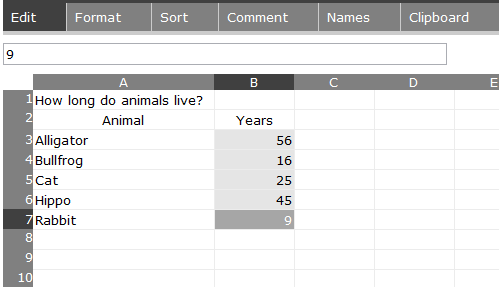
For example, you can make a bar chart that compares the lifespan of different animals. |
For example, you can make a bar chart that compares the lifespan of different animals. |
||
| Line 17: | Line 21: | ||
[[Image:Barchart1.png]] |
[[Image:Barchart1.png]] |
||
Click the '''Graph''' tab, select the '''Vertical Bar Chart''' type, then click OK. |
|||
'''Click Graph or OK again to change the colors in the chart''' |
|||
[[Image:Barchart2.png]] |
|||
Also try the '''Horizontal Bar Chart''' type - which works the same way but has bars in a different direction: |
|||
'''Click the Graph tab again to change the colors used in the chart''' |
|||
[[Image: |
[[Image:Barchart3.png]] |
||
==Pie Charts== |
==Pie Charts== |
||
| Line 35: | Line 41: | ||
[[Image:Piechart1.png]] |
[[Image:Piechart1.png]] |
||
Click the ''' |
Click the '''Graph''' tab, select the '''Pie Chart''' type, then click OK. |
||
'''Click |
'''Click Graph or OK again to change the chart colors.''' |
||
[[Image:Piechart2.png]] |
[[Image:Piechart2.png]] |
||
| Line 51: | Line 57: | ||
[[Image:Linechart1.png]] |
[[Image:Linechart1.png]] |
||
Click the ''' |
Click the '''Graph''' tab, select the '''Line Chart''' option and click '''OK'''. |
||
[[Image:Linechart2.png]] |
[[Image:Linechart2.png]] |
||
Without a list of x-values in the left column, the |
Without a list of x-values in the left column, the points will be placed at [0,1,2,3...) |
||
[[Image:Linechart5.png]] |
[[Image:Linechart5.png]] |
||
| Line 65: | Line 71: | ||
[[Image:Linechart3.png]] |
[[Image:Linechart3.png]] |
||
Select the entire column of numbers, press the '''Graph''' tab, and click '''OK'''. |
|||
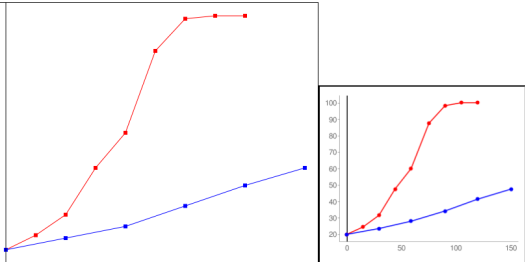
Click the '''Line''' tab to see the new line chart. Both the larger chart and the Google image chart show the second line as blue. |
|||
[[Image:Linechart4.png]] |
[[Image:Linechart4.png]] |
||
SocialCalc draws a second line when the next X value is less than the current one. If you were graphing a line from (1,0) to (2,0) and a line from (3,1) to (4,1) you would need to list the rightmost line - (3,1) to (4,1) - first. |
|||
====Graph Window==== |
|||
| ⚫ | |||
Clicking '''OK''' resets the window, and clicking '''Graph''' will change line colors without changing the window. |
|||
[[Image:Linechart6.png]] |
|||
==Scatter Plots== |
|||
You can use a scatter plot to show the connection between two (or even three) variables. Unlike the line chart, a scatter plot does not connect its dots. You can include results from several experiments and reports to see if they form a line, a cluster, or have other patterns. |
|||
This sample scatter plot shows test scores of several students based on how many hours they had studied. It shows that students that studied more tended to get better scores. |
|||
[[Image:Scatterchart1.png]] |
|||
You can set the size of each dot on the chart, either to highlight their importance or to include a third variable. The following example uses the X and Y dimensions to compare reports of new spring flowers blooming days (time from Jan 1) by latitude (distance from the equator). The size of the dot (put in a new column to the right) shows the number of reports made. |
|||
Use dot sizes from 0.5 to 10.0 for best results. Other values will not appear on the Google chart. |
|||
[[Image:Scatterchart2.png]] |
|||
====Graph Window==== |
|||
The scatter chart, like the line chart, will set the window to fit your data. You can set the window yourself (X Min, X Max, Y Min, Y Max) in the textboxes above the chart. For example, you can set Y Min to zero so that the X-axis is visible in your chart. |
|||
Clicking '''OK''' resets the window, and clicking '''Graph''' will change line colors without changing the window. |
|||
| ⚫ | |||
==Using Charts in Reports== |
==Using Charts in Reports== |
||
| Line 96: | Line 125: | ||
For example, the ages of animals works well in the bar chart example. You could make a pie chart with the same numbers, but there is no reason to include ages of different animals in the same circle. Only make a pie chart if you are comparing parts of the whole. |
For example, the ages of animals works well in the bar chart example. You could make a pie chart with the same numbers, but there is no reason to include ages of different animals in the same circle. Only make a pie chart if you are comparing parts of the whole. |
||
Votes can be compared to each other in a bar chart or a pie chart. The pie chart shows values with fractions, while the bar chart shows values stacked next to each other. |
Votes can be compared to each other in either a bar chart or a pie chart. The pie chart shows values with fractions, while the bar chart shows values stacked next to each other. |
||
Line charts are good for showing change over time - the changing data can be a number like population, temperature, heart rate, or speed. Time can be on the y-axis for some experiments. For example, you could measure the time for a pendulum to swing for several different lengths of the pendulum. You would put the lengths of pendulums in the left column and the times on the right side. The numbers on the right column should depend on changes in the left column's value. |
Line charts are good for showing change over time - the changing data can be a number like population, temperature, heart rate, or speed. Time can be on the y-axis for some experiments. For example, you could measure the time for a pendulum to swing for several different lengths of the pendulum. You would put the lengths of pendulums in the left column and the times on the right side. The numbers on the right column should depend on changes in the left column's value. |
||
| Line 114: | Line 143: | ||
==Programming Notes== |
==Programming Notes== |
||
All necessary changes are made in the JavaScript of SocialCalcActivity.activity/web/index.html - download from [http://andrew.cmu.edu/user/ndoiron/socialCalc/ |
All necessary changes are made in the JavaScript of SocialCalcActivity.activity/web/index.html - download from [http://andrew.cmu.edu/user/ndoiron/socialCalc/index.html here] |
||
The chart is generated twice, using the [http://en.wikipedia.org/wiki/Canvas_(HTML_element) HTML Canvas element] and the [http://code.google.com/apis/chart/ Google Charts API]. This allows users to view charts while offline, with the more professional chart images possible with an internet connection. |
The chart is generated twice, using the [http://en.wikipedia.org/wiki/Canvas_(HTML_element) HTML Canvas element] and the [http://code.google.com/apis/chart/ Google Charts API]. This allows users to view charts while offline, with the more professional chart images possible with an internet connection. |
||
| Line 120: | Line 149: | ||
When programming the Canvas element, use deprecated Mozilla-specific code such as mozDrawText and mozTextStyle - newer methods like fillText are not supported by the laptop. |
When programming the Canvas element, use deprecated Mozilla-specific code such as mozDrawText and mozTextStyle - newer methods like fillText are not supported by the laptop. |
||
Teachers may be unaware of colorblind students' difficulty to read charts. At this time, chart colors are generated randomly for each computer, and students can reset the color as needed. If you are using a set of preset colors, please consider this color set: http://jfly.iam.u-tokyo.ac.jp/color/index.html#pallet |
|||
The Google Charts API produces a professional chart image, but has some quirks. Scatter plots or other charts could also be implemented with the Google Charts API. |
|||
Latest revision as of 04:47, 12 June 2009
Charting additions to the SocialCalc Activity.
Test the code with a Firefox browser here
For all Charts
- 1) Select a row or column of numbers
- 2) Click the Graph tab
- 3) Select a graph type
- 4) Click the OK button
Continue reading for examples of each chart type.
Bar Charts
You can use a bar chart to compare different values to each other.
For example, you can make a bar chart that compares the lifespan of different animals.
- 1) Make a list of animals
- 2) To the right, make a list of animals' lifespans
- 3) Click and drag to highlight the list of numbers
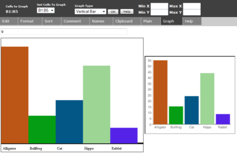
Click the Graph tab, select the Vertical Bar Chart type, then click OK.
Click Graph or OK again to change the colors in the chart
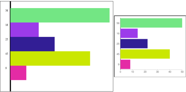
Also try the Horizontal Bar Chart type - which works the same way but has bars in a different direction:
Pie Charts
You can use a pie chart to compare fractions making up the whole.
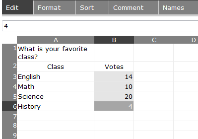
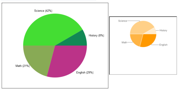
For example, you can make a pie chart that shows how people divided for a vote on their favorite class.
- 1) Make a list of classes
- 2) To the right, put a count of how many people voted for that class
- 3) Click and drag to highlight the list of numbers
Click the Graph tab, select the Pie Chart type, then click OK.
Click Graph or OK again to change the chart colors.
Line Charts
You can use a line chart to see a value change over time, compare multiple values over time, or show the relationship between any two variables.
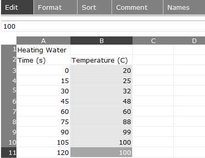
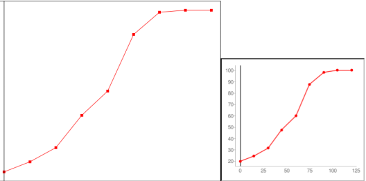
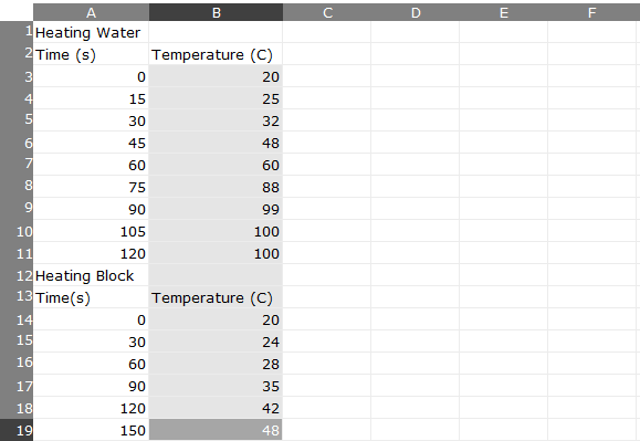
For example, you can make a line chart showing how temperature of water changes as it is heated.
- 1) Make a list of times (they do not need to be equally spaced)
- 2) To the right, make a list of temperatures
- 3) Click and drag to highlight the list of numbers in the right column
Click the Graph tab, select the Line Chart option and click OK.
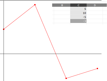
Without a list of x-values in the left column, the points will be placed at [0,1,2,3...)
You can also make a line chart with more than one line (more than one data set). Click on the Edit tab and add a second list of numbers below the first list.
This example shows the temperature of a block over time. The experiment with this block takes longer and is measured at different intervals.
Select the entire column of numbers, press the Graph tab, and click OK.
SocialCalc draws a second line when the next X value is less than the current one. If you were graphing a line from (1,0) to (2,0) and a line from (3,1) to (4,1) you would need to list the rightmost line - (3,1) to (4,1) - first.
Graph Window
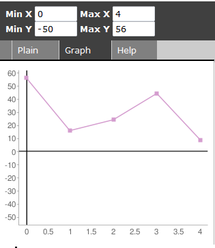
The line chart will set the window to fit your data. You can set the window yourself (X Min, X Max, Y Min, Y Max) in the textboxes above the chart. For example, you can set Y Min to zero so that the X-axis is visible in your chart.
Clicking OK resets the window, and clicking Graph will change line colors without changing the window.
Scatter Plots
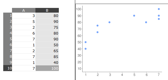
You can use a scatter plot to show the connection between two (or even three) variables. Unlike the line chart, a scatter plot does not connect its dots. You can include results from several experiments and reports to see if they form a line, a cluster, or have other patterns.
This sample scatter plot shows test scores of several students based on how many hours they had studied. It shows that students that studied more tended to get better scores.
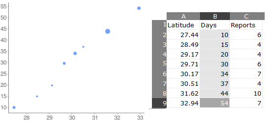
You can set the size of each dot on the chart, either to highlight their importance or to include a third variable. The following example uses the X and Y dimensions to compare reports of new spring flowers blooming days (time from Jan 1) by latitude (distance from the equator). The size of the dot (put in a new column to the right) shows the number of reports made.
Use dot sizes from 0.5 to 10.0 for best results. Other values will not appear on the Google chart.
Graph Window
The scatter chart, like the line chart, will set the window to fit your data. You can set the window yourself (X Min, X Max, Y Min, Y Max) in the textboxes above the chart. For example, you can set Y Min to zero so that the X-axis is visible in your chart.
Clicking OK resets the window, and clicking Graph will change line colors without changing the window.
Using Charts in Reports
Now that you have a chart, you can use either chart in Write, Paint, or other activities.
Google Charts
- 1) Press the Frame button to make it appear
- 2) Click and drag the chart image, then drop it in the lower-left corner
- 3) Click and drag the image out of the frame and into Write, Paint, or another activity
Other Charts
- 1) Press the alt and 1 keys
- 2) Go to the Journal activity and put your mouse over the Screenshot image entry
- 3) Select Copy
- 4) Click and drag the image out of the frame and into Write, Paint, or another activity
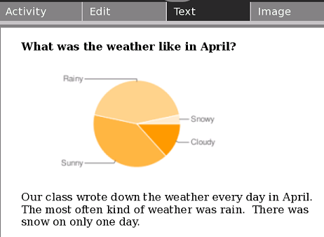
Here you have a chart included in a report about a class project:
Which Chart Type Do I Use?
When you are working on a report, think about what type of chart is good for the data.
For example, the ages of animals works well in the bar chart example. You could make a pie chart with the same numbers, but there is no reason to include ages of different animals in the same circle. Only make a pie chart if you are comparing parts of the whole.
Votes can be compared to each other in either a bar chart or a pie chart. The pie chart shows values with fractions, while the bar chart shows values stacked next to each other.
Line charts are good for showing change over time - the changing data can be a number like population, temperature, heart rate, or speed. Time can be on the y-axis for some experiments. For example, you could measure the time for a pendulum to swing for several different lengths of the pendulum. You would put the lengths of pendulums in the left column and the times on the right side. The numbers on the right column should depend on changes in the left column's value.
Lesson Ideas
- Ask students to write down the day's weather (sun, clouds, rain, snow) for 7-30 days. At the end, help students include a bar chart or pie chart in their results.
- Complete an experiment measuring the temperature of water as it cools or heats. Use a line chart to measure the change in temperature over time
- Have students exercise until their heart is beating quickly, then sit down. Use a heart rate monitor or have the student count the number of beats in a 10-second period to measure heart rate as they relax, until their heart is beating normally. Plot 3 students' results on the same line chart.
- Find census records with population of your city, state, or country. Use a line graph to measure the change in population over several years.
- Have students each cast a vote for favorite singers, sports, or games. Have them create a pie chart showing the results.
- Ask students to compare the population of several countries with a bar chart. You could also compare the numbers of pages in different books, the lengths of dinosaurs, or the weight of different objects.
Programming Notes
All necessary changes are made in the JavaScript of SocialCalcActivity.activity/web/index.html - download from here
The chart is generated twice, using the HTML Canvas element and the Google Charts API. This allows users to view charts while offline, with the more professional chart images possible with an internet connection.
When programming the Canvas element, use deprecated Mozilla-specific code such as mozDrawText and mozTextStyle - newer methods like fillText are not supported by the laptop.
Teachers may be unaware of colorblind students' difficulty to read charts. At this time, chart colors are generated randomly for each computer, and students can reset the color as needed. If you are using a set of preset colors, please consider this color set: http://jfly.iam.u-tokyo.ac.jp/color/index.html#pallet
