Talk:Designs/Journal: Difference between revisions
HoboPrimate (talk | contribs) m (just reording reply paragraphs) |
HoboPrimate (talk | contribs) |
||
| Line 33: | Line 33: | ||
If, for instance, I was looking to see if "Lucida Grande" was on that external device, it would make my task easier if there was an option to ALPHABETIZE the list (assuming it showed filenames for the listed objects). [Then I could tell if "Lucida Grande" was missing, without having to look at each object in the list.] |
If, for instance, I was looking to see if "Lucida Grande" was on that external device, it would make my task easier if there was an option to ALPHABETIZE the list (assuming it showed filenames for the listed objects). [Then I could tell if "Lucida Grande" was missing, without having to look at each object in the list.] |
||
: I agree, you should be able to click on the What/Who/When Titles of this new design, to order the contents according to them.[[User:HoboPrimate|HoboPrimate]] 02:22, 2 March 2008 (EST) |
|||
Revision as of 07:22, 2 March 2008
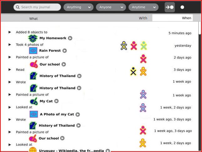
Structured Journal-01 view
Would this level of structure be undesirable for the user?
Would the user (often) instantiate new activities from the Journal? (since I removed the 'Add new entry' bar.) --FGrose 17:46, 27 February 2008 (EST)
- I believe this is a part of the Diary aspect of the Journal, where kids can create entries of pure text ("holidays started today, hooray!"), but I'm not sure how it will work exactly. Will kids be encouraged to create full-blown diary entries through the journal interface, like in a blog? - Eduardo
After checking an entry, loose ability to search
In this design, after checking one entry, a kid can't use the search to find other entries he might want to check, and is limited to scrolling. One thought that comes to mind is if the contextual toolbar was always present in a different tab like in other activities. This of course could create a problem, of a kid checking an entry, then changing the search terms, checking another entry to delete, while forgetting about the previous one. HoboPrimate 19:24, 27 February 2008 (EST)
- In the legend for Designs/Journal#06 Eben says the checkbox titlebar button will show a view of all checkmarked items. Perhaps that view ought to be presented as part of a confirmation-of-action dialog. --FGrose 21:19, 27 February 2008 (EST)
- Good idea. It is unnecessary for just one item, but multiple of them would be a good idea. On the other hand, I suspect confirmation dialogs aren't very well liked by Eben :).HoboPrimate 05:13, 28 February 2008 (EST)
search within results
A very powerful facility of the Google search engine is "search within results". For instance, this allows starting a search with a general category such as "Food". Once one sees *all* the entries thus selected, one can do a 'within' search of "NOT Vegetable". By means of successive elimination, one can quickly narrow down to those entries one is interested in (even though one did not know when one started what the interesting entry would say).
If possible to implement, "search within results" ought to be equally useful for searching the Journal. [A 'Revert' capability is needed, to "back up" in case the most recent 'Search within' did not produce the anticipated result.]
optional alphabetization
Had (build 695) a look in the Journal view at an external storage device:
- ) The __whole__ display of the objects depends on them having been previously described. There were (among lots of other files) a number of fonts on the device. The best I could do to identify them was to choose the 'text' type, then to search for the string 'font'. But I still had no idea (through Journal view) *what* fonts were on that external device.
If Journal view is going to show objects NOT placed by the child, __something__ needs to be listed (in the view) in case whoever *did* place the object failed to provide an object-description (or meta-data). [Suggestion: show the filename]
- ) The __order__ in which these objects were shown was by "how long ago written". I could care less which fonts were "written" three years ago, as opposed to four years ago.
If, for instance, I was looking to see if "Lucida Grande" was on that external device, it would make my task easier if there was an option to ALPHABETIZE the list (assuming it showed filenames for the listed objects). [Then I could tell if "Lucida Grande" was missing, without having to look at each object in the list.]
- I agree, you should be able to click on the What/Who/When Titles of this new design, to order the contents according to them.HoboPrimate 02:22, 2 March 2008 (EST)
