OLPC Human Interface Guidelines/The Sugar Interface/Controls: Difference between revisions
No edit summary |
No edit summary |
||
| Line 54: | Line 54: | ||
====Adjustment Controls==== |
====Adjustment Controls==== |
||
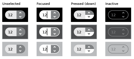
=====Steppers===== |
=====Steppers===== |
||
[[Image:stepper.png]] |
|||
=====Sliders===== |
=====Sliders===== |
||
[[Image:sliders.png]] |
|||
[[Image:slider_indication.png]] |
|||
[[Image:slider_color.png]] |
|||
====Indicator Controls==== |
====Indicator Controls==== |
||
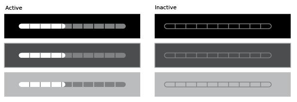
=====Determinate Progress Indicator===== |
=====Determinate Progress Indicator===== |
||
[[Image:progress_determinate.png]] |
|||
=====Indeterminate Progress Indicators===== |
=====Indeterminate Progress Indicators===== |
||
[[Image:progress_indeterminate.png]] |
|||
=====spinners===== |
|||
=====Level Indicators===== |
=====Level Indicators===== |
||
[[Image:indicator_level.png]] |
|||
=====Rating Indicators===== |
=====Rating Indicators===== |
||
=====Relevance Indicators===== |
=====Relevance Indicators===== |
||
| Line 66: | Line 72: | ||
====Text Controls==== |
====Text Controls==== |
||
=====Text Fields===== |
=====Text Fields===== |
||
[[Image:textfield.png]] |
|||
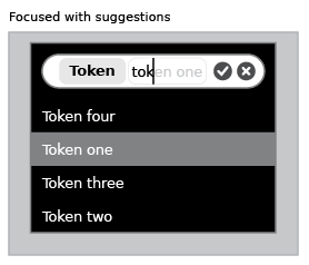
=====Tokenized Text Fields===== |
=====Tokenized Text Fields===== |
||
[[Image:textfield_suggestions.png]] |
|||
[[Image:textfield_tokenized.png]] |
|||
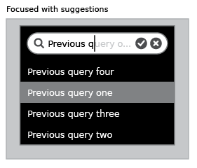
=====Search Fields===== |
=====Search Fields===== |
||
[[Image:searchfield.png]] |
|||
[[Image:searchfield_suggestions.png]] |
|||
=====Password Fields===== |
=====Password Fields===== |
||
[[Image:passwordfield.png]] |
|||
=====Multiline Text Fields===== |
=====Multiline Text Fields===== |
||
[[Image:textfield_multiline.png]] |
|||
[[Image:textfield_multiline_non-edit.png]] |
|||
[[Image:textfield_multiline_edit.png]] |
|||
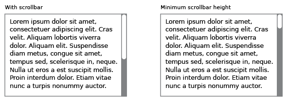
[[Image:textfield_multiline_scrollbars.png]] |
|||
====Separator Controls==== |
====Separator Controls==== |
||
Revision as of 21:29, 5 April 2007
Controls
Sugar defines its own set of control widgets that will create the user interface on the laptops. Though most of the available controls will match developers' expectations, we've also developed some new controls and altered behaviors of others to better suit the user experience on the machines. With these new developments comes a new set of guidelines for their usage and placement which both maintains the broader set of goals and metaphors setup within Sugar and aids in the development of collaborative user interface environments.
Control Regions
In sugar, a predefined set of control regions provide the surfaces upon which controls may be placed. Limiting the background colors that the controls sit on allows for a consistent set of visual rules to define both the type and state of various controls while maintaining sufficient contrast even without the use of color. Shown to the right, the basic regions are the Canvas, Panel, Toolbar, and Palette.
Canvas: The canvas is the general purpose "creation" space within any activity — the region for drawing, writing, or otherwise working within it. Since creation ranks high among our goals, we also hope that this is the dominant region of the screen in most activities. The canvas region is specifically for generating content and 'should not' have any controls placed upon it. As such, the canvas may be any color the activity or the user desires, though Sugar specifies both white and black as the basic defaults.
Toolbars: Activity toolbars have a unique dark gray color which distinguishes them from the other control regions. The Frame also uses this unique shade of gray to indicate its purpose as an omnipresent toolbar that a child may activate from within any view or activity. Each activity will have a toolbar at the top of the screen, though when necessary additional toolbars may also be specified.
Panels: When appropriate, an activity may devote a portion of the screen to additional controls which make more sense outside of the toolbar and within the global activity context. Controls placed in this region should always remain relevant at all times, regardless of any other state associated with the activity or editing context.
Palettes: Palettes serve as multipurpose control regions which appear in several contexts. In an interface without traditional windows and menus, palettes step in to provide a versatile solution in many aspects of the user interface as the second layer of control. For a full description of their uses, please see the section on Palettes and Rollovers.
Controls: The remainder of this section focuses largely on the specific controls and guidelines for their usage within your activity's UI. The designs of all controls presented here follow a basic set of rules regarding colors, line weights, and sizing for each of its various states. More detail about these broader design decisions is discussed in the custom controls section.
Buttons
Text Buttons
Text with Icon Buttons
Icon Buttons
Toggle Buttons
Basic Selection controls
Checkboxes
Radio Buttons
Popup Lists
Combination Popup Lists


