Talk:Designs/Journal: Difference between revisions
| Line 9: | Line 9: | ||
::[[Image:Journal-01c.jpg]] |
::[[Image:Journal-01c.jpg]] |
||
<br> |
<br> |
||
Also the alternate views right justify the number-like attributes, something that if more generally applied might help synchronize learning and mental maps used in spreadsheet and table building. --[[User:FGrose|FGrose]] 16:39, 6 March 2008 (EST) |
Also, the alternate views right justify the number-like attributes, something that if more generally applied might help synchronize learning and mental maps used in spreadsheet and table building. --[[User:FGrose|FGrose]] 16:39, 6 March 2008 (EST) |
||
==Add new entry== |
==Add new entry== |
||
Revision as of 21:45, 6 March 2008
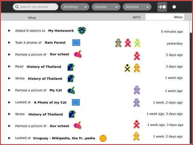
Structured Journal-01 view
Would this level of structure be undesirable for the user? --FGrose 17:46, 27 February 2008 (EST)
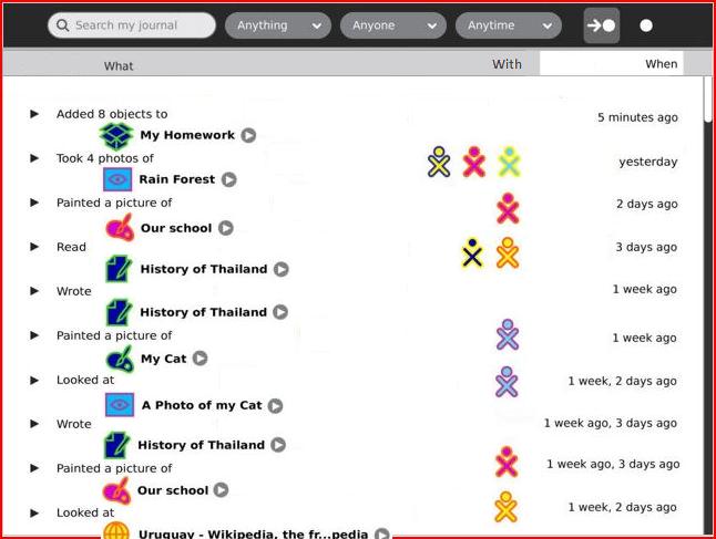
- Our hope here was to humanize it a bit by allowing the actions to read much like sentences. To be honest, I think it's actually a bit more difficult to parse with the staggered approach in this mockup. We considered the possibility of keeping the same list-style as the object view, but thought that this added a meaningful differentiation between the two, and highlighted the "journal" nature. -Eben
- I like the idea of naturalizing the reading of the entry, however, it seems that the significant user task in this view is to find a recent activity among the collection of all recent activities. So mental sorting of the displayed activities will be necessary. For example, the user may remember the desired task as one with many collaborators. I find this visual search difficult in the unsorted view, where if I make a mental subview of that dimension, there is an arbitrary chain of XO symbols. --FGrose 16:39, 6 March 2008 (EST)
- I troubled with the horizontal staggering as well, but because of the variable length of the opening verbage for each entry, found it as a compromise with the present size and space limitations. Perhaps by adding some very light alternate item background shading or very pale gray horizontal rules, the entries could be kept distinct. Or perhaps displaying the activity icon after the object title would help the readability and spacing. Since the users quickly learn that clicking an activity icon activates it, we could perhaps economize on space and symbols by leaving out the gray circle/white wedge play buttons on this view. (Image:Journal-01b.jpg has the play buttons.) --FGrose 16:39, 6 March 2008 (EST)

Also, the alternate views right justify the number-like attributes, something that if more generally applied might help synchronize learning and mental maps used in spreadsheet and table building. --FGrose 16:39, 6 March 2008 (EST)
Add new entry
Would the user (often) instantiate new activities from the Journal? (since I removed the 'Add new entry' bar.) --FGrose 17:46, 27 February 2008 (EST)
- I believe this is a part of the Diary aspect of the Journal, where kids can create entries of pure text ("holidays started today, hooray!"), but I'm not sure how it will work exactly. Will kids be encouraged to create full-blown diary entries through the journal interface, like in a blog? - Eduardo
- This is the intent. We feel that adding the ability to create simple text entries direclty within the Journal enhances its function as a personal tool, and could be a useful addition in a classroom context as well, as the teacher may ask the students to write small entries about their learning experiences (or whatever it might be) on a regular basis. -Eben
After checking an entry, loose ability to search
In this design, after checking one entry, a kid can't use the search to find other entries he might want to check, and is limited to scrolling. One thought that comes to mind is if the contextual toolbar was always present in a different tab like in other activities. This of course could create a problem, of a kid checking an entry, then changing the search terms, checking another entry to delete, while forgetting about the previous one. HoboPrimate 19:24, 27 February 2008 (EST)
- In the legend for Designs/Journal#06 Eben says the checkbox titlebar button will show a view of all checkmarked items. Perhaps that view ought to be presented as part of a confirmation-of-action dialog. --FGrose 21:19, 27 February 2008 (EST)
- Good idea. It is unnecessary for just one item, but multiple of them would be a good idea. On the other hand, I suspect confirmation dialogs aren't very well liked by Eben :).HoboPrimate 05:13, 28 February 2008 (EST)
- Yes, this is definitely the intent for actions on multiple selections. -Eben
- This is a valid point, and one that crossed my mind when mocking it up. I'm glad it came up for discussion. In fact, much earlier designs of the Journal used tabs in exactly this manner, but we thought that there might be a way to simplify the interface. This new design is an attempt, but it does have tradeoffs. We're exploring a new approach to toolbars which might actually make this less of a problem. I think we can discuss this in more depth once some of those ideas are revealed as well. -Eben
search within results
A very powerful facility of the Google search engine is "search within results". For instance, this allows starting a search with a general category such as "Food". Once one sees *all* the entries thus selected, one can do a 'within' search of "NOT Vegetable". By means of successive elimination, one can quickly narrow down to those entries one is interested in (even though one did not know when one started what the interesting entry would say).
If possible to implement, "search within results" ought to be equally useful for searching the Journal. [A 'Revert' capability is needed, to "back up" in case the most recent 'Search within' did not produce the anticipated result.]
- This is an interesting idea. For simplicity in the interface, we opted to omit any explicit facilities for doing this, though it should be mentioned that this is, to a large extent, possible anyway. We have several specific filters which can be applied in different categories, one by one. Each new filter will narrow down the list of results in a meaningful way. Likewise, adding additional search terms to the search field will continue to weed out results (implicit AND). This works relatively well since the list is updated on the fly, unlike Google where an explicit "search again" action is required. This will also improve in the future if we gain support for tokenizing the tags within the search field. Once a tag is typed, it will become a single token, and pressing the erase key once will erase the entire token instead of a single character, which would effectively function as a "go back" option. -Eben
optional alphabetization
Had (build 695) a look in the Journal view at an external storage device:
- ) The __whole__ display of the objects depends on them having been previously described. There were (among lots of other files) a number of fonts on the device. The best I could do to identify them was to choose the 'text' type, then to search for the string 'font'. But I still had no idea (through Journal view) *what* fonts were on that external device.
If Journal view is going to show objects NOT placed by the child, __something__ needs to be listed (in the view) in case whoever *did* place the object failed to provide an object-description (or meta-data). [Suggestion: show the filename]
- Filename should be the default string displayed for any file on a device. If this isn't the case, please enter a ticket in trac and provide a test case for it. -Eben
- ) The __order__ in which these objects were shown was by "how long ago written". I could care less which fonts were "written" three years ago, as opposed to four years ago.
If, for instance, I was looking to see if "Lucida Grande" was on that external device, it would make my task easier if there was an option to ALPHABETIZE the list (assuming it showed filenames for the listed objects). [Then I could tell if "Lucida Grande" was missing, without having to look at each object in the list.]
- I agree, you should be able to click on the What/Who/When Titles of this new design, to order the contents according to them.HoboPrimate 02:22, 2 March 2008 (EST)
- Yes, the thin gray bar beneath the main toolbar provides a way to customize the view. This includes being able to sort by "who", "what" and "when". The last of these is the default, since the primary organizational concept of the Journal is time, but any changes to that will persist. -Eben
