Talk:Sugar: Difference between revisions
No edit summary |
|||
| Line 28: | Line 28: | ||
--[[User:MarcoPesentiGritti|Marco Pesenti Gritti]] |
--[[User:MarcoPesentiGritti|Marco Pesenti Gritti]] |
||
A personal comment about the project's name. I think that "Sugar" is a bad choice. Why? Because it's silly ; because it's an English word (aren't we talking Third World?) ; because everybody now knows that sugar is something you shouldn't eat too much of ; because it has nothing to do with the software itself. |
|||
I suggest changing it for a name with an intimate connection with what happens on the screen. What name? Why, XO of course! |
|||
--Christophe Thill |
|||
===Child Fotos in Chat=== |
===Child Fotos in Chat=== |
||
Revision as of 10:00, 20 April 2007
How about moving out the historical material to archives and tidying up. For example, first picture could be this:. Also could consider cutting out all extranous stuff and redirecting main page to tne new page Nice and upto date stuff --Tonyv 05:15, 19 January 2007 (EST)
The metaphor of Sugar targets a very young demographic,eventhough OLPC's stated demographic is broader. Many 15 year olds who want to do useful work may be 'put off' by its 'childlike' appearance. Are there ways to reskin it on-the-fly for a more mature audience, either with bundles, or more custom? In this way, later developers could offer custom skins...
Please add a link to the Sugar Instructions Page from the main Sugar page... Thanks...
--Tomhannen 19:43, 13 December 2006 (EST)
Why can't it have a "normal" GUI like the images of the demo laptop have? How can they learn about the computer and the operating system when they can only browse the web and chat in a limited environment like this?
- Actually they can't browse the web because most of them will have no Internet connections. Browsers today are used for much more than the web. They are e-document readers that allow people to read HTML and XML documents. They are application front ends that provide a GUI for distributed applications. The wireless mesh of the OLPC lends itself to distributed apps, for instance a library of ebooks where you choose a book and download it to your OLPC.
- Ok but it didn't answer my question :) --Commodore
- Fair enough. The point of the project is NOT to teach kids how to use a computer, but to use a computer as a tool for teaching kids. If all the OLPC did was function as an ebook reader for DRM content, it would still be able to meet that goal. Of course, the OLPC's innovative technical design lends itself to some innovative software design and production of some innovative educational content. There is nothing "normal" about the OLPC and that is also a goal of the project, i.e. to be better than what has come before.
- Sugar is going to be one of several applications available on the laptop, "normal" GUI will be available --Marcin
- Great Marcin! --Commodore
Sugar is not application but both a developer framework and a user environment. It will allow to easily write new applications for the OLPC (and to port existing ones). It will be easy to program and to expand by contributors and even by the kids.
A personal comment about the project's name. I think that "Sugar" is a bad choice. Why? Because it's silly ; because it's an English word (aren't we talking Third World?) ; because everybody now knows that sugar is something you shouldn't eat too much of ; because it has nothing to do with the software itself.
I suggest changing it for a name with an intimate connection with what happens on the screen. What name? Why, XO of course!
--Christophe Thill
Child Fotos in Chat
Do you expect that the children or the teacher have a digital camera to make these pictures? Will the digital camera be part of the "school package"?
- Thats just a mockup to give a more personal look. Digital cameras of course would not be available everywhere neither is it planned to be part of a school package atleast universally - RahulSundaram
- There will be a digital camera (still and video) as part of every laptop, hence there is no need to include a camera as part of a school package. --Walter 13:05, 29 October 2006 (EST)
Different distribution than Fedora Core
Actually, why not build the GUI interface based on some other versions of Linux? Anyway, Fedora Core is not designed for a Laptop with a 500 Mhz CPU. And we can find a lot of more suitable releases in the Linux Community, including many small, fast, user-friendly releases of Linux. Isn't it --Sil
- A stock Fedora Core distribution will not be used on the final laptop. Redhat is an OLPC partner, and will basically making a $100 laptop distribution that is small, fast, and stable. User-friendliness of the distribution is irrelevant, since most children will be using the laptop through Sugar anyway. --SamatJain 12:31, 3 August 2006 (EDT)
Is any attention being paid to how the pretty green artwork will look on the high-res black and white screen mode? I understand that making the GUI as nice-looking as possible is not the focus of olpc, but I don't want to see all the green turn to low-contrast mush in the more usable screen mode.
more recent screen shots
Is anyone going to put up a more recent set of screenshots for Sugar? These pictures have been up since late July, early August if not earlier. Considering that progress on the desktop environment is moving so quickly, would it be so hard as to put up a more current preview of the work being done? Thanks for your effort.
- Point well taken. We are in the midst of documenting the current state of Sugar and uptodate screenshots will be part of that effort. --Walter 13:07, 29 October 2006 (EST)
This page needs serious reorganization
This page, entitled simply "Sugar" needs to be reorganized to serve as a gateway to the various aspects of Sugar. Some people will come here to learn about building Sugar on their *nix system. Others will come here to learn how to make Sugar activities. Some come here to keep up to date on what other OLPC team members are doing.
It should be easy for all types of users to read the first screenful of this page and find the information appropriate to their needs. Please restructure this page as a portal and consider how much of the current content might be more appropriate on another more specialized page.
Thanks.
No info about RUNNING Sugar
This site is full of handwaving ideas about what Sugar will eventually do, but there's no documentation about how to actually use the Sugar that's in the current builds. Thus, it's impossible to tell whether some ability or disability is a bug, lack of a feature, as-yet-unimplemented feature, or a mere misunderstanding by the user. --gnu
There appears to be no way to terminate an activity. Activities don't have "close boxes", and from the Home view, there doesn't appear to be a way to do anything to an activity except resume it. I tried pointing at it and hitting ESC, but that had no effect. I tried hitting CTRL-ALT-Del which had no effect. CTRL-ALT-Backspace was trapped by the window system which hosted qemu, resulting in termination of all my windows, including qemu (I won't do that again!). --gnu
- You might want to read the Sugar Instructions. It has details on how to use Sugar, including how to close applications. Function keys F1-F4 correspond to the zooming-level keys on the laptop, so you should be able to get to the frame even when the mouse fails to activate it. —Leejc 23:56, 15 February 2007 (EST)
The sharing features don't work at all in emulation, or with a lone laptop. This means that essentially NO developers are going to understand how sharing works. This is foolish! The result will be no applications that implement the brand-new integrated sharing model that you're trying desparately to promulgate. Instead, it should be easy for a developer to configure their OLPC or emulated system so that they can join a sharing group at a distance, over the Internet (or over distant meshing connections). This capability will be required in actual use; if a kid is in hospital, traveling, or otherwise away from school, she should still be able to join her usual sharing group(s) as long as both ends can route packets to each other. --gnu
I got into a state in TamTam where the frame refused to pop up, no matter what I did. Do you have any UI guidelines or improvements for users who get caught in this situation -- other than "remove the battery and unplug your laptop"? Perhaps on real laptops this is less of an issue (if the keyboard keys for "get me to a different zoom level" cause the system to respond). In qemu it appears my only options are (1) reset the emulated system, or (2) go into a serial console, log in, and start mucking around trying to kill processes. --gnu
"What is Sugar?" in a glance
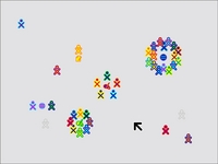
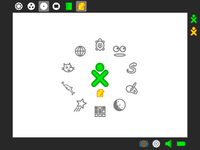
I added a set of images to provide an "instantaneous orientation". An immediate feel for what sugar is and how sugar is organized (neighborhood, home, apps). And a sense of excitement (collaboration, access to knowledge). Combined with the current Frame image, I think these accomplish that. Though it would be nice to have a Frame image with more than 4 apps.
Why the change? When I first saw the Sugar page, trying to get some idea of "What is Sugar?", and saw the current image, my reaction was "Eewh, is that ugly black box always there? Hmm, 4 apps. Some random icons up left." No sense of excitement. A puzzlement which decreased only incrementally (a neighborhood snapshot on one page, an app on another,...). I want to create a much more exciting, motivating, and less confusing experience for future visitors. "What is sugar - in four thumbnails". MitchellNCharity 23:48, 27 February 2007 (EST)
still painful to look at
To deal nicely with greyscale, you need to look back at an OS that handled that well: MacOS, of around the System 7 era. Back in the day, many Macs shipped with greyscale monitors. 4-bit grey was very common. The PC pretty much went from text-only to color, aside from a few non-standard devices.
Thick dark outlines are not the answer. Rather early, MacOS switched to using nicely 3D shaded widgets. Many of the corners were slighly rounded. This gives the appearance of having real objects that can be manipulated, which makes everything easier. Human eyes and brains are made to pick out objects of this sort.
The XO has at least 5-bit grey in all screen modes. It only takes 2-bit grey to do a nice 3D-shaded GUI.
AlbertCahalan 00:40, 28 February 2007 (EST)
- Or keep it intentionally crude, and make it easy for kids to create them. High res permits nice icons, and much lower effort creation (getting a few large pixels to look good is hard, gimp pull-down menu 3d effects much less so). Perhaps the option of "stencils" or something to "play within a theme", distort/art-ify existing icons? Sharing. MitchellNCharity 02:11, 28 February 2007 (EST)
Sugar theme
screenshots: [1]
Issues
- GtkMenuButtonToolItem in a toolbar is unreadable (see Home page)
- Gradients are too slow (you can see them drawing!)
- Should high-computation elements like gradients be in a default theme?


