Talk:Designs/Journal
Jump to navigation
Jump to search
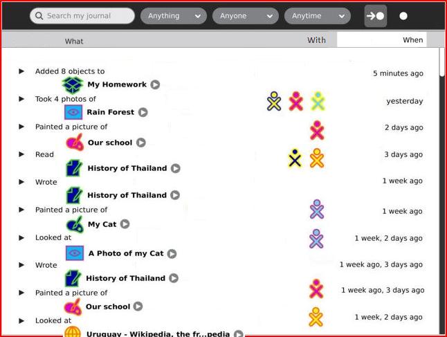
Structured Journal-01 view
Would this level of structure be undesirable for the user?
Would the user (often) instantiate new activities from the Journal? (since I removed the 'Add new entry' bar.)
- I believe this is a part of the Diary aspect of the Journal, where kids can create entries of pure text ("holidays started today, hooray!"), but I'm not sure how it will work exactly. Will kids be encouraged to create full-blown diary entries through the journal interface, like in a blog?
--FGrose 17:46, 27 February 2008 (EST)
After checking an entry, loose ability to search
- In the legend for Designs/Journal#06 Eben says the checkbox titlebar button will show a view of all checkmarked items. Perhaps that view ought to be presented as part of a confirmation-of-action dialog. --FGrose 21:19, 27 February 2008 (EST)
In this design, after checking one entry, a kid can't use the search to find other entries he might want to check, and is limited to scrolling. One thought that comes to mind is if the contextual toolbar was always present in a different tab like in other activities. This of course could create a problem, of a kid checking an entry, then changing the search terms, checking another entry to delete, while forgetting about the previous one. HoboPrimate 19:24, 27 February 2008 (EST)
