Talk:Designs/Activity Management
Hierarchical Launcher Ring
Why is 'hierarchical presentation' being shunned? To me, there exists the problem of "real estate" (i.e., room on the display). The presentation ought to allow for 400 (not just 40) activities. [And no, to me the current design of 'trays' does not cut it.]
My suggestion: expand on the "pie slice" metaphor. Allow either 'Tab' icons or 'Activity' icons in the inner circle. When the cursor hovers (or clicks) on a Tab, an "outer semi-circle" is shown adjacent to the Tab -- it is this "outer semi-circle" that now shows 'Activity' icons displaced by that Tab from the inner circle. [If need be, more levels can be added to the hierarchy by putting Tabs in the "outer semi-circle", etc.]
I myself would not normally use TamTam Activities - yet their icons take up on-screen real estate (both in the old and in the new presentations). What I am proposing is letting me move TamTam icons from the inner circle and putting in their place a 'Tab', which "expands outward" into the icons I've moved. [A child, to whom TamTam Activities are important, would have left those 'Activity' icons in the inner circle.] --Mikus 18:08, 28 February 2008
- The big difference in the new approach, designed to minimize if not eliminate this problem, is the juxtaposition of the radial (ring) and list views. The list view is "infinitely" scalable, and shows all activities installed on the laptop. Items in the list view can be starred as favorites, and only the favorites appear within the activity ring. If you're not into TamTam, then you could un-star it within the list, reserving the ring for the things you do most. Do you think this approach offers enough flexibility? -Eben
In the new approach, judicious use of starring could achieve much of my aim of uncluttering the process of launching an application.
The problem with the current (came with G1G1) activity list is that it treats all activities as equally important. [To separate out my favorites, I've re-ordered (i.e., prioritized) the list.] I suspect that even in the new approach (where favorites can be starred) I will want to re-order the list view to in effect "put into a lower hierarchy" those activities I consider of low priority (to keep their entries from cluttering up that part of the list that I visit frequently).
Journal, a core of Sugar Shell, not an activity
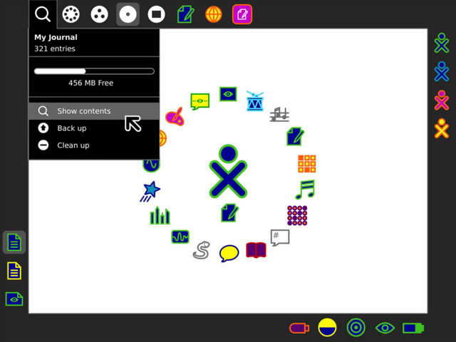
I'd like to raise the question of whether the Journal should really be using an 'activity' metaphor (and implementation). This came up in a #sugar irc meeting earlier this week. Right now, and in the new designs, the Journal feels split between two worlds, that of a core intrinsic sugar feature (which it is), and that of just another regular activity. I'd like to suggest that it be presented and implemented as part of the new shell, for both efficiency and usability, as a peer of the Neighbourhood/Friends/Home/Activity zoom views. It's not just another activity to be switched to, it's a another XO view. See below mock-up for a rough idea of presentation. --garycmartin 00:32, 29 February 2008
- This is a nice presentation of the idea, and you point out some merits, such as the mapping to the keyboard layout. My two main uncertainties regarding this design are as follows:
- 1 I think that the Journal is perhaps the most personal aspect of the laptops, and as such I feel that it should retain the book-like Journal icon, and also that it needs to retain its colors, as it goes hand in hand with the identity of the XO. -Eben
- I do like the reporters note book icon from an aesthetic point of view, but the existing keyboard glyph for journal searching is already a reality and harder to change to get HCI consistency (always felt Journal key should have been as one with the existing 'zoom' view keys), but playing devils advocate here, if the colours give identity/ownership to local XO entities, perhaps the four zoom frame icons should also be in the users personal colours of choice? This is my neighbourhood, these are my groups, my home and my current activity (though you could be sharing someone else's instance so it's colours could could be from them) --garycmartin
- 2 The four zoom levels (we may start referring to these as "spheres", to clarify some terminology) are very closely tied to a spatial metaphor which goes from "tight" to "wide" from right to left. The Journal, as the most private part of the interface, really belongs as a member of the "nearest" sphere: Activity. -Eben
- The journal has always given me the feeling of the most distant/wide view of the XO, obviously not with a particular spacial mapping as it contains more abstract meta information - showing you items you've downloaded, past activity states, and the users you shared them with. --garycmartin

Home view like Quartz Composer
I hope this is not terribly off-topic, since it isn't about activity management but is about the home view. Some time ago I had a crazy idea of the Home view being a sort of workspace. I explained the idea at Vision_for_a_numeracy_activity under "Comments would be most welcome". It was with surprise that I found out that there is an programming environment in MacOSX that works like that, Quartz Composer. I think the idea of having the activity icons in the home view have inputs/outputs/variables would allow for very clever mixes of multiple activities, and because of it, decrease code and feature duplication (for instance, even if there wasn't a system-wise speech feature, you could plug-in Speak with Chat, for blind kids. Or if there ever exists a "Trainable language AI" activity, you could also plug it into a Chat to make a bot. Kids could come up with other solutions which aren't solved by just one activity, but are solved when programmatically using them together).HoboPrimate 22:25, 16 March 2008 (EDT)
Activity title on The Frame
Why not bring back the original concept of having the activity title on the Frame?  TThis would reduce the need to switch tabs to act on such an important action, naming the activities. The Activity toolbar then could be seen as a more advanced area. There would be plenty of space for the other activity icons in the frame as well (and even if they overflow, there could appear a scroll button), and since the active activity will always be on the left, the activity title text box can stay fixed next to it. HoboPrimate 22:59, 16 March 2008 (EDT)