User:Wade/Ideas/Activity Management
Problems addressed
Over-tasked activity icon
The current activity management design double-tasks the activity icons in the home page with:
- Creation of blank activities.
- Resuming old activity instances.
This unfortunately fails to enforce the notion of an activity being separate from an activity instance, and will confuse users in the long run.
It also becomes cumbersome as soon as the user needs two instances of an activity. They will be forced to use a lengthy context menu, or to graduate to using the Journal regularly to start each activity instance, leaving the home screen basically useless.
In other words, I don't think the existing Activity Management design scales well past a single instance of each activity.
Lack of organizational tools
The current design basically requires users to drag around activity icons to organize them. Anyone who has used a modern desktop operating system will know that this is cumbersome to use, and in the hands of children may lead to chaotic home screen arrangements.
This dovetails with the previous problem, since documents (activity instances) cannot be placed on the home screen. If a user wanted to arrange their Write and Calculate together because they were doing math homework, and then later wants to do science homework with Measure, they must move the Write activity over next to the Measure activity to maintain any coherent grouping.
It becomes clear that the dragged icon system is simply a means to make room for more activities, and offers no organizational benefits.
Design
This design removes the permanent activity icons from the home screen, and replaces them with a tag-centric view of previously created activity instances. In a sense, it is turning the home screen into a spatial view of the Journal, plus a mechanism for creating blank activities.
It introduces a transient, grayscale activity ring which appears when the XO icon is clicked. Visually, this looks like creating new activity instances "out of the XO". It later (only once the user is ready) introduces a tag-centric layout, where user-created tags orbit the XO, and activity instances orbit the tags.
Rationale
- Keeping with the constructionist nature of the machine, the user interface should be centered around what the user has created.
- I believe the most common initial step when booting the XO will be to resume existing work.
- This design makes obvious "where's my stuff", as everything the user has created is visible from the start.
- This design makes it more clear who's XO this is. Rather than remembering the user's colors and seeing the standard list of installed activities, you will see your projects and tags.
Annotated Concept Sketches
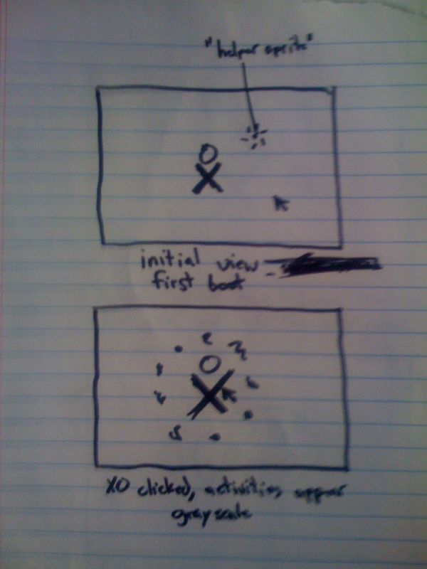
Initial view at first boot
Initial view at first boot. No activity instances have been created yet.
An animated helper sprite is shown because the journal is empty. It animates and shows the user to click on the XO. This will be the subject of a future design page, but please take for granted that it's an animated glowing dot which circles the mouse cursor and then pretends to "click" on the XO. It might also involve voice.
New activity ring
User clicks on the XO, and the activity ring appears with the activity icons in grayscale. This appearing ring of grayscale icons is the standard metaphor for creating a blank activity.
The fact that the icons appear out of the XO indicates that it's being created from the XO. To enforce this, the activity icons will be animated to appear inside the XO and to travel outwards until they reach their point on the circle.
- Clicking on an activity creates a blank activity instance.
- Hovering over activity icons show them in the user's color.
- Clicking anywhere else dismisses the activity ring.
- Dragging and releasing activities reorganizes the activities in the circle.
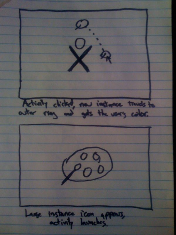
Activity created
When the clicks on an activity icon in the activity ring, the colored icon travels to the outer ring, and the activities ring disappears.
Activity launching
After a brief delay, the icon zooms up to fill the screen and pulses while the activity launches.
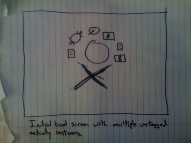
Boot view after a while
Once the user has created several activity instances, they will come to surround the XO just like the current activities circle.
- Activity instances can be dragged around the circle to reorganize them.
- Activity instances icons have context menus showing name, small screenshot, time last resumed, Resume, Tag.
- When the user clicks the XO to create a blank activity, everything else on the screen fades out to light gray behind the activities ring.
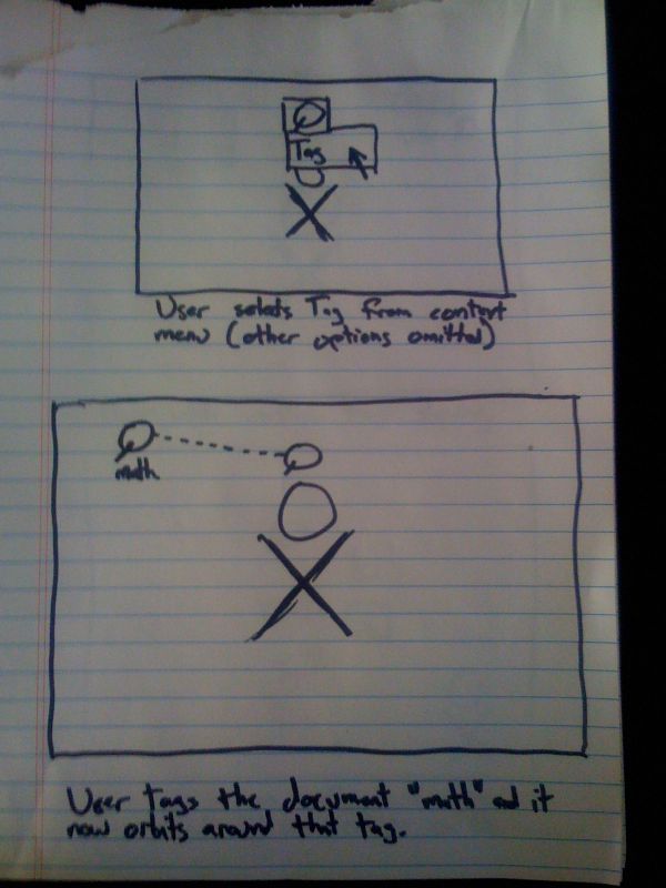
Tag assignment
Tags are how activities are organized beyond the initial XO ring. The user uses the context menu to assign a tag to the activity (the rest of the context menu is omitted). Assume the tag "Math" is assigned.
The use of tags is completely optional until the initial XO ring has been filled with activity instances. The system never makes itself apparent until the user selects Tag from an activity instance's context menu.
Note- Metaphorically, the XO icon can be thought of as the root tag.
Tag based layout
With the tag assigned, the tag's visual representation (text in this case) appears in an outer ring, and the activity icon travels to orbit around the tag.
This allows the entire screen to be filled up with activity instance icons, while preserving automatic organization.
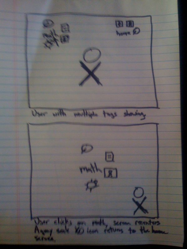
Multiple tags on the home screen
An example of the home screen with a number of tags created.
If too many activity instances are assigned to a tag, all but the few most recently used become tiny dots, and the user must focus the tag to open them.
Tag focus (advanced)
The user clicks on the Math tag, and it travels to the center of the screen while the other tags disappear.
The XO icon travels to the corner of the screen and becomes grayscale, this can be clicked to return to the home screen.
We could extend tag focus to allow for tags within tags. This would create a hierarchical "galaxy" of activity instances, allowing for basically unlimited organizational freedom, while keeping the simple case simple.
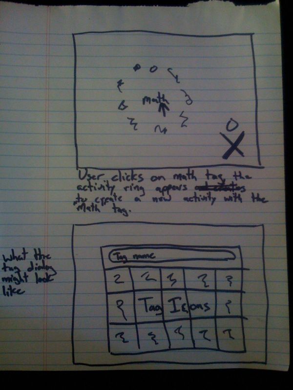
New Tagged activity
When the user clicks the Math tag, the grayscale activities ring appears out of the Math tag. When they click on an activity icon to create a blank activity instance, it will be created with the Math tag already assigned.
This allows users to effortlessly tag, meaning all documents created within the tag's space will automatically receive the tag.
Tag creation dialog
The tag creation dialog allows creating tags with text names and/or pre-made icons. Images can be pasted from the clipboard into the boxes to create new tag icon possibilities.
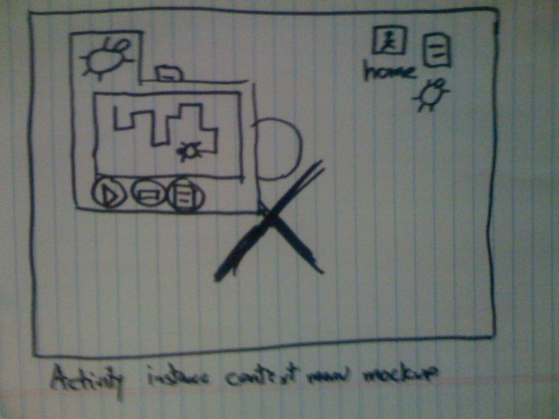
Since the home screen is now a view of the Journal, it needs to be able to show screenshots, resume activities, delete, etc. We could add a Details item to the regular context menu, but it might also be a good idea to build an extended context menu so that activity details can be easily viewed from the home screen.
This context menu sketch replaces the Details screen of the Journal with a more tightly packed version. The buttons correspond to Resume, Delete and Tag. Note that Delete should probably be moved over to the far right of the context menu, it's current position is dangerous.
