OLPC Human Interface Guidelines/The Sugar Interface/Controls
Controls
Sugar defines its own set of control widgets that will create the user interface on the laptops. Though most of the available controls will match developers' expectations, we've also developed some new controls and altered behaviors of others to better suit the user experience on the machines. With these new developments comes a new set of guidelines for their usage and placement which both maintains the broader set of goals and metaphors setup within Sugar and aids in the development of collaborative user interface environments.
As the control widget specification and guidelines compose a substantial portion of this document, internal page by page navigation is available by clicking on the header for any control set. In addition, the individual pages provide detailed specifications for the widgets and their various states. Finally, we're providing developers with an Adobe Illustrator file of the most up to date Sugar Control Specification in .ai (07.04.05) and .svg (07.05.18) in order to streamline early application layout and design mockups. Please understand these specifications and their implementations remain in early development, and their designs may change as the UI progresses. We'll provide links to APIs for the controls as they become available; Thanks for your patience.
Control Regions
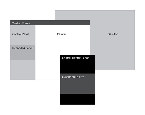
In sugar, a predefined set of control regions provide the surfaces upon which controls may be placed. Limiting the background colors that the controls sit on allows for a consistent set of visual rules to define both the type and state of various controls while maintaining sufficient contrast even without the use of color. Shown to the right, the basic regions are the Canvas, Panel, Toolbar, and Palette.
Canvas: The canvas is the general purpose "creation" space within any activity
