Talk:Designs/Activity Management
Hierarchical Launcher Ring
Why is 'hierarchical presentation' being shunned? To me, there exists the problem of "real estate" (i.e., room on the display). The presentation ought to allow for 400 (not just 40) activities. [And no, to me the current design of 'trays' does not cut it.]
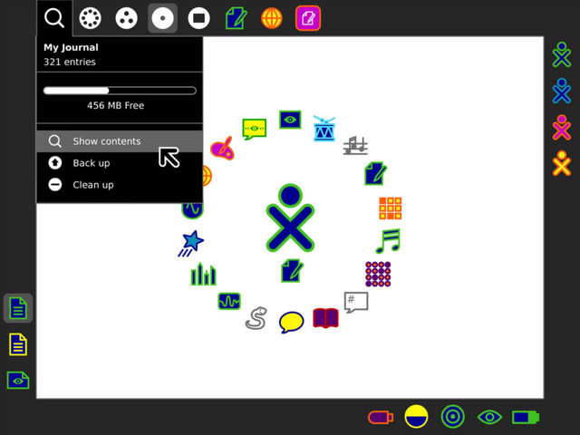
My suggestion: expand on the "pie slice" metaphor. Allow either 'Tab' icons or 'Activity' icons in the inner circle. When the cursor hovers (or clicks) on a Tab, an "outer semi-circle" is shown adjacent to the Tab -- it is this "outer semi-circle" that now shows 'Activity' icons displaced by that Tab from the inner circle. [If need be, more levels can be added to the hierarchy by putting Tabs in the "outer semi-circle", etc.]
I myself would not normally use TamTam Activities - yet their icons take up on-screen real estate (both in the old and in the new presentations). What I am proposing is letting me move TamTam icons from the inner circle and putting in their place a 'Tab', which "expands outward" into the icons I've moved. [A child, to whom TamTam Activities are important, would have left those 'Activity' icons in the inner circle.] --Mikus 18:08, 28 February 2008
Journal, a core of Sugar Shell, not an activity
I'd like to raise the question of whether the Journal should really be using an 'activity' metaphor (and implementation). This came up in a #sugar irc meeting earlier this week. Right now, and in the new designs, the Journal feels split between two worlds, that of a core intrinsic sugar feature (which it is), and that of just another regular activity. I'd like to suggest that it be presented and implemented as part of the new shell, for both efficiency and usability, as a peer of the Neighbourhood/Friends/Home/Activity zoom views. It's not just another activity to be switched to, it's a another XO view. See below mock-up for a rough idea of presentation. --garycmartin 00:32, 29 February 2008
