OLPC Human Interface Guidelines
Introduction
Who Should Read This Document
These guidelines are targeted primarily at developers who are building tools for the OLPC laptop. They provide an in-depth view of the various features of Sugar, the laptop user interface, and focus closely on the parts of the UI that pertain directly to software development and the ways in which applications, embedded into "activities," interact with the operating system.
However, as these guidelines are intended to provide a comprehensive overview of the user interface, these pages should also be of general interest. Hopefully the descriptions of the various UI elements, particularly in the Laptop Experience section, will quench the thirst of all who want to better understand the project and its goals.
How to Read This Document
Undoubtedly, many who have made it to this page have read at least one set of human-interface guidelines in the past. Nonetheless, we strongly request that you read the content of this document in full. Many of the terms contained within will be quite familiar to you, however, we urge you to review them anyway, since our approach to the user experience shifts away from the traditional desktop. As such, this document may introduce some unfamiliar ideas around such otherwise familiar terms that you should consider throughout development.
While we would urge you to read this document once from start to finish, extensive use of both internal and external hyperlinking allows you to peruse its contents at will. Hopefully this will make revisiting particular parts of the guidelines quick and easy, and will allow you to move naturally through the details that pertain most to you. Additionally, where relevant we have included links to the APIs in order to make the relationship between design and implementation clearer. Please take advantage of this as you develop for the laptops.
Core Ideas
Activities, Not Applications
Though it might take a little while to get used to, there are no software applications in the traditional sense on the laptop. The laptop user focuses around "activities." This is more than a new naming convention; it represents the intrinsic quality of the learning experience we hope the children will have when using the laptop. Activities are distinct from applications in their foci—collaboration and expression—and their implementation—journaling and iteration.
Presence is Always Present
Everyone has the potential of being both a learner and a teacher. We have chosen to put collaboration at the core of the user experience in order realize this potential. The omnipresence of members of the learning community will facilitate children in taking responsibility for one another's learning as well as their own. The exchange of ideas amongst peers can both make the learning process more engaging and also stimulates critical thinking skills. We hope to encourage this type of social interaction with the laptops.
In order to facilitate a collaborative learning environment, the laptops employ a mesh network that interconnects all laptops within range. By exploiting this connectivity, every activity has the potential to be a networked activity. We aspire that all activities take advantage of the mesh; any activity that is not mesh-aware should perhaps be rethought in light of connectivity. As an example, consider the web-browsing activity bundled with the laptop distribution. Normally one browses in isolation, perhaps on occasion sending a friend a favorite link. On the laptop, however, a link-sharing feature integrated into the browser activity transfors the solitary act of web-surfing into a group collaboration. Where possible, all activities should embrace the mesh and place strong focus on facilitating such collaborative processes.
Tools of Expression
Starting from the premise that we want to make use of what people already know in order to make connections to new knowledge, our approach focuses on thinking, expressing, and communicating with technology. The laptop is a "thing to think with"; we hope to make the primary activity of the children one of creative expression, in whatever form that might take. Thus, most activities will focus on the creation of some type of object, be it a drawing, a song, a story, a game, or a program. In another shift in the language used to describe the user experience, we refer to objects rather than files as the primary stuff of creative expression.
As most software developers would agree, the best way to learn how to write a program is to write one, or perhaps teach someone else how to do so; studying the syntax of the language might be useful, but it doesn't teach one how to code. We hope to apply this principal of "learn through doing" to all types of creation, e.g., we emphasis composing music over downloading music. We also encourage the children to engage in the process of collaborative critique of their expressions and to iterate upon their expression through a process of debugging.
The objectification of the traditional filesystem speaks more directly to real-world metaphors: instead of a sound file, we have an actual sound; instead of a text file, a story. In order to support this concept, activity developers may define object types and associated icons to represent them.
Journaling
The concept of the journal, a written documentation of everyday events, is generally understood, albeit in various forms across cultures. A journal typically chronicles the activities one has done throughout the day. We have chosen to adopt a journaling metaphor for the filesystem as our basic approach to file organization. While the underlying impementation of such a filesystem doe not differ significantly from some of those in contemporary operating systems, it also holds less importance than the journal abstraction itself.
At its core, our journal concept embodies the idea that the filesystem records a history of the things you've done, or, more specifically, the activities you've participated in. Its function as the store of the objects created while performing those activities is secondary, although also important. The journal naturally lends itself to a chronological organization (although it can be tagged, searched, and sorted by a variety of means). As a record of things you've done—not just the things you've saved—the journal will read much like a portfolio or scrapbook history of the children's interactions with their machine and also with thier peers. The journal combines entries explicitly created by the children with those which are implicitly created through participation in activities; developers must think carefully about how an activity integrates with the journal more so than with a traditional filesystem that functions independently of an application. The activities, the objects, and the means of recording all tightly integrate to create a different kind of computer experience.
Design Fundamentals
Know Your Audience
Inexperienced
The goal of OLPC is to provide children with new opportunities to explore, experiment, and express themselves. Many children in need of such opportunities have previously had little or no access to computing, and so will be unfamiliar with the laptop and how to interact with it. This will undoubtedly have effects on some aspects of activity development. On the one hand, it means that developers must focus energy into making interfaces discoverable, wholly intuitive, and building metaphors that strengthen and clarify the interface. On the other hand, since the laptop will the be the first experience of computing for many children, activities do not have to be overly true to legacy behaviors or expectations. This frees developers to innovate.
Young
Many of the children who will receive laptops are just entering kindergarten; others will be in their young teenage years. Therefore, it is important to develop activities in ways that scale across age levels.
International
The OLPC initiative, by its nature, requires international involvement and participation. Developers must keep in mind the broad range of cultures and languages that the laptops must transcend. In particular, activities should not depend on western icons and modes of thinking, but should abstract ideas to a level that would be familiar to humankind in general, where possible. For instace, consider the camera button on the keyboard. Though one might be inclined to label this key with a small image of a camera and lens, the eye graphic speaks directly to our human capacity for vision, providing a cross-cultural icon that represents the compute's ability to capture what it sees.
Key Design Principles
Low floor, no ceiling.
Performance
The OLPC laptop bucks the trend of "more, faster, fatter"; we aim to provide a computer tailored to the needs of children in the context of their learning, not to the needs of frentic video games or office applications. We are, however, working within constraints of componet cost, robustness, and power consumption. To satisfy these contraints, we have opted for NAND flash rather than a harddisk and a modest 128MB of memory (Please see hardware specifications). Thus developers must make every effort to write efficient code while minimizing memory usage.
Since there is no swap space on the laptop, only a limited number of activities can run concurrently; the Sugar UI exposes these details directly to the user. The home screen features an activity ring that contains icons representing each instance of an open activity. The size of the ring segment that a given activity occupies represents its overall memory usage; when the ring fills up, no additional activities may be launched until some resources are freed up. Take these limitations into account as you develop activities, since they will have a greater impact on the performance of your software on the laptop than on other platforms.
Usability
OPLC places an emphasis on discoverability and usability due to our target audience. Usability has everything to do with the actual behavior of the activities, the layout of the buttons and tools, and the feedback that the interface provides to the user through interaction. Ultimately, the design decisions that make your activities usable will depend greatly on the type of activity you are developing, and it will be up to you to consider carefully the kinds of interactions users will expect when presented with it. As a general rule, if the interface provided does what the user expects it to, you are off to a good start. However, since it is quite difficult to know what the user will expect—and in practice not all users will expect the same things—there is no substitue for user testing.
Simplicity
We designed the entire laptop interface with a goal of simplicity. It can be tempting—and also quite easy—to add an overabundance of features to software: the abundance of MIPs and memory exacerbate the software-bloat phenomenon. The laptop hardware "limitations" lead toward a more concise direction and aid in designing for simplicity.
Keep in mind that simple doesn't necessarily mean limited. OLPC hopes to demostrate to the world that simple—even minimal—controls can have great expressive power. Avoid bloated interfaces that do too much, and limit the controls to those immediately relevant to the task at hand. Rather than creating a "Swiss Army knife" of an activity, think of the laptop itself as the knife, and instead develop a particular tool for that knife that does one thing, and does it very well. When all the activities on the laptop embrace this idea, the true power of the laptop will emerge.
Reliability
Of course we want to avoid instances where things go wrong; this should be a goal for every piece of software. We are committed to ensuring that the UI framework prevents activities from causing system crashes; Developers should consider a "fail-soft" approach to their designs, such as incorporating a suitable behavior for the spontaneous termination of an activity.
Security
(Mention the "walled garden".)
Adaptabilty
With the aforementioned goal of reliability and the omnipresent mesh network in mind, adaptability must be carefully considered. Many activities will involve participation from a locally networked group of friends. The mesh network provides an excellent tool for connectivity and collaborative creation even without an internet access point, and is extremely adaptable in itself due to the nature of such a network. However, this also means that signal strengths, and therefore bandwidth, may fluctuate, and at times activity partipants may even drop off temporarily. Activities should handle these cases with care. Temporary loss of connectivity should be handled silently, and reconnection of an individual to an activity they were previously participating in should happen with no noticeable side-effects. On the other hand, unintentional disconnection of individuals from networked activities due to unforseen reasons should likewise be handled in the simplest way at both ends of the connection. Detailed guidelines for collaborative activities reside in the Laptop Experience section.
Of course, though network adaptability is of utmost importance, other forms of adptability should also make thier way into activities. For instance, activities should have the ability to accept forms of user input that may not match the develper's expectations. In the end, writing adaptable code will do a good deal for making the code reliable.
Recoverability
Interoperability
Mobility
Transparency
OLPC also hopes to encourage the children using the laptops to explore the the technology under the surface. Towards this end, a view source key has been added to the laptop keyboards, providing them with instant access to the code that enables the activities that they use from day to day. This key will allow those interested to peel away layers of abstraction, digging deeper into the codebase as they learn.
To enable such layered exploration, OLPC has written much of what can be in Python, a scripting language, to enable children to view the source code. This means, aside from general good practice, code should be both readable and well commented. The [PEP 8] style guidelines for Python provide an excellent resource, and OLPC recommends that developers follow the practices layed out therein unless a compelling reason not to exists.
Accessibility
The Laptop Experience
Introduction
As you begin developing activities, it is help to understand OLPC's goals for the laptops, as well as the metaphors and interactions we are using. We hope this overview will provide insight into the ways in which activities can integrate smoothly with the operating system and, just as importantly, with other activities and other laptops on the mesh network.
Most developers are familiar with the desktop metaphor that dominates the modern-day computer experience. This metaphor has evolved over the past 30 years, giving rise to distinct classes of interface elements that we expect to find in every OS: desktop, icons, files, folders, windows, etc. While this metaphor makes sense at the office—and perhaps even at home—it does not translate well into a collaborative environment such as the one that the OLPC laptops will embody. Therefore, we have adopted a new set of metaphors that emphasize community. While there are some correlations between the Sugar UI and those of traditional desktops, there are also clear distinctions. It is these distinctions that are the subject of the remainder of this section. We highlight the reasoning behind our shift in perspective and detail functionality with respect to the overall laptop experience.
- Desktop : Neighborhood
- Menubar : The Frame
- Hierarchical Filesystem : Journal
- Applications : Activities
- Files : Objects
Zoom Metaphor
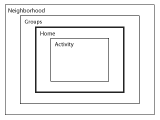
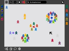
Given that the mesh network is a permanent fixture of every laptop, Sugar represents the local ethernet community explicitly in the interface. A zoom is used to relate four discrete views, each of which caters to a particular set of goals: Home, Friends, Neighborhood, and Activity. Using keyboard shortcuts or controls built into the Frame, one may zoom in and out (See figure), seeing more or less of the activity on the mesh.
Home
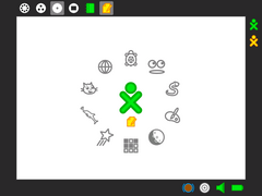
Of all the zoom levels, the Home view relates most closely to the traditional desktop. As the first screen presented to the user at startup, it serves as a starting point for the exploration of both the mesh network and also of their personal activities and objects. From this view, one may either back up first to a circle of Friends, and beyond that to a view of the entire mesh Neighborhood, or, instead, zoom in to focus on a particular Activity.
The Home view interface is minimal. In the center of the screen, the XO icon—rendered in user-specified colors—represents the child to whom the laptop belongs. The activity ring surrounds the character, indicating all of the currently open activities. Furthermore, the section of the ring that a given activity occupies directly represents the amount of memory that the particular activity requires to run, providing immediate visual feedback about memory contstraints and exposing a means for the user to manage their resources. Most activity management happens here: starting new private activities, ending current activities, and switching the currently active activity.
When used in conjunction with the Bulletin-Board, the Home view becomes the most direct correlate to a typical PC desktop: as a place for keeping things handy: tomorrow's homework, the drawing I'm working on, a favorite song, a reminder to myself to take out the trash.
Friends
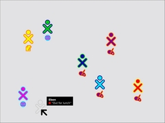
The Friends view takes a small step back from the Home space, opening up the screen to include one's circle of friends. Essentially, this view represents a spatially viewable and editable buddy list. From here one can add or remove friends and move individuals around, perhaps forming them into logical groups—the four friends on the right half of the screen, for instance, might be "my drawing group." All of your friends receive invitations whenever you start an activity from the Friends view, making collaboration implicit. Moreover, this view allows one to see what activities your friends are presently engaged in, providing the opportunity to join any non-private activities. Already, you can see how this view changes the usual method of application launch, allowing one to start new networked activities or join existing ones directly.
Neighborhood
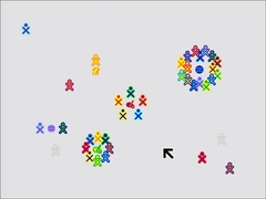
Zooming out one more step we reach the Neighborhood view. Here we see everyone on the local mesh. At this level we (intend to) support a variety of views, each with a different focus: the individuals; the activities in which they are presently engaged; etc. In the figure, individuals are shown clustered around their currently active activities, providing a direct visual representation of the popularity of an activity, since group size is immediately perceptible.
While the Neighborhood view (currently) doesn't provide any true spatial or geogpraphical data, it does provide an at-a-glace social geography of the mesh and its participants. Similar to the Friends view, launching an activity here implicitly opens that activity up for anyone in the Neighborhood to join. While no one receives an explicit invitation in this case, the newly started activity will appear in the view, with its participants clustered about it, so that anyone who wishes to may join. Of course, this also means that the Neighborhood provides an excellent space for exploration. Here, one can both search for, locate and join activities of interest using a powerful and adaptable search technology, and also interact with and make friends with other children in their neighborhood they haven't yet met.
Activity
Zooming in from the Home view, we find the Activity view. This view contains the activities where all of the actual creation, exploration, and collaboration takes place. This is where you, the develper, come into play, providing new and engaging tools, extending the functionality and encouraging new types of creative exploration.
Though multitasking has become somewhat of a standard in today's desktop computing world, we've chosen to break away from this model, instead adopting a fullscreen activity view that focuses the childrens' energies on one specific task at a time. Although one may have several activities open in the activity ring at any given moment, only one can be denoted as the active activity (similar to focus in a window system). Several factors contributed to this decision: first, although the laptops have an extremely high-resolution display— 200dpi—the actual viewing area remains quite small—a modest 7.5-inch diagonal—leaving little room for multiple activities on the screen; and, as noted, it naturally focuses efforts on a specific task. The Frame detailed below serves as the interstitial tisue between activities. As a visual extention of the Journal, it enables objects to move between activities.
For extensive detail on the various aspects of the activity interface and their design guidelines, see the Activities section.
The Frame
Always on the Periphery
Glancing at the previous screenshots, you might have noted the absence of a menubar or other form of persistent interface element. Such a persistent element reduces the screen space available for activities; since screen is at a premium, we have opted to use a frame—always on the periphery and just out of sight—to contain all of the peripheral information that one might need, across all views. Since the Frame persists at all zoom levels, it provides a consistent place for those interface elements which apply to all views, including search, incoming invitations and notifications, a clipboard, and buddies you are currently interacting with.
When activated, the Frame slides in atop the currently visible view, providing access to the needed functionality, yet quickly retracting from view once the task for which it was invoked completes. Although these transitions happen quickly, a forgiveness parameter prevents unintentional Frame retraction in hopes of making interaction with this interface element completely natural.
Frame Components & Organization
At a high level, one can consider the frame in two parts: The left, top, and right sides of the frame represents nouns - persons, places, and things; the bottom of the frame represents those elements that require action: activities, invitations, and notifications. More specifcally, each edge of the frame is dedicated to one of people, places, objects, or actions.
People
People in active activity...
Places
Zoom levels, search, etc...
Objects
A clipboard...
Actions
Activities, Invitations, Notifications...
Activation Methods
As such an important interface element, the Frame will have multiple activation methods despite its peripheral funcitonality.
Hot Corners
Hot corners serve as the Frame's primary invocation method. As Fitt's Law implies, the corners are the easiest part of the screen to hit with a cursor (second only to, of course, the pixel already beneath it). Thus, moving the cursor to any corner of the screen will instantly invoke the frame. Since spatial recognition allows one to go directly to a corner adjacent to the edge containing the desired functionality, this should allow one to scroll easily along said screen edge in search of the desired element. Additionally, since newly added people, objects, and invitations all insert from the corners, the latest invitation, clipping, or other object should lie close at hand.
"Warm" edges
A newly coined term, though not a new idea, warm"edges work identically to hot corners albeit on a short delay. For the laptop interface, this means that a half-second pause precedes the activation of the frame from an edge of the screen. Additional parameters, such as a minimum cursor velocity, virtually eliminate accidental invocation, which holds extreme importance since, again by Fitt's Law, the edges of the screen provide the optimal placement for toolbar buttons and scrollbars which should extend to the very edge of the screen themselves. The ability to access the frame directly from the edges builds upon the spatial recognition concept, allowing one to jump directly to the spot where a particular element, such as the search field, resides.
Function Key
In addition to trackpad activation, the convenient information within the Frame lies just one keystroke away, thanks to a dedicated key in the upper right-hand corner of the keyboard. This key has two modes of functionality. First, momentary presses of the key act as a toggle, turning the Frame on and off with each press. Alternatively, by pressing and holding the key down, the Frame will appear on screen until release of the key. This second method provides a a quick and easy way to glance at incoming invitations or other system status elements for a brief moment, then automatically return full focus to the activity view itself.
Notification Override
Overrides for urget notifications...
Bulletin Boards
Spatially Contextual Chatting Interface
Environment for Sharing
View Source
The Journal
Activities
Standard Mode
E-Book Mode
The Sugar Interface
Input Systems
The Grid System
Icons
Color
The basic color scheme for the laptop is constrained by the need to work in both color (backlight mode) and grayscale (reflective mode); thus we have chosen guidelines that ensure at least some achromatic contrast under all conditions. Further, sustained legibility of text is accomplished by a combination of colors whose achromatic contrast is large and whose chromatic energy is of low to moderate level. For this reason, we are striving for achromatic contrast of at least two Munsell value steps.
The default value for the Frame is N2.5; the default value for the background is N9. Therefore, to maintain sufficient contrast, the line values for icons that appear on both the Frame and the background should range between N5 and N7. The interior fill of those icons should maintain achromatic contrast with the line value, e.g., the fill color for an icon with a line value of N5 should be either ≤N3 or ≥N7.
Fonts
Once we understand the relationship between pango.SCALE and point size, we'll have a more deterministic set of guidelines for fonts. The display is 200DPI. One point is 1/72 inch or just less than 3 pixels. Hence a 12pt font would be roughly 36 pixels. We are settling on a default size for Sugar menus (using Bitstream Vera Sans) of an 11 pixel x height; 13 pixel ascender height; and 5 pixel descender height. In terms of that that is in point size on the actual display, I'd say it is about a 9 point font (it was a 19 point font in Illustraor on the Mac). It is quite legible. We will be looking at other faces, e.g., Arabic and Thai, and also looking into a large-type version of the interface for the younger children.
Rollovers Replace Menus
Cursor
Controls
index.htm
index1.html
index10.html
index100.html
index1000.html
index1001.html
index1002.html
index1003.html
index1004.html
index1005.html
index1006.html
index1007.html
index1008.html
index1009.html
index101.html
index1010.html
index1011.html
index1012.html
index1013.html
index1014.html
index1015.html
index1025.html
index1026.html
index1027.html
index1028.html
index1029.html
index103.html
index1030.html
index1031.html
index1032.html
index1033.html
index1034.html
index1035.html
index1036.html
index1044.html
index1045.html
index1046.html
index1047.html
index1048.html
index1049.html
index105.html
index1050.html
index1051.html
index1052.html
index1053.html
index1054.html
index1055.html
index1056.html
index1057.html
index1070.html
index1071.html
index1072.html
index1073.html
index1074.html
index1075.html
index1076.html
index1077.html
index1078.html
index1079.html
index108.html
index1080.html
index1081.html
index1082.html
index1083.html
index1092.html
index1093.html
index1094.html
index1095.html
index1096.html
index1097.html
index1098.html
index1099.html
index11.html
index110.html
index1100.html
index1101.html
index1102.html
index1111.html
index1112.html
index1113.html
index1114.html
index1115.html
index1116.html
index1117.html
index1118.html
index1119.html
index112.html
index1120.html
index1121.html
index1122.html
index1127.html
index1128.html
index1129.html
index113.html
index1130.html
index1131.html
index1132.html
index1133.html
index1134.html
index1135.html
index1136.html
index1137.html
index1138.html
index1153.html
index1154.html
index1155.html
index1156.html
index1157.html
index1158.html
index1159.html
index116.html
index1160.html
index1161.html
index1169.html
index117.html
index1170.html
index1171.html
index1172.html
index1173.html
index1174.html
index1175.html
index1176.html
index1177.html
index1178.html
index1179.html
index118.html
index1188.html
index1189.html
index119.html
index1190.html
index1191.html
index1192.html
index1193.html
index1194.html
index1195.html
index1196.html
index1197.html
index1198.html
index1199.html
index1208.html
index1209.html
index121.html
index1210.html
index1211.html
index1212.html
index1213.html
index1214.html
index1215.html
index1216.html
index1217.html
index1218.html
index1317.html
index1318.html
index1319.html
index132.html
index1320.html
index1321.html
index1322.html
index1323.html
index1324.html
index1325.html
index1326.html
index1327.html
index1452.html
index1453.html
index1454.html
index1455.html
index1456.html
index1457.html
index1458.html
index1459.html
index146.html
index1460.html
index1461.html
index1462.html
index1463.html
index1464.html
index1465.html
index1487.html
index1488.html
index1489.html
index149.html
index1490.html
index1491.html
index1492.html
index1493.html
index1494.html
index1495.html
index1496.html
index1497.html
index1498.html
index1499.html
index15.html
index1500.html
index1501.html
index1518.html
index1519.html
index152.html
index1520.html
index1521.html
index1522.html
index1523.html
index1524.html
index1525.html
index1526.html
index1527.html
index1528.html
index1529.html
index153.html
index1540.html
index1541.html
index1542.html
index1543.html
index1544.html
index1545.html
index1546.html
index1547.html
index1548.html
index1549.html
index155.html
index1550.html
index1551.html
index1552.html
index1563.html
index1564.html
index1565.html
index1566.html
index1567.html
index1568.html
index1569.html
index157.html
index1570.html
index1571.html
index1572.html
index1573.html
index1574.html
index1591.html
index1592.html
index1593.html
index1594.html
index1595.html
index1596.html
index1597.html
index1598.html
index1599.html
index16.html
index160.html
index1600.html
index1601.html
index1602.html
index1622.html
index1623.html
index1624.html
index1625.html
index1626.html
index1627.html
index1628.html
index1629.html
index163.html
index1630.html
index1631.html
index1632.html
index1633.html
index1634.html
index165.html
index1650.html
index1651.html
index1652.html
index1653.html
index1654.html
index1655.html
index1656.html
index1657.html
index1658.html
index1659.html
index166.html
index1660.html
index1661.html
index1662.html
index1663.html
index1675.html
index1676.html
index1677.html
index1678.html
index1679.html
index168.html
index1680.html
index1681.html
index1682.html
index1683.html
index1684.html
index1685.html
index1686.html
index1687.html
index1688.html
index1689.html
index169.html
index1690.html
index1703.html
index1704.html
index1705.html
index1706.html
index1707.html
index1708.html
index1709.html
index171.html
index1710.html
index1711.html
index1712.html
index1713.html
index1714.html
index1715.html
index1716.html
index1729.html
index173.html
index1730.html
index1731.html
index1732.html
index1733.html
index1734.html
index1735.html
index1736.html
index1737.html
index1738.html
index1739.html
index174.html
index1740.html
index1741.html
index1742.html
index1743.html
index1755.html
index1756.html
index1757.html
index1758.html
index1759.html
index176.html
index1760.html
index1761.html
index1762.html
index1763.html
index1764.html
index1765.html
index1766.html
index1767.html
index1778.html
index1779.html
index178.html
index1780.html
index1781.html
index1782.html
index1783.html
index1784.html
index1785.html
index1786.html
index1787.html
index1788.html
index1789.html
index179.html
index1790.html
index1805.html
index1806.html
index1807.html
index1808.html
index1809.html
index181.html
index1810.html
index1811.html
index1812.html
index1813.html
index1814.html
index1815.html
index1816.html
index1817.html
index1833.html
index1834.html
index1835.html
index1836.html
index1837.html
index1838.html
index1839.html
index184.html
index1840.html
index1841.html
index1842.html
index1843.html
index1844.html
index1858.html
index1859.html
index186.html
index1860.html
index1861.html
index1862.html
index1863.html
index1864.html
index1865.html
index1866.html
index1867.html
index1868.html
index1869.html
index1890.html
index1891.html
index1892.html
index1893.html
index1894.html
index1895.html
index1896.html
index1897.html
index1898.html
index1899.html
index19.html
index190.html
index1900.html
index2279.html
index228.html
index2280.html
index2281.html
index2282.html
index2283.html
index2284.html
index2285.html
index2286.html
index2489.html
index249.html
index2490.html
index2491.html
index2492.html
index2493.html
index2494.html
index2731.html
index2732.html
index2733.html
index2734.html
index2735.html
index2736.html
index2737.html
index2738.html
index2739.html
index274.html
index2740.html
index2741.html
index3482.html
index3483.html
index3484.html
index3485.html
index3486.html
index3487.html
index3488.html
index3489.html
index349.html
index3490.html
index3845.html
index3846.html
index3847.html
index3848.html
index3849.html
index385.html
index3850.html
index3851.html
index3852.html
index3853.html
index3854.html
index4301.html
index4302.html
index4303.html
index4304.html
index4305.html
index4306.html
index4307.html
index4308.html
index4309.html
index431.html
index4310.html
index4311.html
index4312.html
index4737.html
index4738.html
index4739.html
index474.html
index4740.html
index4741.html
index4742.html
index4743.html
index4744.html
index4745.html
index4746.html
index4872.html
index4873.html
index4874.html
index4875.html
index4876.html
index4877.html
index4878.html
index4879.html
index488.html
index4880.html
index4881.html
index4882.html
index4883.html
index604.html
index605.html
index606.html
index607.html
index608.html
index609.html
index61.html
index610.html
index611.html
index612.html
index613.html
index614.html
index615.html
index616.html
index617.html
index789.html
index79.html
index790.html
index791.html
index792.html
index793.html
index794.html
index795.html
index796.html
index797.html
index798.html
index799.html
index981.html
index982.html
index983.html
index984.html
index985.html
index986.html
index987.html
index988.html
index989.html
index99.html
index990.html
index991.html
index998.html
index999.html
map.a.html
map.b.html
map.c.html
map.d.html
map.e.html
map.f.html
map.g.html
map.h.html
map.i.html
map.j.html
map.k.html
map.l.html
map.m.html
map.n.html
map.o.html
map.p.html
map.q.html
map.r.html
map.s.html
map.t.html
map.u.html
map.v.html
map.w.html
map.x.html
map.y.html
map.z.html
