User:Godiard/Record/NewToolbar
Jump to navigation
Jump to search
Ideas to discuss the UI for Record
With Simon, we defined the following ideas:
- Suggestions for improvements from Tom: http://www.flatlandfarm.de/blog/?p=283
- Possible UI for changing the modes (photo, audio, video) http://wiki.sugarlabs.org/go/User:Garycmartin#Memorize_Toolbar_Mockups
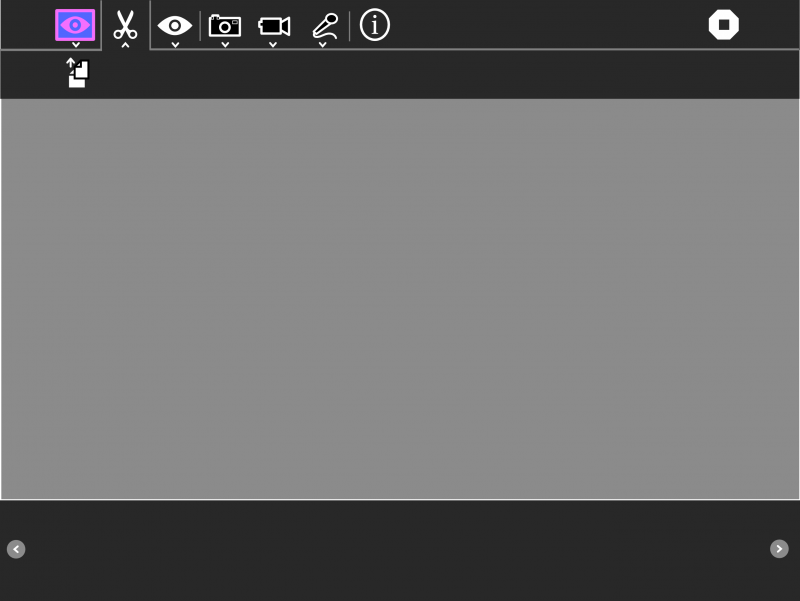
- we add an edit button to the toolbar including a copy button
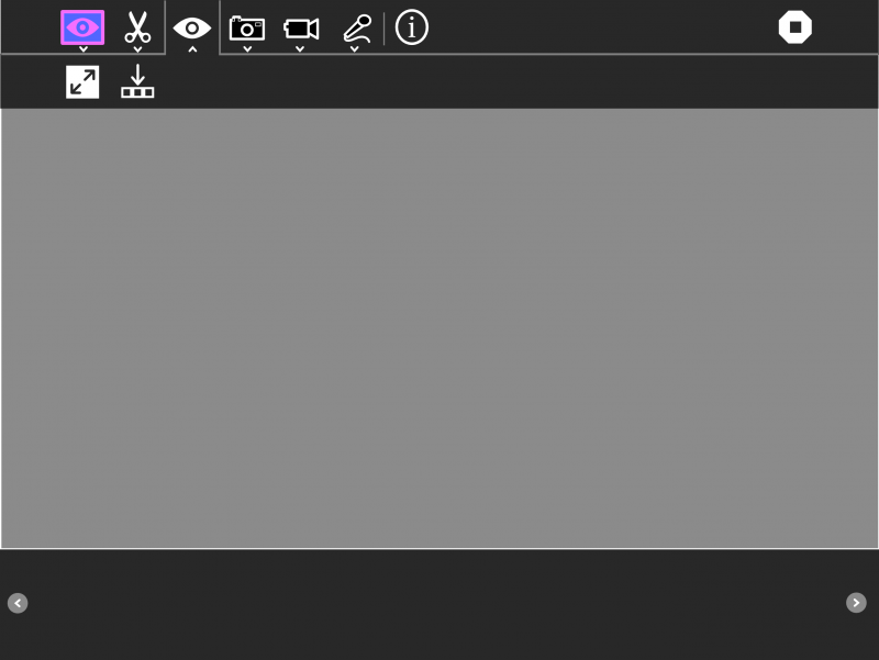
- we add a view button (fullscreen, show/hide mediabox)
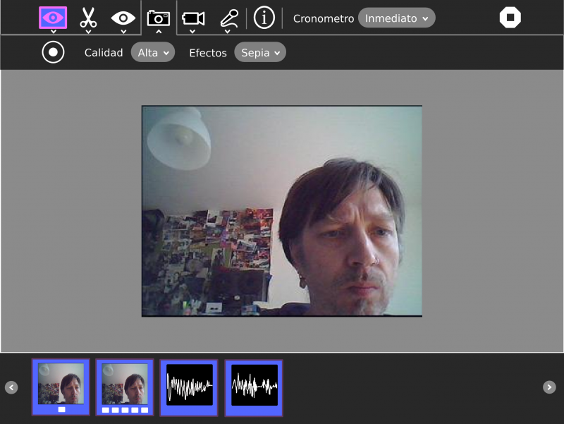
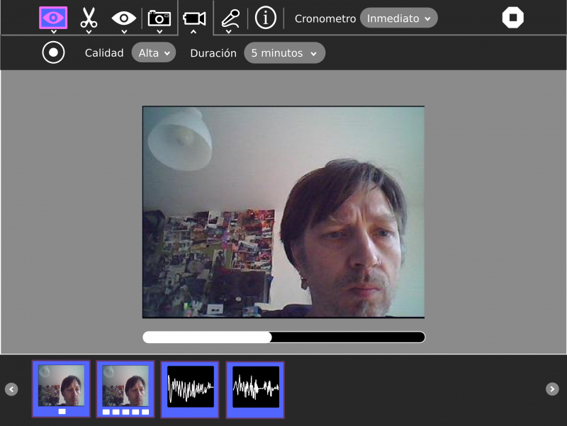
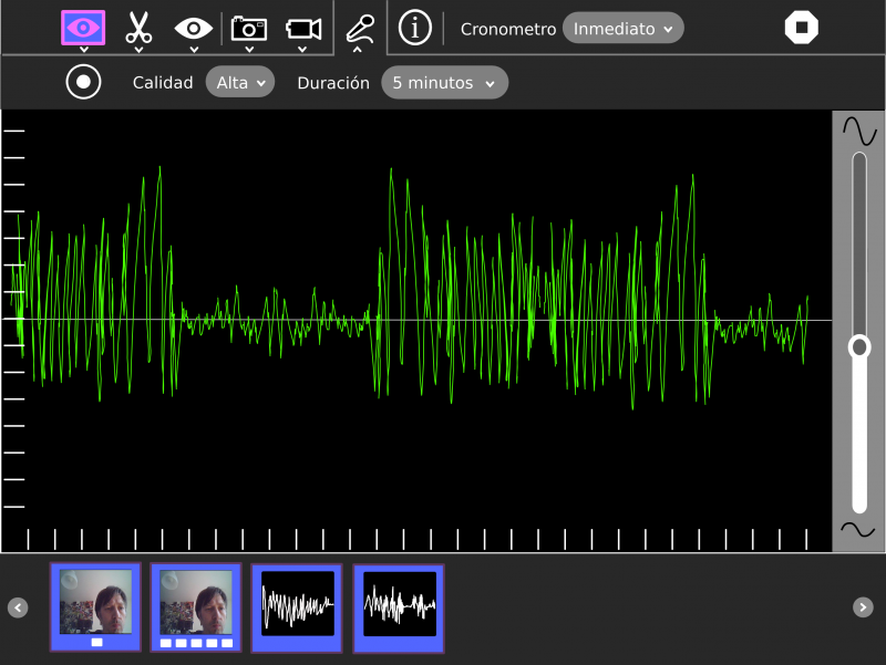
- then we add a button for each mode (photo, audio, video), every mode button has a toolbar with the properties like (duration, quality) and a button to start the recording (use the the circle to match the physical button)
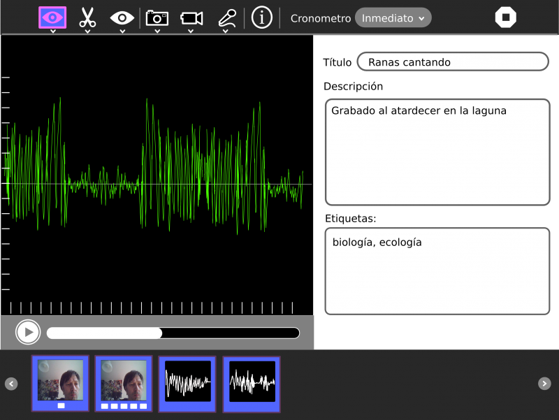
- we add a 'take note'/'playback' mode: plays back the media and gives an option to take notes (title, description, tags)
- we only show the mediabox when we have an item (we call mediabox to the box in the bottom of the screen)
- the mediabox must have a similar behavior to the bookmarks box in Browse for consistency.
- we will show all the medias in one box
- (sharing: sync the mediabox)
- if you select an item in the mediabox we switch to the 'take note'/'playback' mode
- the 'record audio' will show a preview similar to the measure one
- the recording level will be adjustable in the activity
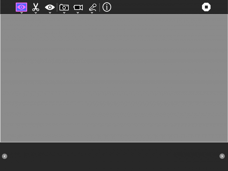
Main Toolbar
Edit Toolbar
- Add consistency and is easier found the copy button.
View Toolbar
- We can show/hide the mediabox or show the media in the full screen.
Toolbars for photo, video and audio modes
- May be we must move the chronometer combo to the secondary toolbar.
- All the media, photo, video, audio is in the same mediabox, to emphasize the idea of project.
Info / Playback / Take notes toolbar
- We need a better icon.
- Can we save to the Journal every metadata change (on exit of inputs) or we must add a button to accept the changes?
