OLPC Human Interface Guidelines/The Sugar Interface/Controls/Basic Selection Controls
Jump to navigation
Jump to search


Checkboxes

Usage:
Behavior:
Guidelines:
States:

Radio Buttons

Usage:
Behavior:
Guidelines:
States:

Popup Menus

Usage:
Behavior:
Guidelines:
States:


Popup Palettes
Usage:
Behavior:
Guidelines:
States:
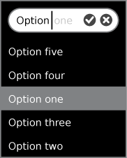
Combo Boxes

Usage:
Behavior:
Guidelines:
States:

