User:Ndoiron/SocialCalc
Charting improvements to the SocialCalc Activity.
Test the code with a Firefox browser here
Pie and line charts are produced with the same steps as bar charts in the current version.
This page serves as a guide/lesson plan for producing different types of charts.
Bar Charts
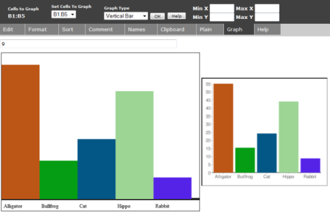
The current version of SocialCalc supports bar charts. You can use a bar chart to compare different values to each other.
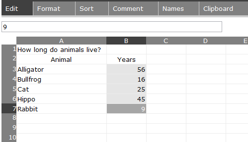
For example, you can make a bar chart that compares the lifespan of different animals.
- 1) Make a list of animals
- 2) To the right, make a list of animals' lifespans
- 3) Click and drag to highlight the list of numbers
Click the Graph tab to see the bar chart
Pie Charts
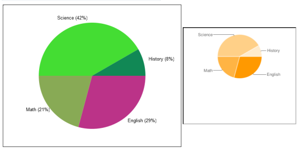
You can use a pie chart to compare fractions making up the whole.
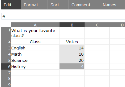
For example, you can make a pie chart that shows how people divided for a vote on their favorite class.
- 1) Make a list of classes
- 2) To the right, put a count of how many people voted for that class
- 3) Click and drag to highlight the list of numbers
Click the Pie tab to see the pie chart - if you are connected to the Internet you can view the second chart (generated by Google).
Click the Pie tab again if you want to change the colors of the pie pieces.
Line Charts
You can use a line chart to see a value change over time, compare multiple values over time, or show the relationship between any two variables.
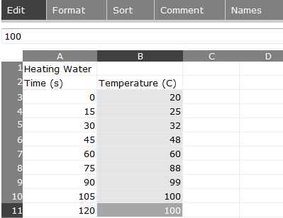
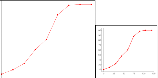
For example, you can make a line chart showing how temperature of water changes as it is heated. In this experiment there were measurements every 15 seconds, but you could use an irregular list of times, like (-1, 4, 5, 7, 8.5)
- 1) Make a list of times
- 2) To the right, make a list of temperatures
- 3) Click and drag to highlight the list of numbers in the right column
Click the Line tab to see the line chart - if you are connected to the Internet you can view the second chart (generated by Google).
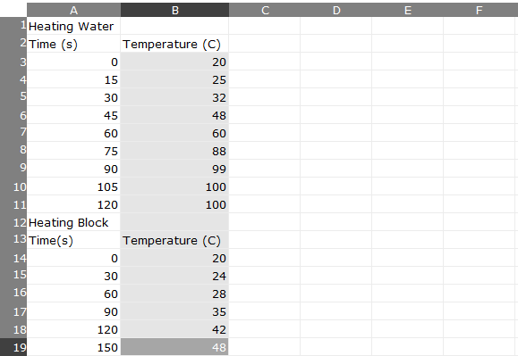
You can also make a line chart with more than one line. Click on the Edit tab and add a second list of numbers. These show the temperature of a block over time. The experiment with this block takes longer and is measured at different intervals.
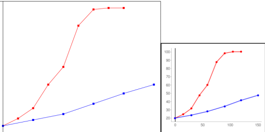
Click the Line tab to see the new line chart. Both the larger chart and the Google image chart show the second line as blue.
How does the system know that there are two lines? It looks in the left column, and if the next number in the list is a lesser number, it starts a new line. If you are making two lines that do not overlap, make sure to list the right-most line's values first.
Programming Notes
The chart is generated twice, using the HTML Canvas element and the Google Charts API. This allows users to view charts while offline, with the more professional chart images possible with an internet connection.
When programming the Canvas element, use deprecated Mozilla-specific code such as mozDrawText and mozTextStyle - newer methods like fillText are not supported by the laptop.
The Google Charts API produces a professional chart image, but has some quirks. The parameters for the chart are written at the same time as the graph is drawn onto the canvas.
