OLPC Human Interface Guidelines/The Laptop Experience/The Frame
The Frame
Always Available on the Periphery
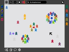
Glancing at the previous screen shots, you might have noted the absence of a menu bar or other form of persistent interface element. Such a persistent element reduces the screen space available for activities; since screen is at a premium, we have opted to use a frame—always on the periphery and just out of sight—to contain all of the peripheral information that a child might need, across all views. Since the Frame persists at all zoom levels, it provides a consistent place for those interface elements which apply to all views, including search, incoming invitations and notifications, a clipboard, and buddies you are currently interacting with.
When activated, the Frame slides in atop the currently visible view, providing access to needed functionality, yet quickly retracting from view once the task for which the child invoked it ends. Although these transitions happen quickly, a forgiveness parameter prevents unintentional Frame retraction in hopes of making interaction with this interface element completely natural.
Frame Components & Organization
| API Reference |
|---|
| Package sugar.shell.view.frame |
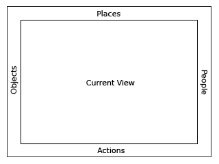
At a high level, one can consider the frame in two parts: The left, top, and right sides of the frame represent nouns: things, places, and persons. The bottom of the frame represents those elements that require action: activities, invitations, and notifications. More specifically, each edge of the frame is dedicated to one of people, places, objects, or actions.
People
| API Reference |
|---|
| Module: ...frame.FriendsBox |
| Module: sugar.shell.model.BuddyModel |
As previously mentioned, the presence of others on the mesh defines much of the laptop experience. In order to surface this at all times in the interface, the right-hand edge of the Frame provides an easily accessible list of all the individuals a child is collaborating with in the currently active activity, represented by their colored XOs. This has a number of benefits. First, it provides a quick reference to the people the child is working with, which updates as new people join and others leave. As new people arrive, they appear in the upper right corner, and as they leave they simply vacate their current location. Additionally, the secondary rollovers for these XO objects reveal biographical information about them: name, age, class, interests, and even a small photo. This makes the frame a great resource for meeting new friends, for what better place to meet them than in the activity shared with them?
Places
| API Reference |
|---|
| Module: ...frame.ZoomBox |
Of the various frame components, the Places category is the most abstract. However, it also emphasizes the metaphors that the zoom levels build upon. In the upper left-hand corner reside the zoom buttons, which can instantly transition the user among the Activity, Home, Groups, and Neighborhood views. For clarity, the upper left-hand function buttons on the keyboard have identical icons and functionality.
On the other side of the Places edge resides the Bulletin-Board button. Again, this button has an analogous key on right-hand side of the keyboard's function keys. Discussed later, this button acts as a toggle for an auxiliary layer which can provide contextual chat and a place to share objects. This button functions within the Places bar because it acts as a modifier to any view. In a sense, it adds an additional layer of context to any other "place" on the laptop.
Finally, though not less importantly, this section of the Frame contains the global search field.
Objects
| API Reference |
|---|
| Module: ...frame.clipboardpanelwindow |
The clipboard has become a staple in any modern operating system. Nonetheless, its implementations have changed little, if at all, in decades. The clipboard has one "page", to which you can copy to, cut to, and paste from, and in most cases this hypothetical page remains invisible: to see what's on it, you've got to paste its contents. While this isn't strictly true (On Mac OSX, for instance, an item at the bottom of the 'Edit' menu allows you to 'View Clipboard Contents'), most users are oblivious about viewing its contents, as one must explicitly seek it out. This basic model, while simple, often falls short of many use cases. Thus, OLPC has extended the traditional clipboard, empowering the user with added functionality without increasing complexity.
On the laptops, the clipboard takes the form of the left-hand edge of the frame. This region serves as temporary storage for objects - a paper, an image, a sentence, a URL - facilitating their transfer among activities and, perhaps more importantly, among the various zoom levels. Any type of object that can be stored in the Journal can likewise be transported via the clipboard. A child may place an object on the clipboard in a couple of convenient ways. First, keyboard shortcuts will provide an interface for simple copy and paste functions in the way already familiar to us. Additionally, since objects support direct manipulation, the child may simply drag a photo, file, or selection onto the frame in order to copy it, and may then drag it out to paste it in another location, such as within another activity, on a friend, or to a Bulletin Board. As items are placed on the clipboard, they are arranged temporally in a push-down stack, the most recent clipping appearing in the upper-lefthand corner of the frame.
With the presence of a clipboard which contains multiple items, it becomes necessary to add a means for selecting an active clipping as the source for any paste command. Since the usual copy/paste keystrokes will quickly become familiar to all, any invocation of the copy shortcut will automatically place the resulting clipping at the top of the stack, selecting it as the source, so that a subsequent paste command behaves as expected. When not using these traditional shortcuts, a single click on any object in the clipboard will select it, visibly indicating it as the new source. Additional copy commands (or drags) will continue to add elements to the clipboard stack. Once the clipboard reaches a predefined limit, the elements at the bottom of the stack will begin to drop off making room for the new ones. Elements may also be removed explicitly by the user via their contextual rollover, and a modified paste shortcut for advanced users will serve to both paste an item and pop it from the stack at the same time.
The resulting clipboard will behave identically to those on current operating systems, while at the same time providing drag and drop support, clipboard history, and previews, as well as advanced functionality for advanced users.
Actions
| API Reference |
|---|
| Module: ...frame.ActivitiesBox |
The bottom edge of the frame functions primarily as an activity launcher, but it also accumulates both incoming invitations and notifications. As a starting point for instantiating activities, this part of the frame is fairly straightforward. Whenever an activity receives a click, a colored instance of that activity appears within the activity ring in the child's own colors, and invitations are automatically sent as appropriate. On the other hand, anytime the child receives an invitation it appears as a colored activity icon (in the color of the inviting XO, of course), clearly distinct from the uncolored outlines of the activities which reside on the child's own machine. Since an invitation to join an activity has no functional differences from starting, the invitations appropriately indicate this by their similar form. The rollover state for these invitations allows the child to accept or decline the invitation, optionally providing a reason for declining.
Notifications, the third aspect of the Actions edge of the frame, function slightly differently. While they don't represent an activity that the child can join, they do come as messages from activities or from the system, conveying important information about the state of the activity or system status such as battery strength or wireless signal. Though slightly different from activities and invitations, these notifications still require some action on the child's part, and are an appropriate addition to the frame which provides a convenient way to access them from within any view. Just as in the other edges of the frame, invitations and notifications organize by time, the most recent always in the lower left-hand corner, so that the child may handle them in a timely manner.
Activation Methods
The Frame has multiple activation methods.
Hot Corners
Hot corners serve as the Frame's primary invocation method. As Fitts' Law implies, the corners are the easiest part of the screen to hit with a cursor. Moving the cursor to any corner of the screen will instantly invoke the frame. From a corner, one can readily scroll along an edge in search of a desired element. Since newly added people, objects, and invitations insert from the corners, the latest invitation, clipping, or participant is always close at hand.
Function Key
In addition to trackpad-based activation, the information within the Frame lies just one keystroke away. A dedicated key has two modes of functionality: (1) momentary presses act as a toggle, turning the Frame on and off with each press; and (2) holding the key down, the Frame will appear on screen until release of the key. This latter method provides a quick way to glance at incoming invitations or other system status elements for a brief moment and then return full focus to the activity view itself.
Notification Overrides
Though rare, some urgent notifications such as low battery levels may override the Frame, automatically bringing it into view without user interaction. These overrides come from the system only; applications do not have privileges for override, although they may alert the user via standard notifications.

