Talk:OLPC Devanagari Keyboard
Notes for the next update : some of the keys on the right-hand side of the keyboard aren't centered (devanagari chars are left and a bit below optimal), and the upper-right key should have perhaps 90%-reduced chars to fit. 01:44, 14 October 2007 (EDT)
Glyph alignment
Some options re glyph alignment. Please comment.
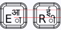
Offset, but aligned
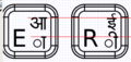
Aligning horizontally, but distorting characters vertically
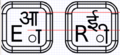
Maximum size, but ignoring horizontal and vertical alignments


--Walter 12:09, 14 October 2007 (EDT)
- Regarding the vertical alignment, the top two options represent the correct vertical alignment and the third one represents an incorrect vertical alignment. --Arjs 13:58, 14 October 2007 (EDT)
- Not sure why the image captions weren't showing up before. Is vertical alignment more important than glyph size? Is horizontal alignment important? --Walter 14:19, 14 October 2007 (EDT)
- Vertical alignment is highly important - first and second ones are examples of correct vertical alignment (Vertical alignment is more important than glyph size). Horizontal alignment is also important. IMHO second one (the one in the center) is the best. However, we should get more feedback on this, I have written on OLPC-India mailing list requesting feedback.--Arjs 15:44, 14 October 2007 (EDT)
- Option 1 seems to be the most visually appealing to me. However, this kind of glyph alignment may be difficult to implement in certain cases (eg: what if character aa, U0906 needs to be combined with vowel sign ii, U0940 ?) Between horizontal and vertical alignment (or no alignment all), I would suggest that more importance be given to vertical alignment, since our writing system makes to mandatory to align all our glyphs in line with the top horizontal bar present in most of the characters. In such a situation, Option 3 should be avoided and Option 2 seems to be the safest one. -- Sayamindu 17:26, 14 October 2007 (EDT)
- Vertical alignment of all glyphs is definitely important, as thats how we write in hindi. The second layout appears to be the neatest when compared to the others. The offset in the first layout however does a good job of differentiating between the two characters. IMHO a reduction of the english character font size might slightly improve the readability (and maybe reduce a bit of clutter, the keyboard seems too full of characters) in case of alignment 1 or 2. Hemant goyal 13:37, 17 October 2007 (EDT)
- There is a 4th option: use a font size that will allow all characters to fit. AlbertCahalan 17:05, 14 October 2007 (EDT)
I've made a version using approach 2 above (See Image:MR-MP-v2.png). --Walter 16:26, 15 October 2007 (EDT)
Use of circle to denote vowel signs and virama
The vowel signs on the keyboard (as well as the Virama/Halant) are preceded by a circle. Rendering engines use the circle (U+25CC DOTTED CIRCLE to be exact) to do fallback rendering for invalid combining marks (ie, a standalone vowel sign). This behaviour is documented in the Unicode standard 5.0 (section 5.13, Rendering Nonspacing Marks, pg 173). I was wondering if this behaviour is required for the keyboard as well. In all our textbooks (language primers), no such circle is used to indicate vowel signs. This may create confusion among the children, since such a circle does not exist in the Devanagari alphabet. On the other hand, it might also serve as a good indication that the characters with a circle before/under/after them in there are dependant ones.
- I've done this for some keyboards (URDU for example) and not for others. I again defer to the local experts. (Note that I had used U+25CC, but the printer complained that the detail of the dashed line was too fine to print clearly at such a small scale, so I switched to the solid circle.) --Walter 16:28, 15 October 2007 (EDT)
- Just noticed that Wikipedia has an image of a Devanagari typewriter keyboard, at http://en.wikipedia.org/wiki/Image:Hindi_typewriter.jpg. It does not use the dotted circle. -- Sayamindu 10:04, 16 October 2007 (EDT)
- I've made a version without the dots Let me know what you think. --Walter 14:13, 16 October 2007 (EDT)

- I prefer the circles. Old technology like typewriters don't need circles because the character set is fixed and small. There are only about 50-60 glyphs. The situation is different with unicode. As you know, there are about a zillion glyphs available in unicode so it's really important to try to avoid ambiguity. The circles help with that. Otherwise an English colin looks the same as U+903 and period is very similar to U+93c. I'm not sure why gucharmap 1.10 no longer draws a dotted circle but I think omitting the circle is a mistake. 128.223.147.173 16:46, 16 October 2007 (EDT)
- The solid line is an artifact of the supplier telling me that they cannot print a fine dashed line on the keyboard surface. --Walter 17:06, 16 October 2007 (EDT)
- I agree with others that a dotted circle is a good indication for a "dependant" character, ie a character which is not supposed to be written as a standalone entity.
- My only gripe with the use of the dotted circle is that it was originally designed as a fallback mechanism for rendering, as per the Unicode specifications :-)
- In fact, rendering engines are supposed display standalone vowel signs (ie, without the dotted circle) if the combination <space><zero width joiner><vowel sign> is used. I think that's what Gucharmap uses to render the standalone characters.
- Anyway - I guess I'm being too much of a nitpick :-) -- Sayamindu 15:39, 18 October 2007 (EDT)
- It isn't nitpicking. I look to you (collectively) to decide whether the circle is helpful or a distraction for the children. --Walter 16:02, 18 October 2007 (EDT)
- I would say that the layout without the circles look a lot more cleaner. Moreover, our (language) primers do not mention any dotted circle. Children who will be using the OLPC would probably already be familiar with the alphabet, so I do not think the circle on the physical keyboard itself adds any significant value. In fact, it might confuse the child, who might be looking for a standalone matra (dependant vowel sign) sign on the keyboard. If asked, I would vote against the inclusion of circles. --Sayamindu 13:55, 21 October 2007 (EDT)
- Well, you need something. It could as well be a filled-in circle or an XO logo. Without something there, lots of the combining characters look indistinguishable from each other and from other things. It's also easy to think that the keyboard is broken (hardware or software) when a key with a symbol on it fails to type. I think there are a few of these on the US International keyboard as well. AlbertCahalan 02:35, 19 October 2007 (EDT)
a few points
- the circle below/over each matra (accents) makes the entire layout a bit crammed. It s too full with characters..
- however the circle does provide a means to find the positions of all matras easily on the keyboard layout. matras like '.' can often become hard to find without the circle.
- a circle can also provide some intuition to the child - by this i am implying that the child will be able to figure out that hindi character must replace the circle. The circle will also assist the child in finding out the correct position for the matra[ie over/under the character]. This would not be so apparent in the other layout. It will surely help in speeding up the learning how to write hindi in general as far as a child is concerned. I hope the point I am making is clear..
- what is the need for having the circle on the 'J' key? Why does'nt the 'v' key have a circle in that case?
Switching between two keyboard modes
One can switch between two keyboard layouts/modes by pressing the key which is below Enter key and to the right of the up-arrow key.
Adding a new font to Sugar
To add a new font, put the font in /usr/share/fonts/ and rebuild the font cache by
fc-cache -f
XKB Symbol File
Please have a look at the XKB symbol file. In-case of any deviations, please feel free to make changes in the symbol table. Kindly report about your changes here.
We look forward to your feedback on it.
Please use this notation - U0930 for character codes, so instead of 0x1000930 use U0930 etc.. - Karunakar
I think र्, ज्ञ, त्र, क्ष, and श्र should be mapped onto $, %, ^, & and * respectively according to the inscript standard keymap. - Rahul B
Yes, I also think and recommend that र्, ज्ञ, त्र, क्ष, and श्र should be mapped onto $, %, ^, & and * respectively. Ravishankar Shrivastava