Flatland: Difference between revisions
| Line 78: | Line 78: | ||
The scrapbook activity is a more permanent place to deposit things you've picked up in the overlay. It's a great big 2.5-D canvas where you can drop anything. Initially it's just a collection of bitmap images, where each one has a place in the z-ordering. |
The scrapbook activity is a more permanent place to deposit things you've picked up in the overlay. It's a great big 2.5-D canvas where you can drop anything. Initially it's just a collection of bitmap images, where each one has a place in the z-ordering. |
||
Steps 1 and 2 get you quickly to a information-gathering tool |
{{payoff|Steps 1 and 2 get you quickly to a information-gathering tool. You can save anything you've seen to look at later or to show your friends. You can also organize the things you've collected. You can do a lot just by moving around images: you can play practically '''any board game at all'''! You can make magnetic poetry. You can make a photo collection. The scrapbook becomes a generic remixing tool for content.}} |
||
You can do a lot just by moving around images: you can make any board game at all; you can make magnetic poetry; you can make a photo collection. |
|||
===Step 2a. Pasting=== |
===Step 2a. Pasting=== |
||
Revision as of 01:29, 26 March 2007
From Scrapbook to Flatland:
Ideas for the XO's magnificent collaboration application, and how to get there incrementally
| Strangely, airplane flights seem to be a good place for generating ideas about the XO. Here are some thoughts I had on the recent trip home that grew out of the 2-D shared play space idea that I described at the Friday Fight on March 23. This document will evolve as the ideas evolve; I intend to fill it out with illustrations and more detail as time goes on. Also -- I know some of the ideas in here are already in the works, and some of them differ from what's been proposed for Sugar; I hope to start unifying some of these ideas once I've gotten the initial brain dump out. -- Ping, 2007-03-25 22:47 PST |
The ultimate vision is a flexible, extensible, collaborative space for storage (collecting and organizing ideas and content), creation (writing, drawing, and programming), and socializing (communicating, playing, and working together). That's a pretty broad vision, so it helps to figure out how we can get there by starting with something simple and immediately useful and adding to it, bit by bit, to get to something powerful and transformative. Also, if we start with something simple and flexible, we can open the doors to let everyone add to its capabilities.
Here's a plan for getting there. The idea is that at each stage you should have something useful and appealing, and each step should add exciting new functionality that integrates naturally with what's already there, multiplying the power of the existing functionality.
Please don't hesitate to post your thoughts and feedback!
Step 1. Clipboard
Here's an easy place to start.
Pressing the overlay button always brings up the overlay screen no matter where you are. Everything on the screen dims and the contents of the overlay appear on top.
The overlay screen is the natural place for a visual clipboard, with some advantages over today's clipboards:
- The overlay can hold multiple objects at once, unlike today's clipboards, which usually can only hold one. You can collect many things without losing what you collected previously.
- In today's clipboards, the content is invisible. You don't know what's in the clipboard until you paste it. But with an overlay clipboard, you can immediately see what's in it.
- In the overlay, you can put things anywhere you want. You can use spatial positioning to organize the things you've collected.
| Rationale: The clipboard has a limited size because it is a temporary place, and you don't want to lose track of things you put there. |
The overlay clipboard does not scroll. Anything you paste there stays put, just where you left it.
| Rationale: Toolbars make functionality discoverable. The overlay is a place to collect things and should support a series of collect operations or a series of paste operations to/from multiple activities or contexts. |
The overlay has a toolbar with tools that stay active until you switch to another tool. After you click on a tool, it remains the current tool even if you flip the overlay off and back on.
| Other options: The OLPC Human Interface Guidelines suggest that there be separate Bulletin Boards for each level: a Home View bulletin board, a Friends View bulletin board, a Mesh View bulletin board, and Activity bulletin boards for each Activity. My opinion is that it will be too confusing to keep these all straight, so this proposal suggests a single overlay plane with a consistent appearance, accessible from anywhere. Less modality is better. -- Ping 19:49, 25 March 2007 (EDT) |
Long-term vision: The overlay is the lightweight place to collect and create things. Initially it's just a place to collect, and it can grow to become a place to jot a note or make a quick doodle by adding just a few simple tools.
You shouldn't have to start an entire activity to make a note to yourself. Starting an activity is currently quite heavyweight, not just in the time it takes, but in complexity of user interaction, since it creates a whole new context. The overlay is your constant companion -- the context you carry around with you all the time, available instantly.
Step 1a. Screen grabs
Screen grabs are the lowest-hanging fruit here, because the concept of a screen grab makes sense in every activity and it can be implemented uniformly.
Payoff: Once you have screen grabs, you can leverage all the activities to create clippable content. You can pick up a bitmap image of whatever you drew in the paint activity, whatever you've written in the text editor, anything you've seen on a web page, etc. The image you pick up won't be live, but visual constancy will make the meaning of this operation very direct and easy to understand.
| Rationale: Direct manipulation. The first time you try this, it becomes obvious what the tool does. |
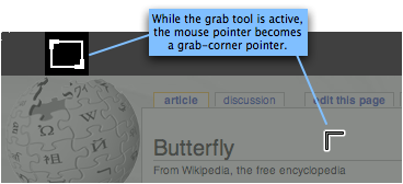
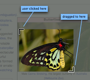
There is a "screen grab" icon on the overlay toolbar. To grab a clip, you activate the overlay, then switch to the screen grab tool if necessary. Drag out a rectangle over the dimmed screen to "pop" that rectangle up to the overlay; the clipped rectangle appears undimmed.
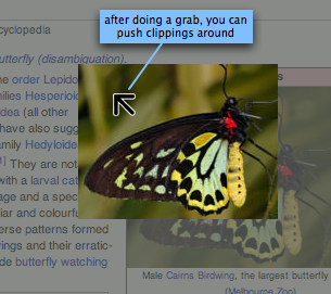
While the "screen grab" tool is active, dragging in the empty area cuts out a new screen clip; dragging over an existing clip moves the clip around. The pointer changes to indicate what will happen: it becomes a "cropping corner" in empty areas, and an arrow pointer when you're over an existing screen clipping.
| Rationale: It should be fast and easy to clean out lots of stuff, because the overlay is only for temporary storage. |
There is an "eraser" icon on the overlay toolbar. When this tool is active, anything you click disappears. You can wipe out lots of items by dragging the eraser around. An "undo" button recovers what you just wiped out.
| Other options: We may need to experiment with this a bit to find out whether the eraser should be a temporary mode, flipping automatically back to the last tool when you use it or when you leave the overlay. It doesn't seem that useful to stay in eraser mode when you leave the overlay and come back to it. |
Step 1b. Other types of elements
After screen grabs are working, we can add support for copy and paste across applications. Plain text could be the next easiest and most essential thing to do; then perhaps URLs, then formatted text, and then other media types like vector graphic objects and audio clips.
Each media type should have a Python class that implements a standard API. The standard API needs to support visual rendering and serialization and can have hooks for interaction events (behaviour in response to a click, etc.)
For invisible types like audio clips, the graphical representation that appears on the overlay should visually indicate the size/length of the object.
Step 1a is all that's necessary to move on to Step 2; Step 1b can start taking place in parallel.
Step 2. Scrapbook
The scrapbook activity is a more permanent place to deposit things you've picked up in the overlay. It's a great big 2.5-D canvas where you can drop anything. Initially it's just a collection of bitmap images, where each one has a place in the z-ordering.
Payoff: Steps 1 and 2 get you quickly to a information-gathering tool. You can save anything you've seen to look at later or to show your friends. You can also organize the things you've collected. You can do a lot just by moving around images: you can play practically any board game at all! You can make magnetic poetry. You can make a photo collection. The scrapbook becomes a generic remixing tool for content.
Step 2a. Pasting
Proposed UI: To put things in your scrapbook, you paste them from the overlay. One of the tools on the overlay toolbar is the "paste" tool; with this tool active, anything you click gets pasted.
Rationale: Modality sucks, but we want to easily let you paste multiple copies of an object or many objects in a lightweight way. We could also add "paste" to a right-click context menu on overlay objects, for times when you want to paste one thing without having to switch tools.
Step 2b. Manipulating
Proposed UI: The scrapbook has a toolbar also, initially with just one tool: the pointer. Use it to drag objects around. Initially, the click-down can do hit testing just according to the bounding box of the bitmap.
Rationale: Direct manipulation.
Step 2c. Scrolling
Proposed UI: The scrapbook is infinite. (Maybe it should be only vertically infinite and horizontally large but finite, so you don't get lost.) There is no "save" and "load"; there is only one scrapbook, and it goes on forever. Everything you put here is instantly saved automatically.
Rationale: This is a place where you can store your whole life, if you want. "Save" and "load" are confusing and a hassle.
Proposed UI: To pan the view in any direction, hold down either "hand" button and drag with the touchpad. This should always work, in any context (even mid-operation) and no matter what other tool is active.
Rationale: This is what the "hand" buttons are intended for. It's non-modal (quasi-modal). Non-modality is good.
Proposed UI: There is a "hand" tool on the toolbar that permits scrolling also (but modally). It looks just like the keyboard "hand" key.
Rationale: This makes scrolling discoverable. Once it's obvious how the toolbar button works, it's a small step to try the keyboard button and move to more advanced (non-modal) usage of the same tool.
Step 2d. Transparency
When we support transparency, hit-testing can test for an opaque pixel. This makes it easy to manipulate shaped objects.
This is how you share anything. Once you can copy and paste into your friends' scrapbooks, you can give anything to your friends, and pick up anything your friends want to share with you.
This is also a place you can start to work together. You can collaboratively organize things here (e.g. invite your friends to help you organize your photo collection).
Step 3a. Invitations
Step 3b. Talking pointers
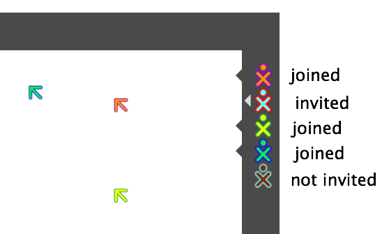
Everyone can see everyone else's pointers. The stroke and fill colour of the pointer matches the stroke and fill colour of your XO icon.
When you type, a speech bubble appears next to your pointer. Now the scrapbook is a place for free-form chat.
Step 3c. Manipulation of remote objects
Step 3d. Copying and pasting in a remote scrapbook
This is pretty straightforward: you just bring up your overlay on top of your friend's scrapbook, and use the same copy and paste functions you're used to.
Step 3e. Access control
Whenever you invite friends into your scrapbook, your friends are limited by a rectangular fence. Initially the fence is the current screen boundary: by default, your guests cannot modify things that you can't see. But you can drag the edges of the fence to make a bigger space for them to play in, if you want. Or you can draw a big fence before inviting them.
Fences stay up; when you invite a friend by dropping them into a fenced area, that becomes the current fence.
Wire Protocol
Need to define a wire protocol for this. Updates to the scrapbook go over TCP; they need to be reliable and sequenced. Mouse pointer location updates can use UDP or some faster but less reliable protocol, since you only need to see the most recent pointer location.
Step 4. Drawing
Create objects directly in the scrapbook. You can incorporate all the basic MacDraw tools here.
Undo only has to undo. Redo might not be necessary, since you can always "branch" by picking up a copy of the current object into your overlay. (In existing programs, undo and redo are necessary because there is nowhere to paste a copy of what you're working on -- the paste is itself an operation that affects your undo history. But with the overlay, you can copy and paste "out of band" without affecting your undo history.)
Colour chips for fill and stroke colour.
Templates full of objects to deposit on your canvas.
Now you can collaboratively draw. After Step 4, we should be able to start "eating our own dogfood" -- using Flatland for our own design discussions about XO apps and user interfaces (including using Flatland to talk about Flatland!).
Step 5. Writing
Step 6. Revision control
Draw a "time machine box" around any part of the scrapbook. Now everything that happens in the box from that point forward is revision controlled. Click the "forward" and "backward" buttons on the time machine box to step forward and backward. Moving objects in and out of the box brings them into and out of revision control.
Step 7. Programming
This is where Logo turtles should live. Write a program; create a turtle and let it draw on your scrapbook. Let your friends pick up the turtle and drop it in their scrapbooks too, then edit the code to make new turtles they can give back to you.
This is where you should also be able to program your own interactive objects: widgets, charts, graphs, equations, and so on.


