GTK for OLPC: Difference between revisions
(swizzle) |
(fixed link) |
||
| (17 intermediate revisions by 6 users not shown) | |||
| Line 1: | Line 1: | ||
This is the wiki page for the "GTK+ for OLPC" project, as a "Summer of Code" project. The student is [http://www.manucornet.net Manu Cornet], mentor is [http://primates.ximian.com/~federico/ Federico Mena-Quintero]. You can find the initial goals of the project on the [[OLPC Google Summer of Code]] page. |
This is the wiki page for the "GTK+ for OLPC" project, as a "Summer of Code" project. The student is [http://www.manucornet.net Manu Cornet], mentor is [http://primates.ximian.com/~federico/ Federico Mena-Quintero]. You can find the initial goals of the project on the [[OLPC Google Summer of Code]] page. And here is [http://dev.laptop.org/git.do?p=projects/soc-gtk;a=summary the git tree of this project] (with all the code). |
||
If you want to checkout the code for this project, just do: |
|||
git-clone git://dev.laptop.org/projects/soc-gtk |
|||
== GTK theme/engine torturer and crash tester == |
== GTK theme/engine torturer and crash tester == |
||
| Line 10: | Line 14: | ||
* It takes each one of the gtk_paint_* functions (implemented by the engines themselves) and tries all possible parameters configurations, including unusual values to see if the engine crashes. |
* It takes each one of the gtk_paint_* functions (implemented by the engines themselves) and tries all possible parameters configurations, including unusual values to see if the engine crashes. |
||
The program also outputs detailed time measures (thanks to Federico's widget profiler infrastructure, which I tweaked a bit for the torturer). |
The program also outputs detailed time measures (thanks to Federico's widget profiler infrastructure, which I tweaked a bit for the torturer). It also supports an non-interactive mode (thanks to Fernando Herrera) on the command-line, and XML output (thanks to Frederic Peters). You can get the code from the project's git repository. |
||
The current version of gtk-theme-torturer is [http://www.manucornet.net/pub/olpc/gtk-theme-torturer/ here] (current tarball in the parent directory). Possible future enhancement: currently, the detailed log is sent to stdout. It would be more convenient to let the user choose (GtkFileChooser) a log file. |
|||
[[Image:Torturer.png|320px|Theme torture]] |
[[Image:Torturer.png|320px|Theme torture]] |
||
| Line 19: | Line 21: | ||
=== A few observations === |
=== A few observations === |
||
I have made a small analysis on a few themes' performance, see the [http://www.manucornet.net/pub/Themes_performance.ods results (spreadsheet)] and the [http://laptop.org/pipermail/devel/2006-August/001026.html original mail |
I have made a small analysis on a few themes' performance, see the [http://www.manucornet.net/pub/Themes_performance.ods results (spreadsheet)] and the [http://lists.laptop.org/pipermail/devel/2006-August/001026.html original mail mentioning the results]. |
||
Note that all themes crash on a particular parameter set of gtk_draw_handle (GTK_STATE_NORMAL, GTK_SHADOW_NONE, GTK_ORIENTATION_HORIZONTAL, detail = NULL, width = height = 1, area = (0, 0, 1, 1)), still need to figure out why. |
|||
== Simulation Tools == |
== Simulation Tools == |
||
| ⚫ | |||
I made a hack for Xephyr to let it emulate "color swizzling". The laptop's DCON chip basically only selects the red signal for the first pixel, the green signal for the second pixel, etc., following this pattern : |
I made a hack for Xephyr to let it emulate "color swizzling". The laptop's DCON chip basically only selects the red signal for the first pixel, the green signal for the second pixel, etc., following this pattern : |
||
[[Image: Swizzling.png]] |
[[Image: Swizzling.png|200px|center|Swizzling]] |
||
The swizzling mode also performs a very simple antialiasing filter on the image, the matrix of which is : |
|||
The patch is [http://dv8.org/~fragmede/xephyr_swizzle_opt.diff here]. Apply it to the hw/kdrive/ephyr directory. It adds a '-swizzle' option to Xephyr to switch between the two modes. |
|||
<center> |
|||
=== Color swizzling === |
|||
<table cols="3" border="0" cellspacing="15"> |
|||
<tr><td></td><td>1/8</td><td></td></tr> |
|||
<tr><td>1/8</td><td>1/2</td><td>1/8</td></tr> |
|||
<tr><td></td><td>1/8</td><td></td></tr> |
|||
</table> |
|||
</center> |
|||
=== Postprocessing === |
|||
Here are some screenshots of the color swizzling in Xephyr: |
|||
Due to the fact that the swizzling mode discards 2/3 of the signal, the output is very dark: |
|||
[[Image:Swizzled_Firefox.png|320px|Theme torture]] |
|||
[[Image:Swizzled_Crash_test.png|320px|Crash test]] |
|||
[[Image:swizzle_dark.png|320px|center|Raw swizzled image]] |
|||
These are not really loyal to the actual appearance of the display, which will have a much better luminosity. However, it is good enough to start previewing the UI design and detect problems happening with small graphic elements (such as thin lines or small fonts). If you zoom on these screenshots, you'll be able to see the red-green-blue sequence as shown before. |
|||
In order to 'correct' this and get a luminosity that is relatively faithful to the real OLPC display, a postprocessing step (thanks to David Turner) restores, for each pixel, the two lacking color components. For a red pixel for instance, compute the average of the green pixels on its right and below it, and the average of the blue pixels on its left and above it: |
|||
| ⚫ | |||
[[Image: PostProcess.png|200px|center|Postprocessing]] |
|||
After the color swizzling, a bit of antialiasing is necessary to smooth things out. This is what the laptop does, and so does my Xephyr patch: see the difference between not-antialiased and antialiased modes (both are swizzled): |
|||
Thanks to this postprocessing, we can get much better visuals (click to enlarge): |
|||
[[Image:xephyr_swizzled.png|320px|Swizzle, no AA]] |
|||
[[Image:xephyr_swizzled_aa.png|320px|Swizzle and AA]] |
|||
[[Image:Swizzle enhanced.png|320px|center|Enhanced swizzle demonstration]] |
|||
'''Make sure you view those at 100%''', or the image resizing may look weird. |
|||
The patch is [http://www.manucornet.net/pub/olpc/xephyr_swizzle.diff here], or directly inside the project's git tree (simulation subdirectory). Apply it to the hw/kdrive/ephyr directory. It adds a '-swizzle' option to Xephyr to switch between the two modes (since 16 bit colors are closest to what the OLPC display will do, the '-swizzle' option automatically switches the server's depth to 16. |
|||
| ⚫ | |||
=== Shrinking === |
|||
I began hacking the theme by first making it more crash-proof with the torturer: [http://www.manucornet.net/pub/olpc/log_olpc_theme_torture.txt here is a short log about this]. The next big, very big issue, is performance: the theme is much slower than most other popular themes when using the torturer. I still need to make precise time measurements (very soon) with the (torturer + profiler). |
|||
The OLPC screen is very small, and has a resolution twice as high as our usual displays. Based on these observations, a "shrinking" process takes a 1200 x 900 pixels image and creates a 600 x 450 pixels image by reducing each group of four pixels into on as follows. For example, with a group of four pixels like this: |
|||
The first goal is to match [http://people.redhat.com/dfong/olpc/ Diana's mockups] the best I can while making a light/fast theme. An important issue will be to adapt the theme to the hardware constraints (high dpi value, color swizzling, greyscale mode, etc.). |
|||
[[Image: Shrink.png|200px|center|Shrinking]] |
|||
I will keep Marco Pesenti Gritti (marcopg) and Dan Williams (dcbw) posted on my progress and coordinate with them. |
|||
thus averaging the two blue pixels among the four (same process for other cases). |
|||
== Various enhancements == |
|||
The shrunk version of the above screenshot looks like this (click to enlarge). |
|||
'''Cursor blinking''' |
|||
[[Image: shrink_example.png|250px|center|Shrinking example]] |
|||
| ⚫ | |||
Shrunk images are a good preview of what the display would look like at a normal distance. If you measure their width on your screen, you shouldn't find something very far away from 15 cm (probably even a little larger). The unshrunk, swizzled images are a good preview of what you would see if you had a closer look, but of course they don't have the right visual dimensions. |
|||
== Review of theme elements on OLPC display == |
|||
[http://www.manucornet.net/pub/olpc/theme_and_display/ This page] shows a fairly extensive review of various GTK theme elements / graphic elements (fonts, thin lines, buttons, etc.) and how they would look on the OLPC display, using the simulation tools mentionned earlier. |
|||
| ⚫ | |||
One of the initial goals was to write a GTK theme for the OLPC. However, the whole UI being redesigned nearly from scratch, it would have been useless for me to work on the current theme's code (which will be discarded anyway). |
|||
However, I investigated a bit on which existing engine could be a good basis for the future theme. It turns out (after chatting with the gnome-art/gnome-engine guys, Federico, etc.) that [http://cvs.gnome.org/viewcvs/gtk-engines/engines/thinice/ ThinIce] is a pretty good choice, with probably a few elements from [http://cvs.gnome.org/viewcvs/gtk-engines/engines/clearlooks/ ClearLooks]. |
|||
Earlier in the project, I hacked the current theme (see the artwork module [http://dev.laptop.org/git.do?p=artwork;a=summary here]) by first making it more crash-proof with the torturer: [http://www.manucornet.net/pub/olpc/log_olpc_theme_torture.txt here is a short log about this]. Then I made some time measurements (see the torturer section, above) to compare it with ClearLooks/Human/HighContrast. |
|||
== Minor enhancement: cursor blinking == |
|||
| ⚫ | |||
This is done by : |
This is done by : |
||
| Line 70: | Line 94: | ||
</ul> |
</ul> |
||
A |
A final version of the patch (both for GtkEntry and GtkTreeView) is available [http://www.manucornet.net/pub/olpc/enhancements/cursor_blink_lifetime.diff here]. |
||
[[Category:Software development]] |
|||
[[Category:Developers]] |
|||
Latest revision as of 21:45, 12 October 2007
This is the wiki page for the "GTK+ for OLPC" project, as a "Summer of Code" project. The student is Manu Cornet, mentor is Federico Mena-Quintero. You can find the initial goals of the project on the OLPC Google Summer of Code page. And here is the git tree of this project (with all the code).
If you want to checkout the code for this project, just do:
git-clone git://dev.laptop.org/projects/soc-gtk
GTK theme/engine torturer and crash tester
The application
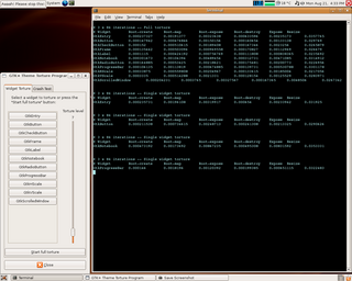
This "gtk-theme-torturer" is an application to detect performance issues in GTK themes/engines. It does two things:
- For each of the most common widget types (very easy to add some more), it packs an instance of it in a container, and resizes/redraws it many, many times. You can set a "pain level" to determine the number of times widgets will get redrawn while scaling.
- It takes each one of the gtk_paint_* functions (implemented by the engines themselves) and tries all possible parameters configurations, including unusual values to see if the engine crashes.
The program also outputs detailed time measures (thanks to Federico's widget profiler infrastructure, which I tweaked a bit for the torturer). It also supports an non-interactive mode (thanks to Fernando Herrera) on the command-line, and XML output (thanks to Frederic Peters). You can get the code from the project's git repository.
A few observations
I have made a small analysis on a few themes' performance, see the results (spreadsheet) and the original mail mentioning the results.
Simulation Tools
Color swizzling and antialiasing
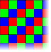
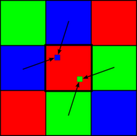
I made a hack for Xephyr to let it emulate "color swizzling". The laptop's DCON chip basically only selects the red signal for the first pixel, the green signal for the second pixel, etc., following this pattern :
The swizzling mode also performs a very simple antialiasing filter on the image, the matrix of which is :
| 1/8 | ||
| 1/8 | 1/2 | 1/8 |
| 1/8 |
Postprocessing
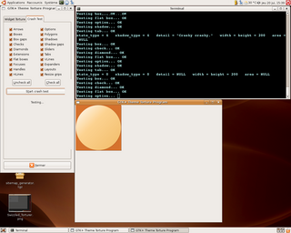
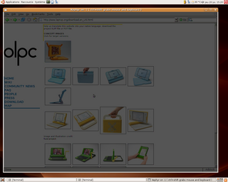
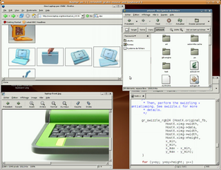
Due to the fact that the swizzling mode discards 2/3 of the signal, the output is very dark:
In order to 'correct' this and get a luminosity that is relatively faithful to the real OLPC display, a postprocessing step (thanks to David Turner) restores, for each pixel, the two lacking color components. For a red pixel for instance, compute the average of the green pixels on its right and below it, and the average of the blue pixels on its left and above it:
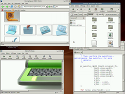
Thanks to this postprocessing, we can get much better visuals (click to enlarge):
The patch is here, or directly inside the project's git tree (simulation subdirectory). Apply it to the hw/kdrive/ephyr directory. It adds a '-swizzle' option to Xephyr to switch between the two modes (since 16 bit colors are closest to what the OLPC display will do, the '-swizzle' option automatically switches the server's depth to 16.
Shrinking
The OLPC screen is very small, and has a resolution twice as high as our usual displays. Based on these observations, a "shrinking" process takes a 1200 x 900 pixels image and creates a 600 x 450 pixels image by reducing each group of four pixels into on as follows. For example, with a group of four pixels like this:
thus averaging the two blue pixels among the four (same process for other cases).
The shrunk version of the above screenshot looks like this (click to enlarge).
Shrunk images are a good preview of what the display would look like at a normal distance. If you measure their width on your screen, you shouldn't find something very far away from 15 cm (probably even a little larger). The unshrunk, swizzled images are a good preview of what you would see if you had a closer look, but of course they don't have the right visual dimensions.
Review of theme elements on OLPC display
This page shows a fairly extensive review of various GTK theme elements / graphic elements (fonts, thin lines, buttons, etc.) and how they would look on the OLPC display, using the simulation tools mentionned earlier.
GTK+ theme engine
One of the initial goals was to write a GTK theme for the OLPC. However, the whole UI being redesigned nearly from scratch, it would have been useless for me to work on the current theme's code (which will be discarded anyway).
However, I investigated a bit on which existing engine could be a good basis for the future theme. It turns out (after chatting with the gnome-art/gnome-engine guys, Federico, etc.) that ThinIce is a pretty good choice, with probably a few elements from ClearLooks.
Earlier in the project, I hacked the current theme (see the artwork module here) by first making it more crash-proof with the torturer: here is a short log about this. Then I made some time measurements (see the torturer section, above) to compare it with ClearLooks/Human/HighContrast.
Minor enhancement: cursor blinking
I began with this (quite simple to do). The purpose is to let the cursor blink for a few seconds, then just stay on and stop blinking (affects GtkEntry and GtkTextView).
This is done by :
- Adding an XSetting called "gtk-cursor-blink-lifetime", which defaults to 5 seconds.
- Adding a timeout with the corresponding lifetime each time the code asks the cursor to begin blinking. When the timeout is over, the cursor stays on.
A final version of the patch (both for GtkEntry and GtkTreeView) is available here.
