Help:Sandbox: Difference between revisions
| Line 44: | Line 44: | ||
=== Test header with mismatched header marks (level 3 followed by level 2) == |
=== Test header with mismatched header marks (level 3 followed by level 2) == |
||
Test [[dummy link|font ''face'' stuff in '''alternate''' '''''link''''' text]] |
|||
== hello! == |
== hello! == |
||
Revision as of 20:03, 9 July 2006
| Cell 1, row 1 | Cell 2, row 1 |
| Cell 1, row 2 | Cell 2, row 2 |
My sandbox test
Testing italics with bold inside line.
Testing bold-italics with bold inside line.
Testing bold-italics with italics inside line.
Testing italics
across paragraphs.
Testing improperly nested bold and italics line.
Testing improperly nested italics and bold line.
Testing improperly nested bold-italics and italics line.
Testing improperly nested bold-italics and bold line.
Testing 'four' tics.
Testing 'six' tics.
Testing italics with bold-italics inside line.
Testing bold with bold-italics inside line.
Testing plain text line
followed by preformatted line
Test preformatted line
followed by plain text line.
= Test header with mismatched header marks (level 3 followed by level 2)
Test font face stuff in alternate link text
hello!
i started this new page so i could experiment a bit, i hope it's ok.
|
This is a little test of some stuff that might make a smaller box around some text. |
i see we have some nice editing buttons, including one for bold and another for italic. it would be better if those worked as we expected, and modified the selected text in the edit-field itself, rather than requiring the writer to jump through some hoops, but i guess as reminders they're better than nothing.
in general, i think "wiki markup" is the type of system that would give the _easy_editing_capability_ described on this "wiki as e-books" page as your fundamental goal.
but i believe that "wiki markup" is still too complicated...
i'll write more on this later, but for now, let's make sure this page works correctly, and doesn't screw things up...
-bowerbird
I found that if I type some text and then click the B button now Bold text appears in the text. So I could use the B button and then remove the text that says Bold text and put some other text in its place, as now some other characters.
However, if I type directly and then click before the d of directly, then hold down the shift key of the keyboard and use the right arrow key eight times so as to highlight the word directly and then release the shift key and then click the B, the formatting is added around the highlighted text and the words Bold text do not appear.
William Overington
28 March 2006
test!
I can`t find the button so that great new page. And i found my English is very poor! ^-^!
You create a link by inserting two "[" brackets on either side of the link:
Sue is reading the [[video policy]].
Please refer to the Editing Help page for details. --Walter
thank you very much
bites
2004-04-26 0830Z
I am trying to restructure the Other Ideas page.
At its edit a few days ago three lines, one blank, were added at the start and a lot of text was clipped from the end, clipping starting from within a word.
I suspect that this was because the page went over 32 kilobytes.
I am now going to try to split the Other Ideas page into two pages, namely Other Ideas and a new Rollout and Community Building page, while retaining the three line addition of a few days ago.
I am not entirely sure how to do it at present, so please help out if it goes wrong!
To begin, the three lines added the other day are preserved here in the sandbox for later use.
FROM HERE
VoIP
Skype or somesuch? TO HERE
2004-04-26 0920Z
The changes have now been made. In the event I did not need to recover the new message from the storage space above.
Along the way I generated the page Rollout and Community Building and later realized that it should have been Rollout and Community Building Ideas, so the Rollout and Community Building page is surplus and may get deleted, unless it becomes used as an official policy page.
So, the desired result has been obtained, though with a hiccup along the way!
Trying to work out if the main page could be structured so that the two items are side by side.
The main page has the following.
OLPC Wiki
Enter the wiki here: One Laptop per Child.
View the Table of Contents.
Seymour's Corner: Seymour Papert's weekly column on Learning Learning
Suppose that it were restructured as follows.
OLPC Wiki
|
Enter the wiki here: One Laptop per Child, |
or visit Seymour's Corner (Seymour Papert's weekly column on Learning Learning) |
|
View the Table of Contents. |
Thank you for fixing my attempt at the markup and showing how to do it.
Thank you also for answering the question in the About page.
Original
Original colours, space added at start
White on Blue
White on Orange
White on Green
Blue on Green
color bars
2006-06-15
The latest version of the green that was actually used in the OLPC template.
Made a little nearer towards a white background.
Made a little nearer towards a white background.
Made a little nearer towards a white background.
Made a little nearer towards a white background.
The later colours are not traditional web-safe colours: does that matter?
Testing of the latest colour above with the text.
Color bars again
- This is actually more in tune with the colors on the wiki.
- BTW, I was originally trying for a pale green in order to highlight the statement without being too garish. I wanted to use a background color to waste less vertical space on the page, especially important on the main page. Also, I wanted people to take note of this statement, try out the "Talk" link, and learn that there is a discussion page for every wiki page.
OLPC News
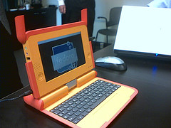
The first working prototype of the $100 Laptop was unveiled at the Country Task Force Meeting, 23 May 2006. (See Flickr for more images.) This was first time we had combined the industrial design with the hardware (A-TEST board). Both the ID and the hardware had been shown separately in the past; pictured is the working laptop, completely self-contained, running Fedora Core 5.0.
One thing that might be somewhat misleading is the display; we plan to ship a display that is bigger and of a higher resolution than the one pictured. We plan to ship a 7.5-inch diagonal display with 1200×900 pixels vs. the 7.0-inch diagonal display with 800×480 pixels seen in the prototype.
About One Laptop per Child
This is the wiki for the One Laptop per Child association. The mission of this non-profit association is to develop a low-cost laptop—the "$100 Laptop"—a technology that could revolutionize how we educate the world's children. Our goal is to provide children around the world with new opportunities to explore, experiment, and express themselves.
Why do children in developing nations need laptops? Laptops are both a window and a tool: a window into the world and a tool with which to think. They are a wonderful way for all children to learn learning through independent interaction and exploration.
It's an education project, not a laptop project -- Nicholas Negroponte
The Special:Allpages page lists 265 pages that are in this wiki. That does not include the Talk pages nor the User pages. 2006-06-15 1818Z


