OLPC Human Interface Guidelines/The Sugar Interface
| ← Security | [[OLPC Human Interface Guidelines/{{{curr}}}|{{{curr}}}]] [[ talk:OLPC Human Interface Guidelines/{{{curr}}}|(discussion)]] | The Sugar Interface → |
The Sugar Interface
Input Systems
Keyboard
Localized Keyboard Layouts
| API Reference |
|---|
| Module: keymapping TBD |
Softkey Sliders
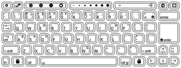
The slider keys have two modes: "digital" and "analog." In digital mode, the discrete functions printed on the key caps are accessed, four per key. In analog mode, accessed with the Fn key, intermediate key codes are enabled—there are seven positions along the slider; intermediary postions are interpolated in software, turning each of the keys into a 13-position slider.
Keyboard Shortcuts
For the purposes of development, you may want to review the detailed specifications for keys and their codes on the Keyboard Layout page. For a complete list of agreed upon keyboard shortcuts in the Sugar environment, at both system and activity levels, please refer to the Keyboard Shortcuts page. Following is a high level description of the types of shortcuts the available keys should pertain to.
- ◆ CTRL (U+25C6) will be the main modifier key. It will be used to define "base" shortcuts. For instance, ◆A will "select all" in a text editor.
- ◇ ALT (U+25C7) should be used for optional modifications (or ALTernates) to base shortcuts. For instance, ◆S will perform a standard "keep" and ◇S could be "keep as...". ◆V is paste, ◇V is "paste and remove from clipboard."
- ⇧ SHIFT (U+21E7) can work in two ways. Its primary use would be as an inversion modifier, such that it inverts the meaning of the base shortcut. For instance, ◆Z is undo and ⇧◆Z is redo. ◆TAB is next activity, ⇧◆TAB is previous activity. SHIFT can also be used to create a second set of "base" shortcuts which are less often used.
The FN key is reserved solely for system level operations, and generally for those that map to functions which are printed on the keyboard itself.
Trackpad
The laptops employ a capacitive (finger controlled) trackpad.
Only the center region of the trackpad has capacitance, responding to a finger.
Trackpad as Mouse
The use of the finger on the central trackpad area serves as the primary input device for pointing. Though external USB mice will work seamlessly with the laptops, their availability will be limited, and activity designers should not expect that children will have access to them. This means that a certain lack of precision can be expected when moving the cursor about the screen, and activities should not require extremely precise motion. Excessively small controls should also be avoided for similar reasons; details on how to design interface elements reside in the Controls section.
In addition, the laptops have two buttons positioned beneath the trackpad for input. The left button is the primary button with which elements of the interface are selected, pressed, or activated. The right button has secondary functionality. Typically, the right mouse button invokes contextual menus, the content of which pertains directly to the interface element the mouse is positioned over.
Trackpad as Graphics Tablet
No stylus support is currently planned for the XO.
Microphone and Speakers
The laptop has a built-in microphone and stereo speakers to allow for voice communication and recording. You may integrate audio functionality directly into your activities by requesting access to this hardware in the Functional Manifest. There are also an external microphone and speaker jacks.
Need a section on using sounds in activities; particularly in the background...
Camera
The laptops have built-in cameras to allow for still photography and video recording. You may integrate camera functionality directly into your activities by requesting access to this hardware in the Functional Manifest.
"Hand-held" Mode
The laptops feature a hand-held mode of operation in which the screen swivels around 180 degrees and folds flat, similar to a tablet PC. In this mode, the screen covers the keyboard and trackpad; however, the microphone and camera, mounted within the display bezel, remain available for use. Additionally, bezel-mounted controls provide auxiliary input suitable for the activities that Hand-held mode is designed to support: reading an eBook, playing games, etc.
Energy Saving Benefits
The laptop is engineered for extreme operating efficiency—a goal furthered by Hand-held mode. The CPU can be suspended while still displaying on-screen graphics. While reading an eBook, since the screen need only be updated when a page is changed, the time spent reading any given page requires no use of the CPU. The screen can run in reflective (daylight) mode—with the backlight off—for additional energy savings. These factors combine to create an extremely low-power, energy-efficient machine; Hand-held mode provides a usage scenario where maximal energy savings can be attained.
Implementing Hand-held Controls
Unlike a typical tablet PC, the OLPC laptop does not have a touch-sensitive screen. Primary user input comes from two bezel-mounted button sets: the D-pad (directional pad), which has 8 directions of articulation; and the button controller, which houses 4 discrete buttons (labeled ◯, ╳, △, ▢, on the B1 machine).
The Directional Buttons
The D-pad should not be, in general, used to move a cursor around the screen— in fact, the cursor will hide by default in Hand-held mode. Instead, it should be used for more discrete operations, such as flipping through pages, scrolling a view, or jumping to focusable elements on screen. When an interface necessitates focusable elements, these should be visually apparent and arranged in a natural order. In most cases, "natural order" will mean scan-line order, or the way in which one reads a page of text, but this may adapt to suit the needs of the activity. For instance, some activities may opt to scan first by column, then by row; some may use a clockwise ordering some may even zig-zag across the screen. All of these arrangements are acceptable as long as their orderings logically follow from one to the next according to the visuals provided on screen.
Specific activities may in fact benefit from a more traditional cursor. Some games, for instance, may require one. To support these cases, the cursor may be explicitly shown. However, these instances should be carefully considered, since in many cases a cursor will provide a simple yet inefficient solution to a problem for which a better one exists.
The Controller Buttons
Generally speaking, the controller buttons can act either as standard event triggers, or as modifier buttons to the target of the D-pad controls. A common use for standard buttons is as select and cancel buttons. In such instances, the ◯ button should always represent confirmation, selection, or forward progress, while the ╳ button represents cancel, escape, or backward progress. Adhering to these guidelines will make navigation of Hand-held interfaces consistent.
When used as a modifier, the visuals on screen should clearly indicate which of the directions—up, down, left, right—perform actions, and those actions likewise should be clearly indicated. For instance, in the eBook, holding down ∆ displays an overlay listing the book's chapters, and the up/down arrows will have focus within this list while the modifier key remains pressed. The currently selected chapter appears in the center of the screen, and up and down arrows above and below the selected chapter clearly indicate how to scroll through the list. When activities implement a combination of both standard and modifier buttons, we encourage ╳ and ◯ for standard, and △ and ▢ for modifiers, since the former two are easier to hit with natural finger placement.
Built-in Hardware in Hand-held Mode
Both the camera and microphone reside within the display bezel, and as such remain available for activities to use within Hand-held mode. The important trade off to consider before using the camera or microphone is that of energy efficiency: while the laptop conserves energy in Hand-held mode, continued use of either of these two devices requires constant CPU usage, virtually eliminating the benefits. Therefore, do not simply integrate these hardware components unless they provide a fundamental service to your activity—but don't let this deter you from doing so where appropriate.
Screen Rotation
While in Hand-held mode, the laptops support screen rotation; by pressing a small button on the bezel of the display, the interface will rotate 90 degrees to provide a portrait layout of the currently active activity. Just as any activity can implement Hand-held mode, those which can benefit from a vertical aspect ratio may also implement this feature, and we encourage developers to take advantage of this functionality. The Read activity serves as a prime example of the usefulness of such a feature, since a vertical layout is well suited to displaying a single page from a book. This is just the type of activity one might want to do in Hand-held mode, and by providing two orientations a greater number of use cases can be covered.
In the current revisions of the laptops, its important to note that the buttons for interacting with Hand-held mode are slightly less accessible when the laptops are held vertically. For this reason, activities that require heavy or frequent use might not be best suited for this mode. However, OLPC is working hard on introducing touch-screen technology in the near future, which will nearly eliminate the dependency on the physical buttons, expanding the possibilities as every activity can take advantage of screen rotation. Therefore, even if screen rotation doesn't make sense for the first version of your activity, please construct your interface in such a way as to allow future adaptation to this new and potentially useful functionality.
Layout Guidelines
The Grid System
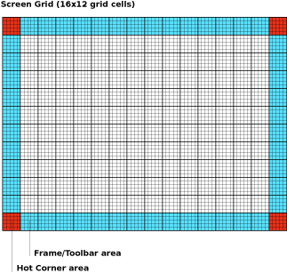
In keeping with the simple, flat visual style of the Sugar interface, we have designed all of the interface elements on a straightforward grid system. The system functions like a basic floorplan which allows interface elements to tile neatly within its boundaries. The grid consists of a 16x12 array of square tiles.
The diagram below shows the screen dissected into cells. Furthermore, the cells highlighted in blue indicate the areas suitable for activity toolbars. Note the exclusion of the corners, which are reserved for the hot corners which invoke the frame. In order to prevent accidental invocation, no buttons should be placed in these locations. Though all edges of the screen are suitable for placing toolbars, we recommend that the top and left edges of the screen serve as the primary location for them unless circumstances specifically suggest an alternative. Conforming to these guidelines will both make the variety of activities supported on the laptop feel more consistent, and also reserves the right and bottom edges for scroll bars, making navigation (when required) within the primary pane much simpler. Though the grab key provides the primary means for panning, preserving these edges for scroll bars even as visual indicators will increase usability.
Considering the screen at its maximum resolution of 1200x900 pixels in luminance mode, each square tile is 75x75 pixels in size. Each cell is comprised of a 5x5 array of 15 pixel subcells. These subcells provide layout guidelines at a finer level of detail. In general, the 3x3 subcell interior region is icon-safe.
Icons
Categories of Icons
The XO
The icons which represent People have special status on the laptops. Referred to generally as the XOs, they represent the children and their laptops on the mesh Neighborhood, and furthermore represent the OLPC project and its goals to place a laptop in the hands of every child. Each child will select a stroke and fill color for their XO, and their chosen colors will then apply to the icons of any Activities or Objects they create.
Activity Icons
Object Icons
Action Icons
Active vs. Inactive Icons
Many instances may arise in which some elements of the interface are inactive. Sugar specifies a consistent visual style to represent the concepts of absence and inactivity. Inactive elements are buttons that are not currently actionable, or controls that are temporarily disabled. Absent elements are object icons that represent people or things which aren't actually present at the moment; for instance, an incomplete download, or an invited friend who hasn't yet joined the activity.
Generally, interfaces represent such inactivity through grayed out imagery. Of course, since the laptop also operates in grayscale mode, such a color distinction must not be used under any circumstances. Instead, Sugar will take advantage of the vector graphics used for rendering objects and buttons by rendering inactive ones as a white outlined stroke, with no fill color.
Active
Inactive
Icon Design Guidelines
Icon Format
All icons designed for use in Sugar must be provided in SVG format. Since all icons exist as vectors, dynamic scaling and coloring of the icons occurs without any degradation. This allows variably sized representations of particular icons to exist depending on context in the interface. Additionally, this provides support for dynamic coloring of activity and object icons based upon a child's chosen XO colors.
Icon Sizes
Icons should be developed and saved at Standard (S) size, though their actual size and appearance in the interface may change dynamically. When developed at standard size, icons should fit loosely within the 3 x 3 icon-safe subcell of a standard 75px grid cell, as specified in the layout section.
Notice that when the interface scales your icons, strokes do not necessarily scale proportionally to the overall icon size. This ensures that the stroke weight remains visible enough at all sizes to convey its weight and color, but it may also limit the granularity with which you use strokes, which could begin to blend together at smaller sizes. The following chart relates the various icon sizes to their corresponding scale factors and stroke weights. We strongly suggest that you try rendering your icons at XS, S, and M sizes in order to tweak their appearance for optimal legibility.
| Icon Size | Scaling Factor | Stroke Weight |
|---|---|---|
| XS | 0.5 | 2.25px |
| S | 1.0 | 3.5px |
| M | 1.5 | 4.0px |
| L | 2.0 | 4.5px |
| XL | 2.75 | 6.0px |
Strokes & Fills
| API Reference |
|---|
| Module: sugar.shell.view.stylesheet |
All icons render in two colors: stroke and fill. The actual stroke and fill colors that an icon renders in are determined by the children, since they correspond to the colors they have chosen for their XOs. As such, the colors in which you choose to save your icon are arbitrary. However, note that any fills that have the same color as your strokes will dynamically take on their color when rendered.
All strokes within an "S" activity icon must have a line weight of 3.5px. All icons should have a primary fill which represents its overall shape. In addition, any number of supplemental strokes and fills may be used; not all strokes within an icon must have fills, and not all fills must have strokes.
More detailed instructions for making icons can be found here.
Colors
Imbuing Color with Meaning
Sugar treats color differently from the typical UI: colors used in the interface represent the individuals who are interacting within the mesh, not the activities or objects they are using. Children personalize their laptops and their presence on the mesh by selecting a dual-tone color scheme. All of the activities, objects, and comments belonging to a child take on her own colors—even when they appear on the laptops of other children on the mesh—forming a visual identity that supplements her name and attributes.
This color treatment extends even within activities. For instance, in the Web activity a link-sharing feature encourages children to browse the web in groups, sharing interesting or useful pages with each other. Each URL object posted for the others to view appears in the colors of the child who posted the link. Similarly, chat bubbles on the Bulletin Board take on the children's colors. Likewise, any object, text, or other interface element within your activities that corresponds to a particular child should be rendered in this manner. When the display runs in grayscale mode, this colored visual identity is less apparent. However, significant differences in value, according to the Munsell System, ensure that the XOs retain a level of visual distinction even in the absence of color.
To maintain a degree of purity to this system, interface elements, buttons, and other icons that belong solely to the activity and not to any particular child should remain in grayscale to the extent possible. While removing color as a primary visual clue may seem counter-intuitive, it does encourage the icon's form to clearly indicate its function. Since the laptops will also run in grayscale mode, clearly distinct shapes become essential in the absence of chroma information, and so limiting activity icons to grayscale by default ensures compatibility in both modes. Additionally, keep in mind that the traditional method of "graying-out" inactive buttons and controls simply will not function on the laptops and must be avoided. Instead, please adhere to the guidelines for inactive icons.
See XO colors for the full list of defined and approved XO colors.
Contrast in the Munsell Colorspace
The basic color scheme for the laptop is constrained by the need to work in both color (backlight mode) and grayscale (reflective mode); thus we have chosen guidelines that ensure at least some achromatic contrast under all conditions. Further, sustained legibility of text is accomplished by a combination of colors whose achromatic contrast is large and whose chromatic energy is of low to moderate level. For this reason, we are striving for achromatic contrast of at least two Munsell value steps.
The default value for the Frame is N2.5; the default value for the background is N9. Therefore, to maintain sufficient contrast, the line values for icons that appear on both the Frame and the background should range between N5 and N7. The interior fill of those icons should maintain achromatic contrast with the line value, e.g., the fill color for an icon with a line value of N5 should be either ≤N3 or ≥N7.
|
|
Fonts
Sizes
The OLPC display is 200DPI; therefore one point—1/72 inch—is just less than 3 pixels (2.78 pixels). We are settling on a default font size of 7pts. for the Sugar UI (using DejaVu LGC Sans). It is quite legible. This translates to a font size of approximately 19.45 pt in Adobe Illustrator, which bases its units on the traditional 72DPI display. For the purposes of preparing activity GUI mockups, you must always remember to make the conversion to the laptops' display resolution by multiplying by a constant factor of 0.36.
We will be looking at other faces, e.g., Arabic and Thai, and also looking into a large-type version of the interface for the younger children.
Readability
Due to the unique design of the OLPC display, particular techniques for text rendering will provide much better results than others. The dual mode display has a resolution of 1200x900 (200 dpi) in luminance mode, but only ~800x600 (133 dpi) in chrominance mode. Therefore, unless they are sufficiently large, fonts rendered with luminance and no chroma will appear sharper and more readable.
Additionally, the display has higher resolution in black pixels than in white pixels. This results from the fact that each pixel has a color part which contains either red, green, or blue information. In order to create white, red, green and blue parts must all work together; when off, each of the color parts is black on its own. Furthermore, a grey background limits the readability of the display in sunlight. Therefore, we recommend the use of black text on a white background for best readability of fine text, and color on white for larger print.
Rollovers
| Animation Phase | Time Offset (seconds) |
Duration (seconds) |
|---|---|---|
| Immediate Background Change | 0.0 | 0.1 |
| Primary Rollover Begins Expanding | 0.1 | 0.2 |
| Primary Rollover Displayed | 0.3 | 0.4 |
| Secondary Rollover Begins Expanding | 0.7 | 0.3 |
| Secondary Rollover Displayed | 1.0 | ---- |
Primary Rollover
Secondary Rollover
Rollovers as Menus
Rollovers as Contextual Menus
Rollovers as Dialogs
Controls
Sugar defines its own set of control widgets that will create the user interface on the laptops. Though most of the available controls will match developers' expectations, we've also developed some new controls and altered behaviors of others to better suit the user experience on the machines. With these new developments comes a new set of guidelines for their usage and placement which both maintains the broader set of goals and metaphors setup within Sugar and aids in the development of collaborative user interface environments.
As the control widget specification and guidelines compose a substantial portion of this document, internal page by page navigation is available by clicking on the header for any control set. In addition, the individual pages provide detailed specifications for the widgets and their various states. Finally, we're providing developers with an Adobe Illustrator file of the most up to date Sugar Control Specification in .ai (07.04.05) and .svg (07.05.18) in order to streamline early application layout and design mockups. Please understand these specifications and their implementations remain in early development, and their designs may change as the UI progresses. We'll provide links to APIs for the controls as they become available; Thanks for your patience.
Control Regions
In sugar, a predefined set of control regions provide the surfaces upon which controls may be placed. Limiting the background colors that the controls sit on allows for a consistent set of visual rules to define both the type and state of various controls while maintaining sufficient contrast even without the use of color. Shown to the right, the basic regions are the Canvas, Panel, Toolbar, and Palette.
Canvas: The canvas is the general purpose "creation" space within any activity — the region for drawing, writing, or otherwise working within it. Since creation ranks high among our goals, we also hope that this is the dominant region of the screen in most activities. The canvas region is specifically for generating content and 'should not' have any controls placed upon it. As such, the canvas may be any color the activity or the user desires, though Sugar specifies both white and black as the basic defaults.
Toolbars: Activity toolbars have a unique dark gray color which distinguishes them from the other control regions. The Frame also uses this unique shade of gray to indicate its purpose as an omnipresent toolbar that a child may activate from within any view or activity. Each activity will have a toolbar at the top of the screen, though when necessary additional toolbars may also be specified.
Panels: When appropriate, an activity may devote a portion of the screen to additional controls which make more sense outside of the toolbar and within the global activity context. Controls placed in this region should always remain relevant at all times, regardless of any other state associated with the activity or editing context.
Palettes: Palettes serve as multipurpose control regions which appear in several contexts. In an interface without traditional windows and menus, palettes step in to provide a versatile solution in many aspects of the user interface as the second layer of control. For a full description of their uses, please see the section on Palettes and Rollovers.
Controls: The remainder of this section focuses largely on the specific controls and guidelines for their usage within your activity's UI. The designs of all controls presented here follow a basic set of rules regarding colors, line weights, and sizing for each of its various states. More detail about these broader design decisions is discussed in the custom controls section.
Buttons
Text Buttons
Usage: Lorem ipsum dolor sit amet, consectetur adipisicing elit, sed do eiusmod tempor incididunt ut labore et dolore magna aliqua. Ut enim ad minim veniam, quis nostrud exercitation ullamco laboris nisi ut aliquip ex ea commodo consequat. Duis aute irure dolor in reprehenderit in voluptate velit esse cillum dolore eu fugiat nulla pariatur. Excepteur sint occaecat cupidatat non proident, sunt in culpa qui officia deserunt mollit anim id est laborum.
Behavior: Lorem ipsum dolor sit amet, consectetur adipisicing elit, sed do eiusmod tempor incididunt ut labore et dolore magna aliqua. Ut enim ad minim veniam, quis nostrud exercitation ullamco laboris nisi ut aliquip ex ea commodo consequat. Duis aute irure dolor in reprehenderit in voluptate velit esse cillum dolore eu fugiat nulla pariatur. Excepteur sint occaecat cupidatat non proident, sunt in culpa qui officia deserunt mollit anim id est laborum.
Guidelines: Lorem ipsum dolor sit amet, consectetur adipisicing elit, sed do eiusmod tempor incididunt ut labore et dolore magna aliqua. Ut enim ad minim veniam, quis nostrud exercitation ullamco laboris nisi ut aliquip ex ea commodo consequat. Duis aute irure dolor in reprehenderit in voluptate velit esse cillum dolore eu fugiat nulla pariatur. Excepteur sint occaecat cupidatat non proident, sunt in culpa qui officia deserunt mollit anim id est laborum.
Text with Icon Buttons
Usage:
Behavior:
Guidelines:
Icon Buttons
Usage:
Behavior:
Guidelines:
Toggle Buttons
Palette Buttons
Basic Selection Controls
Checkboxes
Usage:
Behavior:
Guidelines:
Radio Buttons
Usage:
Behavior:
Guidelines:
Popup Menus
Usage:
Behavior:
Guidelines:
Popup Palettes
Usage:
Behavior:
Guidelines:
Combo Boxes
Usage:
Behavior:
Guidelines:
Advanced Selection Controls
Color Picker
Usage:
Behavior:
Guidelines:
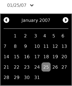
Date Picker
Usage:
Behavior:
Guidelines:
Object Picker
Usage:
Behavior:
Guidelines:
Find/Replace Palette
Usage:
Behavior:
Guidelines:
Adjustment Controls
Steppers
Usage:
Behavior:
Guidelines:
Basic Sliders
Usage:
Behavior:
Guidelines:
Sliders with Indication
Usage:
Behavior:
Guidelines:
Color Sliders
Usage:
Behavior:
Guidelines:
Indicators
Determinate Progress Bars
Usage:
Behavior:
Guidelines:
Indeterminate Progress Bars
Usage:
Behavior:
Guidelines:
Activity Spinners
Usage:
Behavior:
Guidelines:
Level Indicators
Usage:
Behavior:
Guidelines:
Rating Indicators
Usage:
Behavior:
Guidelines:
Relevance Indicators
Usage:
Behavior:
Guidelines:
Text Controls
Text Fields
Usage:
Behavior:
Guidelines:
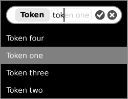
Tokenized Text Fields
Usage:
Behavior:
Guidelines:
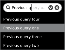
Search Fields
Usage:
Behavior:
Guidelines:
Tokenized Search Fields
Usage:
Behavior:
Guidelines:
Password Fields
Usage:
Behavior:
Guidelines:
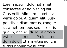
Multiline Text Fields
Usage:
Behavior:
Guidelines:
View Controls
Basic Sort Bars
Advanced Sort Bars
Sort Bar View Toggles
Tab Bars
Tabbed Sidebars
Disclosure Triangles
Tooltips
Grouping Controls
Separators
Trays
Custom Controls
When to Use Custom Controls
We have created a set of controls to suit most basic needs for Activity development. Using these controls wherever possible ensures that interfaces across Activities remain consistent and clear, and also maintains the visual style of the Sugar interface. Nonetheless, their basic functionality may prove limiting in some cases, and we certainly hope to inspire new and exciting uses of the various capabilities of the laptops, including their collaborative nature, and don't want to stifle additional ideation and design. For this reason, we are providing a general set of guidelines for the creation of custom controls that match the visual style of Sugar and maintain some basic standards for compatibility and usability within the Sugar interface.
Before implementing a custom control, be sure that the need truly exists. In some cases, you may find that a combination of simpler controls may suffice. In other cases, more complex functionality can be accommodated though use of a Palette. Additionally, be sure that the need is a functional one; Custom controls should have additional or different behavior that the current controls don't provide, and not simply define a different aesthetic for existing ones. Again, think carefully about the requirements for the control, and be sure that the functional need itself merits the work associated with creating the new control.
Control Color Palette
The Sugar interface defines a strict palette for the control widgets, along with guidelines for using these colors for various states and control types. Custom controls should adhere to the same set of colors and associated rules in order to ensure that their behavior mimics those of the core Sugar controls, and can be easily inferred by those who are familiar with them. Though their name and primary uses define these colors, any color within the palette provided below may be used for various parts of your control where it doesn't interfere with the basic rules associated with them.
| Name | Primary Uses | Hex | % Gray |
|---|---|---|---|
| Black | Palettes, Popups | #000000 | 100% |
| Toolbar Grey | Toolbars, Trays, Palette Groupings | #404040 | 75% |
| Button Grey | Default Button States | #808080 | 50% |
| Selection Grey | Selections, Panel Groupings | #A6A6A6 | 35% |
| Panel Grey | Panels, Desktop | #C0C0C0 | 25% |
| Text Field Grey | Text entry background | #E5E5E5 | 10% |
| White | Pressed states, multiline text areas | #FFFFFF | 0% |
Control Sizing
In accordance with the grid system, we have defined two standard sizes for controls: 75px and 45px. These sizes determine the bounding box for a given control, with 45px being the smallest recommended active (clickable) area for any control component. Note that the control itself may actually be smaller than this canvas, depending on the desired context. For instance, the icons for buttons fill up to 60% of the canvas area, with the actual icons having sizes of 55px and 27px.
| ← Security | [[OLPC Human Interface Guidelines/{{{curr}}}|{{{curr}}}]] [[ talk:OLPC Human Interface Guidelines/{{{curr}}}|(discussion)]] | The Sugar Interface → |
