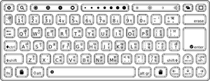
Talk:OLPC Devanagari Keyboard
Notes for the next update : some of the keys on the right-hand side of the keyboard aren't centered (devanagari chars are left and a bit below optimal), and the upper-right key should have perhaps 90%-reduced chars to fit. 01:44, 14 October 2007 (EDT)
Glyph alignment
Some options re glyph alignment. Please comment.
--Walter 12:09, 14 October 2007 (EDT)
- Regarding the vertical alignment, the top two options represent the correct vertical alignment and the third one represents an incorrect vertical alignment. --Arjs 13:58, 14 October 2007 (EDT)
- Not sure why the image captions weren't showing up before. Is vertical alignment more important than glyph size? Is horizontal alignment important? --Walter 14:19, 14 October 2007 (EDT)
- Vertical alignment is highly important - first and second ones are examples of correct vertical alignment (Vertical alignment is more important than glyph size). Horizontal alignment is also important. IMHO second one (the one in the center) is the best. However, we should get more feedback on this, I have written on OLPC-India mailing list requesting feedback.--Arjs 15:44, 14 October 2007 (EDT)
- Option 1 seems to be the most visually appealing to me. However, this kind of glyph alignment may be difficult to implement in certain cases (eg: what if character aa, U0906 needs to be combined with vowel sign ii, U0940 ?) Between horizontal and vertical alignment (or no alignment all), I would suggest that more importance be given to vertical alignment, since our writing system makes to mandatory to align all our glyphs in line with the top horizontal bar present in most of the characters. In such a situation, Option 3 should be avoided and Option 2 seems to be the safest one. -- Sayamindu 17:26, 14 October 2007 (EDT)
- There is a 4th option: use a font size that will allow all characters to fit. AlbertCahalan 17:05, 14 October 2007 (EDT)
I've made a version using approach 2 above (See Image:MR-MP-v2.png). --Walter 16:26, 15 October 2007 (EDT)
Use of circle to denote vowel signs and virama
The vowel signs on the keyboard (as well as the Virama/Halant) are preceded by a circle. Rendering engines use the circle (U+25CC DOTTED CIRCLE to be exact) to do fallback rendering for invalid combining marks (ie, a standalone vowel sign). This behaviour is documented in the Unicode standard 5.0 (section 5.13, Rendering Nonspacing Marks, pg 173). I was wondering if this behaviour is required for the keyboard as well. In all our textbooks (language primers), no such circle is used to indicate vowel signs. This may create confusion among the children, since such a circle does not exist in the Devanagari alphabet. On the other hand, it might also serve as a good indication that the characters with a circle before/under/after them in there are dependant ones.
- I've done this for some keyboards (URDU for example) and not for others. I again defer to the local experts. (Note that I had used U+25CC, but the printer complained that the detail of the dashed line was too fine to print clearly at such a small scale, so I switched to the solid circle.) --Walter 16:28, 15 October 2007 (EDT)
- Just noticed that Wikipedia has an image of a Devanagari typewriter keyboard, at http://en.wikipedia.org/wiki/Image:Hindi_typewriter.jpg. It does not use the dotted circle. -- Sayamindu 10:04, 16 October 2007 (EDT)
- I've made a version without the dots . Let me know what you think. --Walter 14:13, 16 October 2007 (EDT)
- I prefer the circles. Old technology like typewriters don't need circles because the character set is fixed and small. There are only about 50-60 glyphs. The situation is different with unicode. As you know, there are about a zillion glyphs available in unicode so it's really important to try to avoid ambiguity. The circles help with that. Otherwise an English colin looks the same as U+903 and period is very similar to U+93c. I'm not sure why gucharmap 1.10 no longer draws a dotted circle but I think omitting the circle is a mistake. 128.223.147.173 16:46, 16 October 2007 (EDT)
Switching between two keyboard modes
One can switch between two keyboard layouts/modes by pressing the key which is below Enter key and to the right of the up-arrow key.
Adding a new font to Sugar
To add a new font, put the font in /usr/share/fonts/ and rebuild the font cache by
fc-cache -f


