Kuku/Visual design
Visual Design
Screenshots
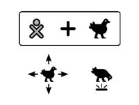
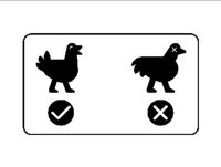
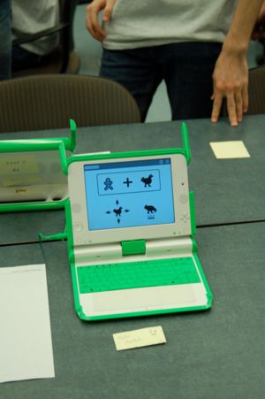
We want to make the game images as 'discoverable' as possible. To that end, the start screen describes the nature of the game (addition symbol for mathematics (right now)), the arrow keys denote chicken motion, and the B2 space-bar key tells the kids how to make the chicken peck. There are a lot of numbers or the game screen which could certainly be dealt with better. The losing and winning screens are added to by downbeat and upbeat music, respectively.
XO Screenshots
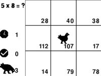
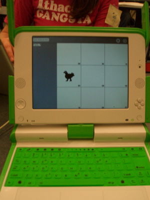
This screenshot depicts the basic grid layout with the player (chicken) in the lower left-hand corner. The question (5 + 5 = ?) is posed outside the upper left of the grid. Below the question are the current score (+25), and the current time (1.35 s). (Please excuse the state of this screenshot - we have not focused on the graphics yet!)
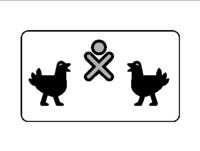
This screenshot shows the startpage of the version of the activity that was judged by children on Sunday afternoon during the first OLPC Game Jam.
