Pen Tablet UI/User Study: Difference between revisions
No edit summary |
m (category:Usability) |
||
| (One intermediate revision by one other user not shown) | |||
| Line 1: | Line 1: | ||
[[Category:Usability]] |
|||
This page describes a user study that was performed on April 8 and 10, 2008 by [[User:Pdubroy|Patrick Dubroy]] in order to evaluate prototypes for a [[Pen Tablet UI]]. |
This page describes a user study that was performed on April 8 and 10, 2008 by [[User:Pdubroy|Patrick Dubroy]] in order to evaluate prototypes for a [[Pen Tablet UI]]. |
||
== Method == |
== Method == |
||
=== Participants === |
=== Participants === |
||
| Line 11: | Line 12: | ||
=== Study method === |
=== Study method === |
||
Participants were asked to perform a several drawing tasks using the [http://en.wikipedia.org/wiki/Think_aloud_protocol Think Aloud protocol]. Before beginning the tasks, participants were given an opportunity to become familiar with the OLPC and get a feel for the use of the tablet. This warm-up period was also used to get the participants comfortable with using think-aloud. |
|||
During the drawing tasks, video of the screen and tablet area was captured along with audio. Afterwards, I reviewed the videos and made notes of any interesting results, behaviours, or comments. |
During the drawing tasks, video of the screen and tablet area was captured along with audio. Afterwards, I reviewed the videos and made notes of any interesting results, behaviours, or comments. |
||
In each task, the participant was given a paper drawing and asked to reproduce it on the XO screen using a specified drawing mode. For the first three partipants (C, S, and M), before opening touching the XO, they were asked to do a simple drawing on a piece of paper, something they imagine a 6 - 12-year-old might draw. They were later asked to recreate this drawing on the XO (see below). |
|||
| ⚫ | |||
[[Image:Task1.jpg|none|thumb]] |
|||
Before beginning the task, each participant was told that "the blue rectangle on the screen represents that area that the tablet is mapped to. So when you draw on the tablet, it will always appear inside the blue rectangle." Then participants were asked to reproduce this drawing using the Fixed mapping mode method. |
|||
==== Drawing 2 ==== |
|||
[[Image:Task2.jpg|none|thumb]] |
|||
Participants were asked to reproduce this drawing using Fixed, Movable, and Dynamic mapping modes. The order that these modes were applied varied from participant to participant. Before each mode, they were given a short explanation of how that mode would work, but it was not demonstrated to them. |
|||
Before using Fixed or Movable (whichever came first), they were told about the XO's grab buttons, and told what they are used for ("panning around a document, like you can do in Google Maps"). They were not told whether to use the stylus or the touchpad for panning, nor were they told exactly what "panning" would mean (moving the paper or moving the rectangle). |
|||
Before using the other related mode (between Fixed and Movable) they were told that it would work in a similar, but slightly different way than the previous one, and that they should experiment to figure out how it worked. |
|||
When Dynamic mapping mode was introduced, the participants were told: "whenever you draw a line, you move the cursor to the point where you want the line to start. Then when you start drawing on the tablet, the line will appear beginning at the cursor." |
|||
==== Drawing 3 ==== |
|||
[[Image:Task3a.jpg|none|thumb]] |
|||
[[Image:Task3b.jpg|none|thumb]] |
|||
Participants were instructed to duplicate one of the images above, using both the Fixed mapping mode, and the Dynamic mapping mode. The order in which the modes were applied varied from participant to participant. |
|||
''Note:'' The first participant (C) was asked to perform this task for both drawings. For subsequent participants, they were only asked to do it for the second. The reason for this change was that the first drawing evaluated both the mapping modes and the precision modes, but I really only wanted to evaluate the precision modes. |
|||
In addition, participants were asked to complete the drawing using three separate lines, rather than one continuous line. |
|||
Before using the Fixed mapping mode, they were told about the Alt-hover precision mode: "when you hold down Alt and draw on the stylus, instead of making a line, it will display crosshairs at the point where the stylus currently is." |
|||
== Results == |
== Results == |
||
| Line 53: | Line 88: | ||
* the mapping rectangle should be *exactly* the same aspect ratio as the physical tablet, and maybe have the same grey marks as the tablet to make it obvious exactly how it maps |
* the mapping rectangle should be *exactly* the same aspect ratio as the physical tablet, and maybe have the same grey marks as the tablet to make it obvious exactly how it maps |
||
* dragging with the stylus seemed to be very slow -- it should maybe be accelerated, and support for dragging with the mouse should be added |
* dragging with the stylus seemed to be very slow -- it should maybe be accelerated, and support for dragging with the mouse should be added |
||
* the crosshairs had a problem with flicker and weren't always visible |
|||
=== Problems with the study methodology === |
=== Problems with the study methodology === |
||
| Line 65: | Line 101: | ||
* it's not obvious why you can't use your finger on the whole tablet area, not just the middle |
* it's not obvious why you can't use your finger on the whole tablet area, not just the middle |
||
* there is an area about 0.5 cm around the edge of the tablet area that is not actually pressure sensitive. The physical barrier should be at the same place that the sensors stop. |
* there is an area about 0.5 cm around the edge of the tablet area that is not actually pressure sensitive. The physical barrier should be at the same place that the sensors stop. |
||
| ⚫ | |||
* software should allow people to move the shapes they draw |
|||
* If the physical tablet had crosshairs built in, you could use a movable mapping mode that wasn't contrained in the x-axis, then they could just use that for precise drawing. You would move the on-screen crosshairs to where you want to start drawing, and then put the stylus down on the corresponding physical crosshairs |
|||
== Conclusions == |
== Conclusions == |
||
| Line 79: | Line 110: | ||
* Test precision modes separately from mapping modes (as I learned from the first test subject, and corrected) |
* Test precision modes separately from mapping modes (as I learned from the first test subject, and corrected) |
||
* Modify the drawings to be a bit more representative of realistic tasks, and do not use 3 equally spaced graphics |
* Modify the drawings to be a bit more representative of realistic tasks, and do not use 3 equally spaced graphics |
||
* When testing precision, a different drawing should be used that requires precision, and that cannot be drawn as a continous line (so that they don't have to be told to draw in 3 separate lines) |
|||
=== Future Design Prototypes === |
=== Future Design Prototypes === |
||
| Line 85: | Line 117: | ||
* All participants found Dynamic mode to be quite useful and intuitive, however it also has some serious usability issues, as noted above. We should consider a hybrid mode that combines Movable (for the majority of drawing) with the ability to enter Dynamic mode when high precision is required |
* All participants found Dynamic mode to be quite useful and intuitive, however it also has some serious usability issues, as noted above. We should consider a hybrid mode that combines Movable (for the majority of drawing) with the ability to enter Dynamic mode when high precision is required |
||
* Putting crosshairs on the physical tablet and using a Movable mode that also allows movement in the X axis might make a separate precision mode unnecessary. However, this would require modifying the XO (although only to use a permanent marker to make a small mark on the tablet area, which seems reasonable) |
* Putting crosshairs on the physical tablet and using a Movable mode that also allows movement in the X axis might make a separate precision mode unnecessary. However, this would require modifying the XO (although only to use a permanent marker to make a small mark on the tablet area, which seems reasonable) |
||
* The mapping rectangle shown on the screen should look *exactly* like the physical tablet area -- grey lines and all. |
|||
* When drawing, the user should be given better feedback about the pressure they are applying, so they can understand when they are not pressing hard enough. If a tablet widget is on-screen and no pressure is detected on the tablet, it might be worth putting up a subtle message to "Press hard"...maybe as grey text inside the mapping rectangle. |
|||
* In Movable mode, it should be possible to drag with either the mouse or the stylus, and when dragging with the stylus, it should probably be accelerated. |
|||
* In a Dynamic-like mode, the line should begin *exactly* where the cursor is. Also, the cursor should disappear or change so as not to obscure the line being drawn. |
|||
=== Recommendations for activities supporting the tablet === |
|||
* Activities that support unconstrained drawing with the tablet should an easy undo feature to allow for easy experimentation with the tablet |
|||
* They should also allow individual shapes to be moved, so that the user can easily recover if they unintentionally draw in the wrong spot |
|||
=== Hardware Design Recommendations === |
|||
* The physical barrier (edge of the tablet area) should be exactly at the edge of the sensor area. It should not be possible to draw inside the physical edges of the tablet area without being sensed |
|||
* The entire area should be capactive-sensing, not just the center third. For users, there is no obvious reason that they can only use their finger on the center area when the stylus can be used on the whole thing. |
|||
:* If this is not possible, then the capactive-sensitive area should be made somehow physically different from the area rest of the tablet area |
|||
Latest revision as of 22:21, 1 May 2008
This page describes a user study that was performed on April 8 and 10, 2008 by Patrick Dubroy in order to evaluate prototypes for a Pen Tablet UI.
Method
Participants
Five participants were selected for the study. No participant was familiar with the XO hardware or the Sugar UI, nor did they have any experience with a conventional graphics tablet. [More details to come]
The number of participants was chosen based on Jakob Neilsen's rationale (Why You Only Need to Test With 5 Users) that this will find approximately 85% of the usability problems in a design. Given the early design stage, this seems like an appropriate approach.
Study method
Participants were asked to perform a several drawing tasks using the Think Aloud protocol. Before beginning the tasks, participants were given an opportunity to become familiar with the OLPC and get a feel for the use of the tablet. This warm-up period was also used to get the participants comfortable with using think-aloud.
During the drawing tasks, video of the screen and tablet area was captured along with audio. Afterwards, I reviewed the videos and made notes of any interesting results, behaviours, or comments.
In each task, the participant was given a paper drawing and asked to reproduce it on the XO screen using a specified drawing mode. For the first three partipants (C, S, and M), before opening touching the XO, they were asked to do a simple drawing on a piece of paper, something they imagine a 6 - 12-year-old might draw. They were later asked to recreate this drawing on the XO (see below).
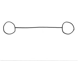
Drawing 1
Before beginning the task, each participant was told that "the blue rectangle on the screen represents that area that the tablet is mapped to. So when you draw on the tablet, it will always appear inside the blue rectangle." Then participants were asked to reproduce this drawing using the Fixed mapping mode method.
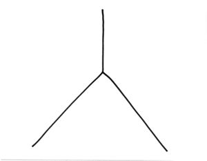
Drawing 2
Participants were asked to reproduce this drawing using Fixed, Movable, and Dynamic mapping modes. The order that these modes were applied varied from participant to participant. Before each mode, they were given a short explanation of how that mode would work, but it was not demonstrated to them.
Before using Fixed or Movable (whichever came first), they were told about the XO's grab buttons, and told what they are used for ("panning around a document, like you can do in Google Maps"). They were not told whether to use the stylus or the touchpad for panning, nor were they told exactly what "panning" would mean (moving the paper or moving the rectangle).
Before using the other related mode (between Fixed and Movable) they were told that it would work in a similar, but slightly different way than the previous one, and that they should experiment to figure out how it worked.
When Dynamic mapping mode was introduced, the participants were told: "whenever you draw a line, you move the cursor to the point where you want the line to start. Then when you start drawing on the tablet, the line will appear beginning at the cursor."
Drawing 3
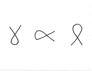
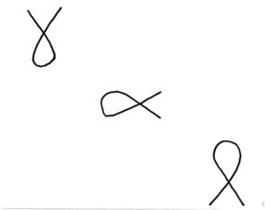
Participants were instructed to duplicate one of the images above, using both the Fixed mapping mode, and the Dynamic mapping mode. The order in which the modes were applied varied from participant to participant.
Note: The first participant (C) was asked to perform this task for both drawings. For subsequent participants, they were only asked to do it for the second. The reason for this change was that the first drawing evaluated both the mapping modes and the precision modes, but I really only wanted to evaluate the precision modes.
In addition, participants were asked to complete the drawing using three separate lines, rather than one continuous line.
Before using the Fixed mapping mode, they were told about the Alt-hover precision mode: "when you hold down Alt and draw on the stylus, instead of making a line, it will display crosshairs at the point where the stylus currently is."
Results
Detailed notes from each participant:
Fixed Mode
- two users did not understand it at all
- everybody said that they like Movable Mode better
Movable Mode
- some users tried to use the touchpad to move the mapping rect, instead of using the stylus
- due to the pressure required with the stylus, it doesn't really seem that there would be any reason to use the stylus rather than the touchpad. Although, we could easily allow both to move the mapping
Alt-hover
- 2 users (S, M) weren't initially pressing hard enough to see the crosshairs. It seemed like because there was no line being drawn, they thought they didn't have to press as hard
- 4 users (C, S, A, MO)thought that once the crosshairs were in the right place, they could lift the stylus off the tablet, like in Dynamic mode. It's unclear whether this was due to having learned Dynamic mode first
Dynamic Mode
- if you accidentally stop drawing a line -- e.g. by releasing a bit of the pressure, or by going off the edge of the tablet -- things go totally wrong, and a new line is started at the cursor.
- an ever worse version of this (because it's less obvious what's happening) is if you don't press hard enough while drawing a line. You end up getting a bunch of marks being made right under the cursor, with the mapping rectangle sliding in the opposite direction
- one user (A) commented that it would be hard to draw a dotted line or something similar
- one user (M) didn't realize she had to move the cursor for every new line that she wanted to draw, and another (A) sometimes forgot to do it (it didn't seem to come naturally, for lines that are close together)
- 2 users (S, A) would set the cursor, but then being drawing in a way that wasn't completely consistent with how they had placed the cursor
- users didn't generally feel that the rectangle was useful to display
- 2 users (C, M) thought they had to click the button to set the start of the line in DYNAMIC mode. But, that didn't actually cause any problems, because it would still work just as they intended
Problems with the prototype
- in Dynamic mode, the lines did not seem to start *exactly* where the cursor was
- in Dynamic mode, the cursor often obscured the line that was being drawn
- the mapping rectangle should be *exactly* the same aspect ratio as the physical tablet, and maybe have the same grey marks as the tablet to make it obvious exactly how it maps
- dragging with the stylus seemed to be very slow -- it should maybe be accelerated, and support for dragging with the mouse should be added
- the crosshairs had a problem with flicker and weren't always visible
Problems with the study methodology
- having 3 figures to draw in each rectangle encouraged people to think of the screen as being divided into thirds, which wasn't necessarily representative of a normal drawing task
- since the exact placement of the objects isn't that important, maybe go with a different task next time
- using Dynamic mode before seeing the Alt-hover may have had a negative learning effect on their use of Alt-hover. Should consider doing the Alt-hover task before teaching them Dynamic mode
Problems with the hardware
- people consistently had some trouble with pushing hard enough on the tablet. It shouldn't be too much of a problem to learn to push hard enough, but this might be difficult for children.
- one user (A) commented that because the tablet surface was higher than the table where she was resting her hand, that she had to hold the stylus different than she would a regular pen
- it's difficult to get any events on the absolute edges of the tablet area
- it's not obvious why you can't use your finger on the whole tablet area, not just the middle
- there is an area about 0.5 cm around the edge of the tablet area that is not actually pressure sensitive. The physical barrier should be at the same place that the sensors stop.
Conclusions
Methodology
There were a few issues with my study methodology, as noted above. Recommendations for a future study:
- Test Alt-hover mode before introducing Dynamic mode. There may have been a learning effect from Dynamic -> Alt-hover. The effect would probably not be present in the opposite direction.
- Test precision modes separately from mapping modes (as I learned from the first test subject, and corrected)
- Modify the drawings to be a bit more representative of realistic tasks, and do not use 3 equally spaced graphics
- When testing precision, a different drawing should be used that requires precision, and that cannot be drawn as a continous line (so that they don't have to be told to draw in 3 separate lines)
Future Design Prototypes
- Movable mode seems to be equal or superior to Fixed mode
- All participants found Dynamic mode to be quite useful and intuitive, however it also has some serious usability issues, as noted above. We should consider a hybrid mode that combines Movable (for the majority of drawing) with the ability to enter Dynamic mode when high precision is required
- Putting crosshairs on the physical tablet and using a Movable mode that also allows movement in the X axis might make a separate precision mode unnecessary. However, this would require modifying the XO (although only to use a permanent marker to make a small mark on the tablet area, which seems reasonable)
- The mapping rectangle shown on the screen should look *exactly* like the physical tablet area -- grey lines and all.
- When drawing, the user should be given better feedback about the pressure they are applying, so they can understand when they are not pressing hard enough. If a tablet widget is on-screen and no pressure is detected on the tablet, it might be worth putting up a subtle message to "Press hard"...maybe as grey text inside the mapping rectangle.
- In Movable mode, it should be possible to drag with either the mouse or the stylus, and when dragging with the stylus, it should probably be accelerated.
- In a Dynamic-like mode, the line should begin *exactly* where the cursor is. Also, the cursor should disappear or change so as not to obscure the line being drawn.
Recommendations for activities supporting the tablet
- Activities that support unconstrained drawing with the tablet should an easy undo feature to allow for easy experimentation with the tablet
- They should also allow individual shapes to be moved, so that the user can easily recover if they unintentionally draw in the wrong spot
Hardware Design Recommendations
- The physical barrier (edge of the tablet area) should be exactly at the edge of the sensor area. It should not be possible to draw inside the physical edges of the tablet area without being sensed
- The entire area should be capactive-sensing, not just the center third. For users, there is no obvious reason that they can only use their finger on the center area when the stylus can be used on the whole thing.
- If this is not possible, then the capactive-sensitive area should be made somehow physically different from the area rest of the tablet area


